We built a brand for a high trajectory golf tech startup, helping them jump to hyperspeed without missing a stride.
When Whoosh came to us, they were on a tear. A company moving that fast couldn't afford to slow down for a lengthy brand identity process. Between product development, sales, and a capitalization, they needed an effective brand that could plug and play.


Truth

Golf is trying to find its future, and the clubs at its heart had been stuck running on legacy technology that limits staff and frustrates members. Whoosh knew the future of club management lay in less friction. Built with input from more than 150 leading clubs, the product gives staff their time back — reducing revenue loss and saving 20+ hours of staff time each week — so that they can leave the counter and be with members instead.

Working with co-founder and CEO Colin Read made this one a joy. He and our founder Wade are both avid golfers, unapologetic purists about the game and, it turns out, equally revolutionary about rooting out the frustrating experiences that surround golf tech. The central creative challenge: how do you honor the pure and ancient roots of golf while building something tech-enabled and new? Whoosh had already built a solid product with a strong point of view but they needed a brand that could tell their story.

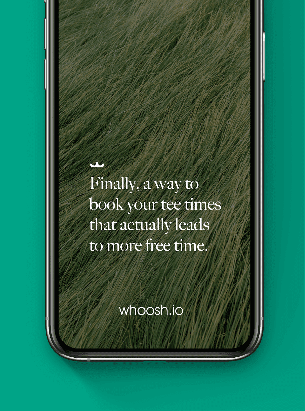
Mobile Ad. A nature-driven mobile visual introducing WHOOSH as a simpler way to book tee times.
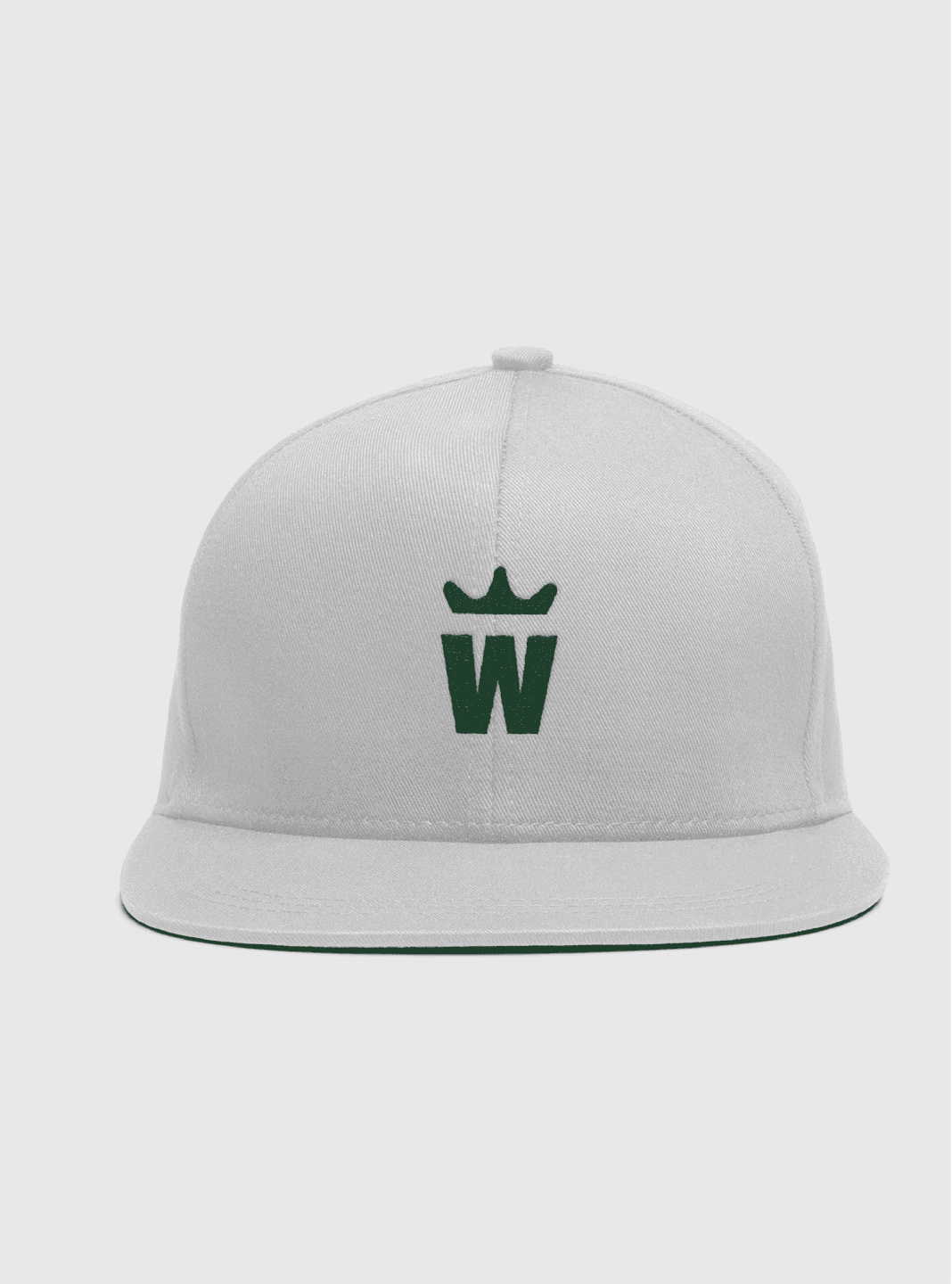
Branded Hat. A minimal cap embroidered with the crowned “W” monogram.
Embossed Mark. A sleek black-on-black emboss of the WHOOSH crown symbol.
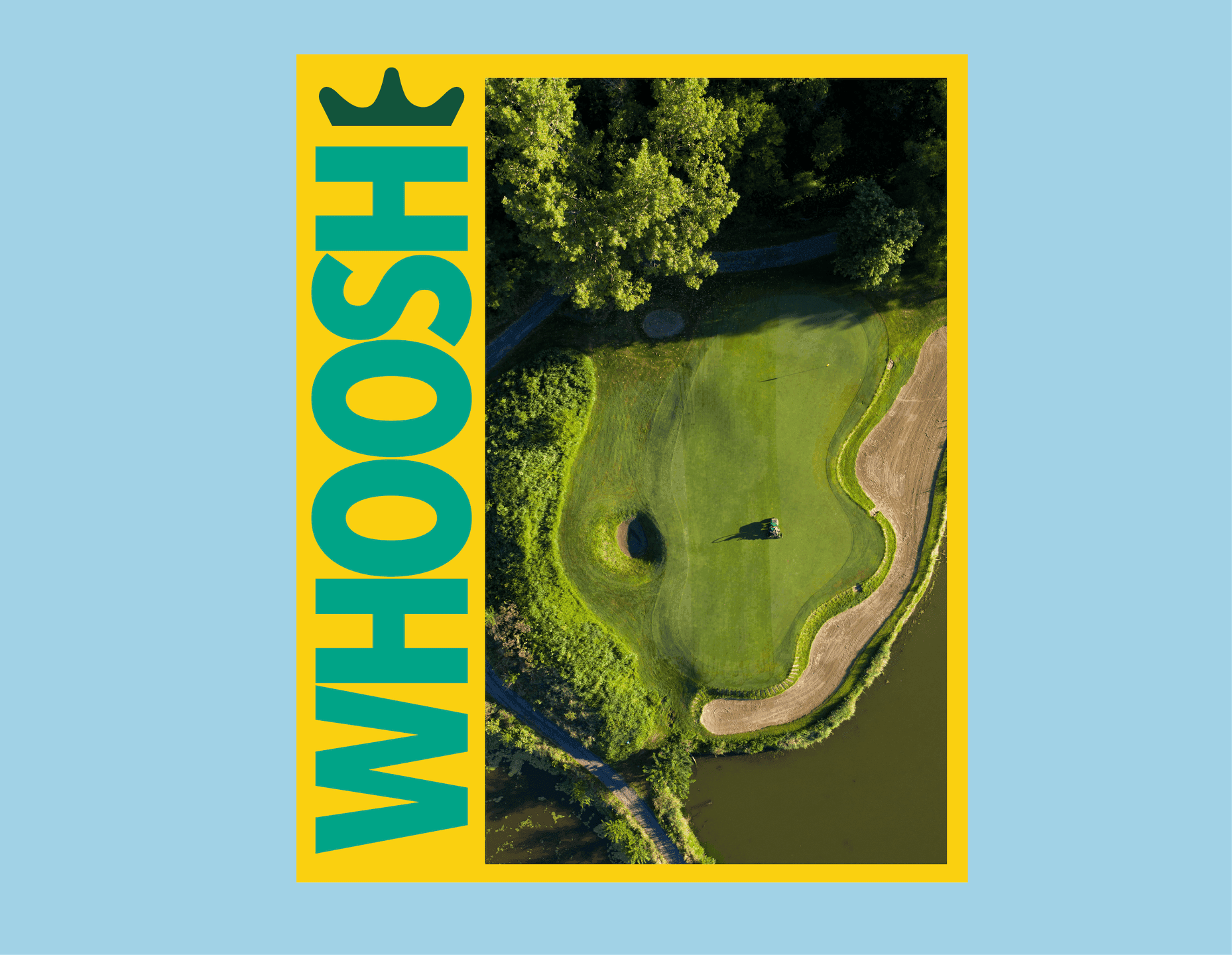
Vertical Poster. A bold, graphic poster pairing golf-course photography with stacked WHOOSH typography.
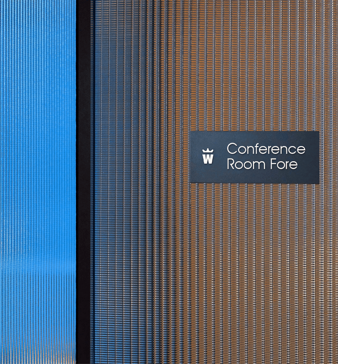
Wayfinding Sign. Office signage using the monogram to brand WHOOSH conference spaces.

Beauty

The identity lives in a deliberate tension: tradition and transformation. After initial exploration, what was telling was what we rejected. Anything that felt too tech, and anything that felt too golf. Lean too far into Silicon Valley and Whoosh would read as an outsider crashing a centuries-old game. Lean too far into crests and classical serifs and it would disappear into the legacy it was meant to transform. The answer was to introduce Whoosh as a sans-serif brand to golf. It signals that Whoosh is part of the club but here to move it forward.
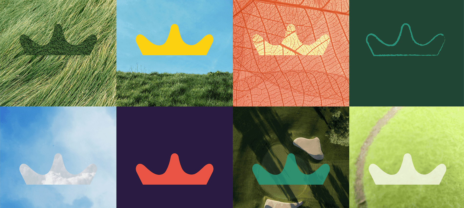
Crown System. A grid of crown icons expressed through textures, materials, and golf-related imagery.
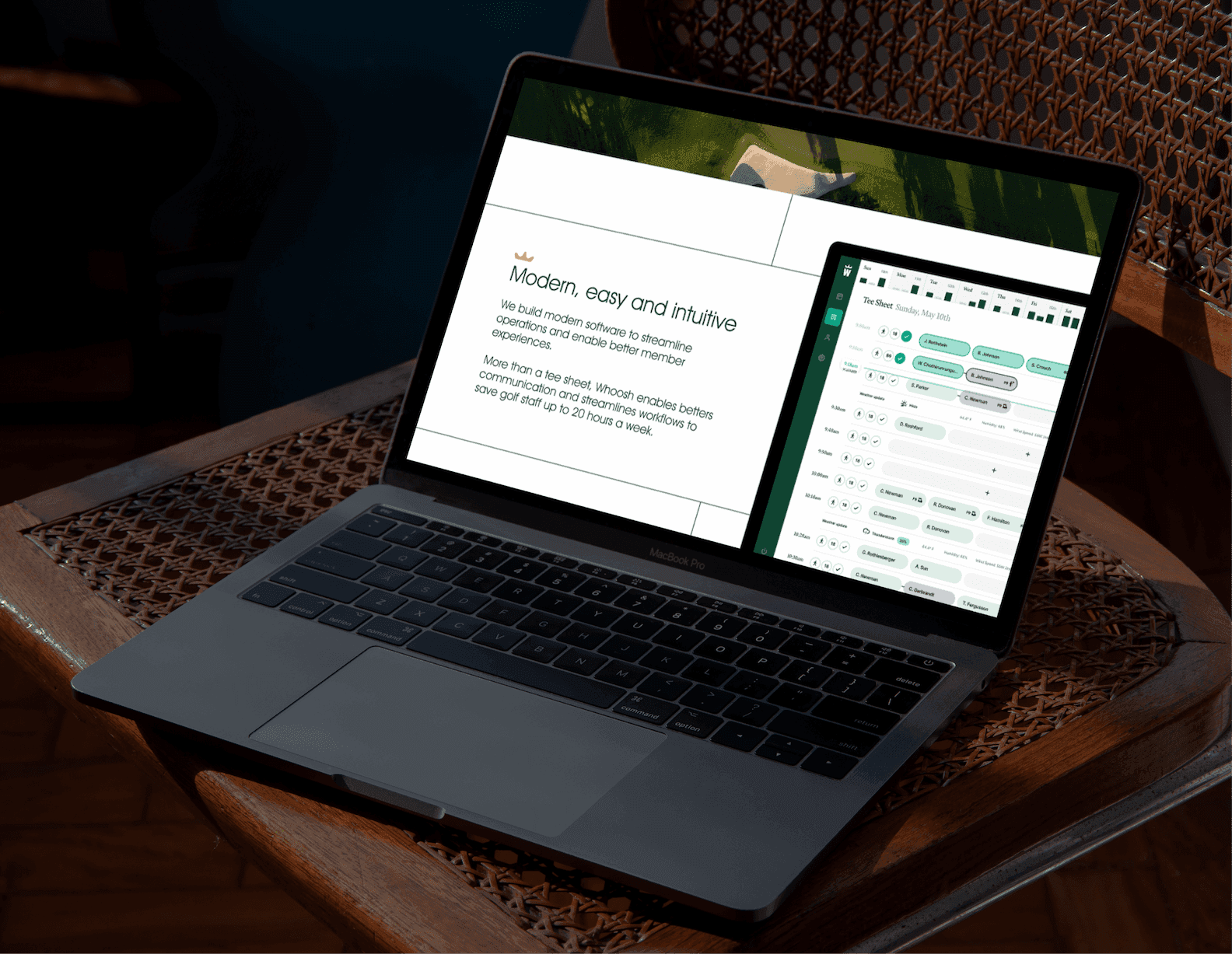
Product Demo. A laptop mockup highlighting WHOOSH’s intuitive software and streamlined booking tools.

Impact

We delivered a complete toolkit to carry Whoosh through its growth spurt, with creative direction and templated layouts designed for speed and consistency as the team scaled. The timing mattered. As Whoosh expanded from private clubs into public courses, simulators, and "eatertainment" venues, the brand was ready to stretch with it. Professional enough to stand beside partners like Lightspeed and Square, simple enough to stay speedy. It's a brand that advances everything we love about the game and its history, while pulling it confidently into the future.
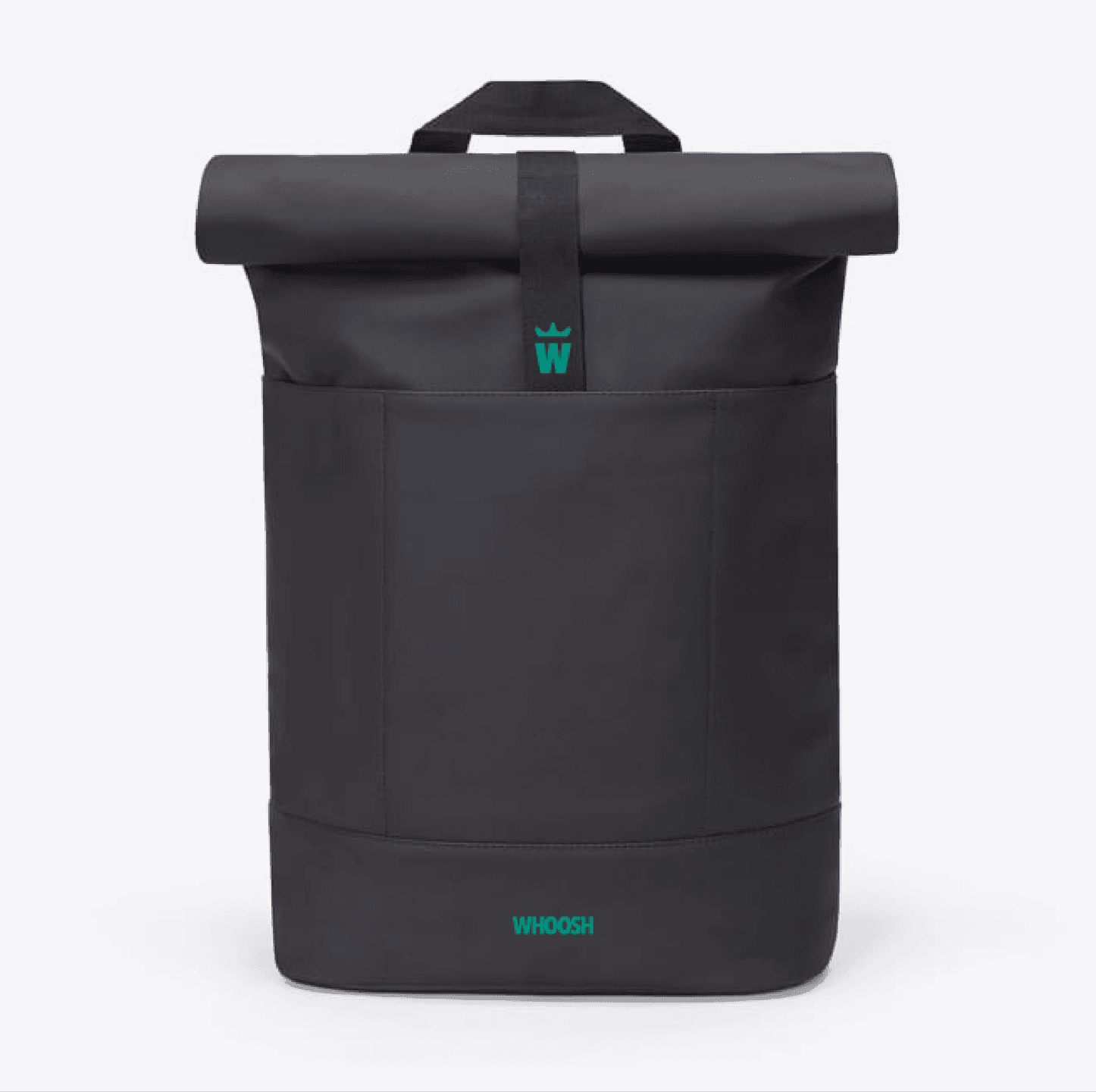
Branded Backpack. A functional roll-top bag featuring subtle WHOOSH branding.

Like what you see? Look at some more

Oakland visitors Center
Rethink Your Milk. Bold typographic graphic with swirling pink-orange background promoting MuYu’s modern milk alternative.
WELCOME TO THE FUTURE. CADY CONFERENCE SCREEN
View all work