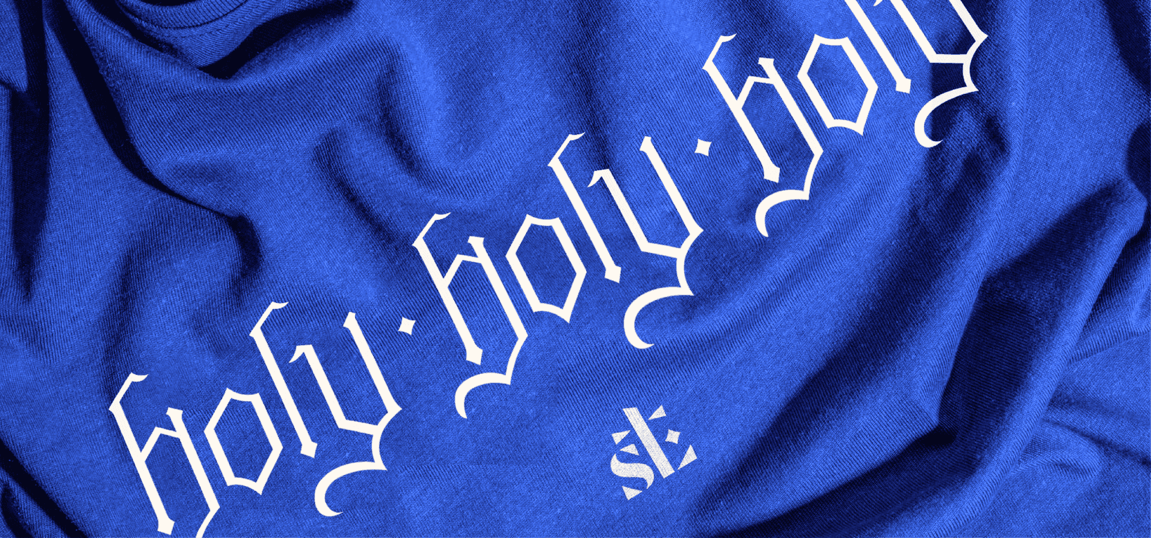
A spiritual home for many and a gathering place for the whole city. We helped St. Luke's claim its place in the heart of Atlanta.
St. Luke's plays a special role in the lives of its congregants and Atlantans. It's a place where civic leaders and faith leaders convene, where the big issues of justice, housing, and immigration sit alongside the small ones of Sunday school, meal trains, and prayer requests. It's active, engaged, and energetic, a big church with a small-church heart. It has also been a launchpad for many of the city's essential nonprofits. But its identity didn't reflect that vibrance or diversity.

Truth

We engaged in a deep and expansive discovery process at the top of this project. The wider context was sobering. Our client lived in a world of eroding trust in institutions, declining church influence in public life, an epidemic of loneliness, and membership decline as the norm across most congregations. But the truth about St. Luke's is that it's a church that stayed in Downtown when others left, that helps people feel genuinely welcome, that is of and for Atlanta. Its congregation was dreaming big, imagining a campus alive seven days a week, a hub knitting together the neighborhoods all around it.

We also identified a massive design gap. St. Luke's had a logo and a single color. No color system, no type hierarchy, little signage to identify the building or guide a visitor through it, no rules or tools to keep communications coherent. A body this joyful and this bold had no way to show it. Our imperatives became clear: amplify the church's faith, advocacy, and impact; help it invite as warmly as it welcomes; and build a brand that sings in worship and in administration alike.

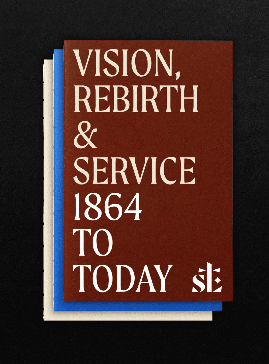
Vision & Service Booklet Stacked St. Luke’s booklets featuring the cover text “Vision, Rebirth & Service 1864 to Today.”
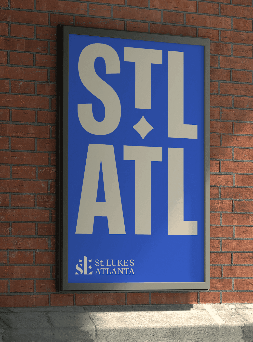
STL ATL Poster Bold blue and cream St. Luke’s poster with oversized “STL ATL” typography.
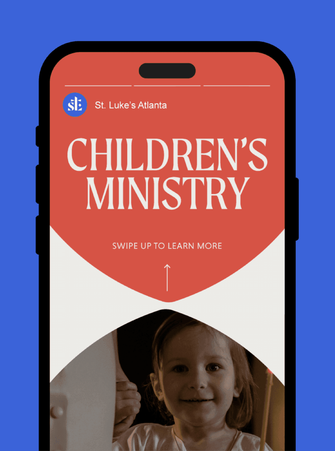
Children’s Ministry Story Graphic Instagram Story promoting St. Luke’s Children’s Ministry with warm colors and a child’s photo.
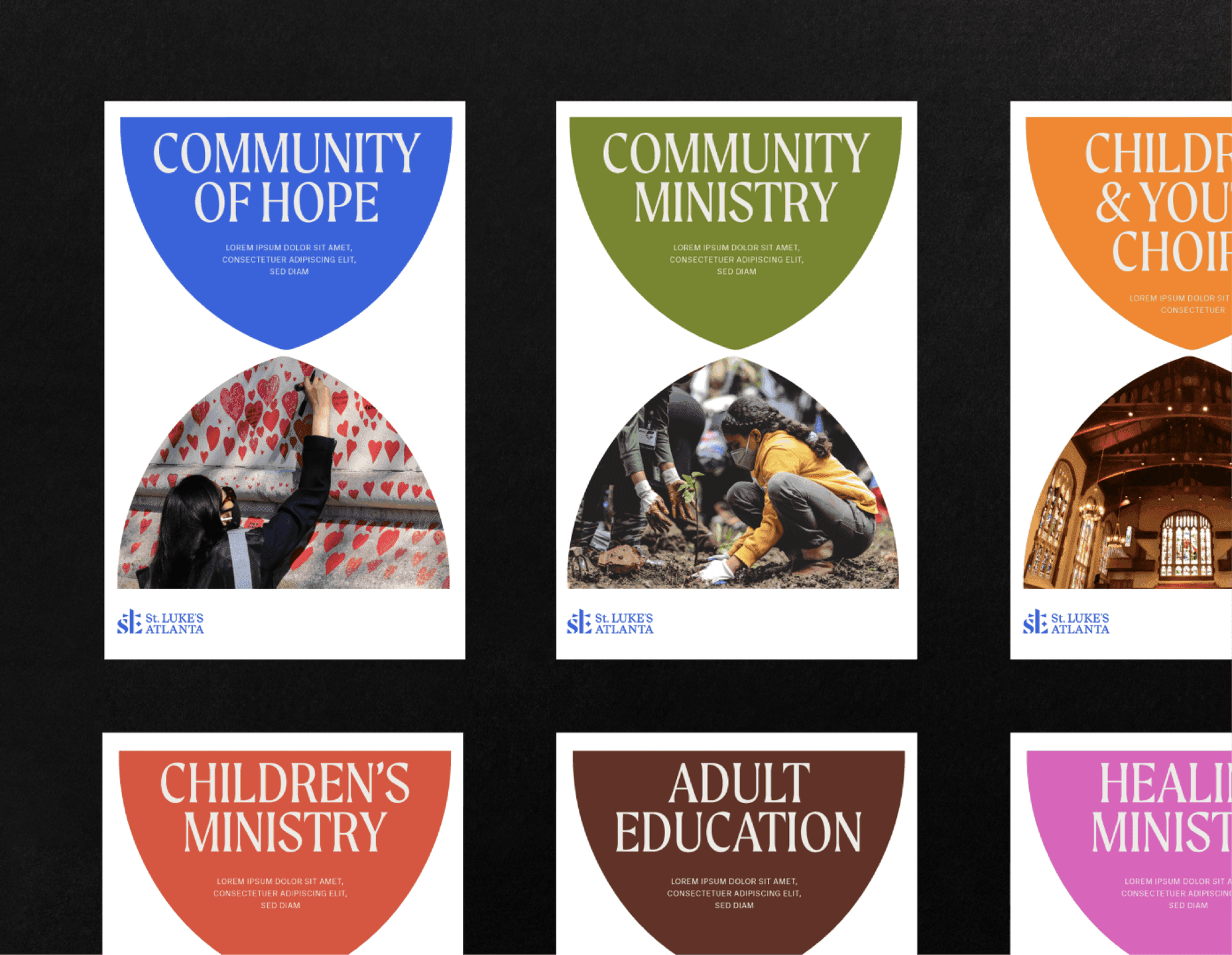
Ministry Program Posters Series of St. Luke’s posters for ministries and programs using colorful arch layouts and photography.
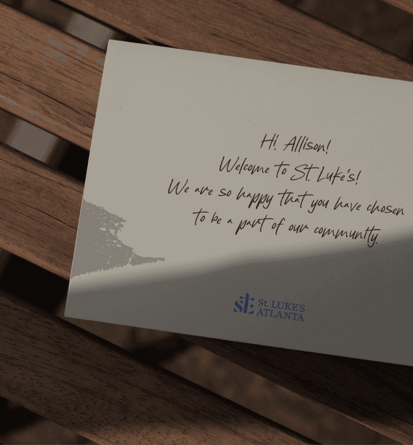
Welcome Note Card Handwritten St. Luke’s welcome card for new community members.

Beauty

We grounded our design in the materiality of the sanctuary itself. The colors came from the stained glass windows. The typography came from the relics and objects throughout the space. The patterns were derived from the brickwork running down the center aisle, and the shapes were taken from the arches and architectural motifs of the church. We explored the sacred and civic, the solemn and the celebratory and crafted a system that held the full spectrum. Then we needed to make a bold move. The buildings are full of warm red, in the brick exterior, the painted doors, the wood pews and sanctuary floor. The old red logo disappeared into them. So we shifted the primary color to a vivid blue that's a striking contrast to the built environment.
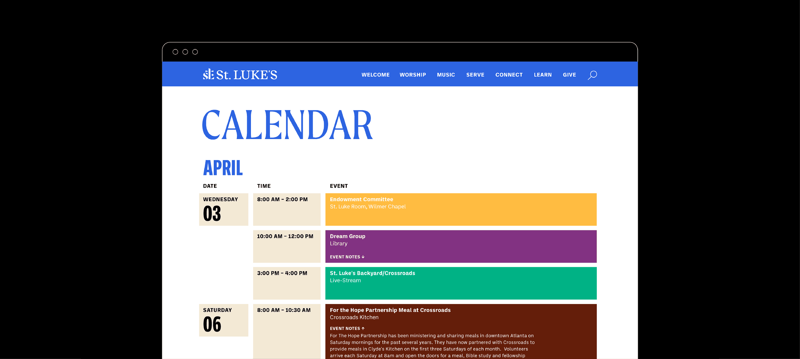
Events Calendar Page St. Luke’s online calendar displaying upcoming events in a clean, color-coded layout.
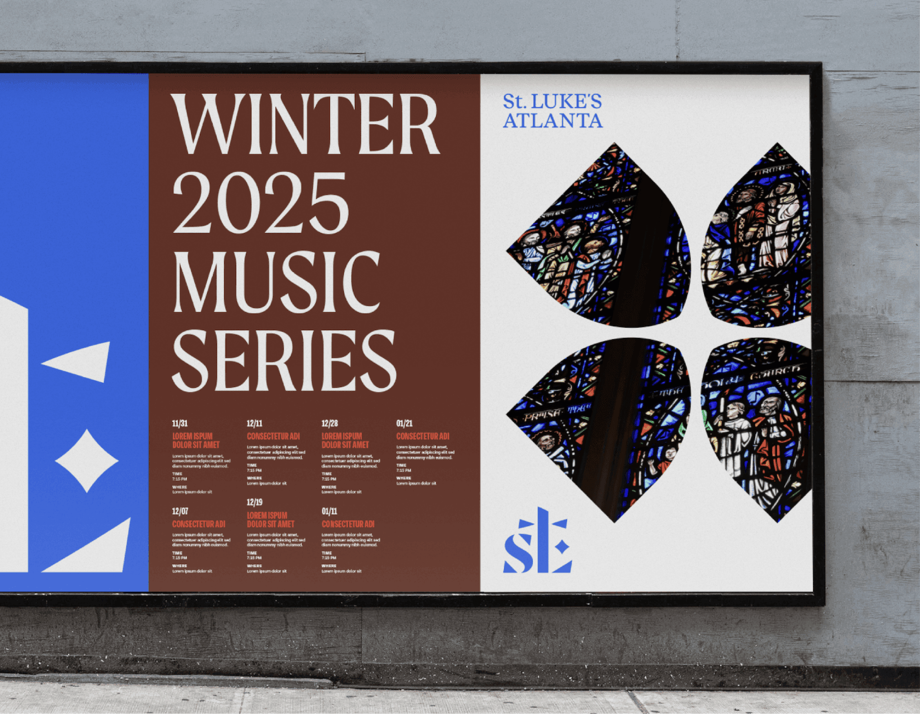
Winter Music Series Billboard. St. Luke’s Winter 2025 Music Series billboard featuring stained-glass graphics and large typography.

Impact

St. Luke's now has the communication tools to be gregarious and invitational. The church can share its joy and good works with the wider world and shift the misperception that it's only open on Sundays toward the truth. That it is a campus of miracles, active all week, its doors open to all of Atlanta. The brand is as alive and present as the congregation of St. Luke's, actively welcoming on Peachtree Road, in the heart of Atlanta.
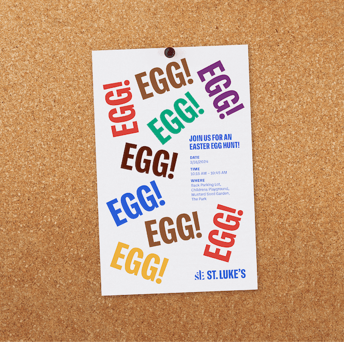
Easter Egg Hunt Flyer Colorful Easter Egg Hunt flyer with repeated “EGG!” text and event details.

Like what you see? Look at some more

PRIA Brand Graphic. Gradient arcs and a bold monogram introduce PRIA’s modern, confidence-driven identity.
Whoosh Logo graphic
A bold blue Atlanta History Center logo
View all work