Creating islandwide connection through a bold vision of unified transportation.
Son&Sons partnered with a team of architects, urban planners, and the government of Puerto Rico to shape the country’s 2050 transit vision and design a shared identity for their modes of public transportation. Our goal: to unite the people of the island and connect them to what matters most.


We worked closely with residents to help them imagine and express their hopes for mobility and connection to family, culture, and economic opportunity. During our own time on the island, we catalogued the logistical gaps the system needed to bridge and palette and texture of Puerto Rico to inspire a place and people based identity.


Son&Sons positioned the Transit Authority (ATI) as dynamic, unifying agency the connects residents and visitors to the rich cultural and economic centers and natural beauty of the island. The work unlocked the funding and governmental support to advance the deep infrastructure and planning investments. The identity and the vision became a promise for the future of mobility in Puerto Rico.

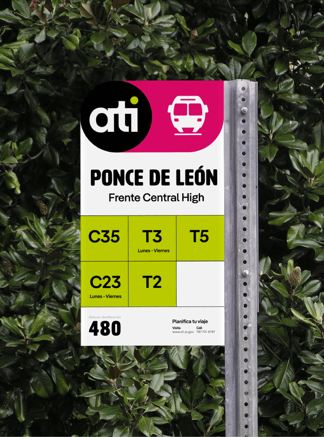
ATI Bus Stop Sign — Ponce de León. A colorful ATI bus stop sign displays route numbers, schedules, and location info at Ponce de León.
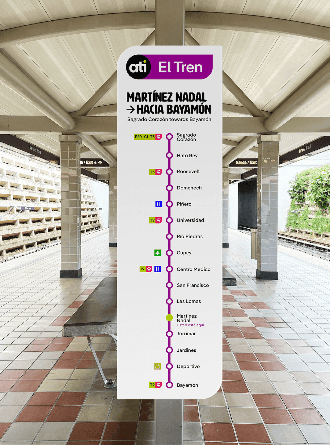
ATI Train Line Map at Station. A tall station sign shows the full ATI rail line with stop names, line colors, and directional information.
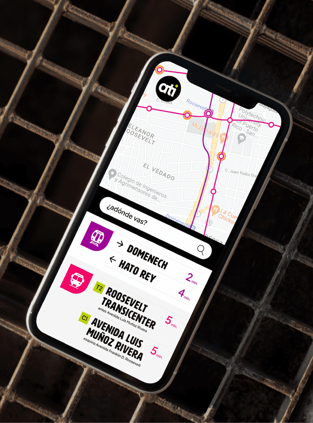
ATI Mobile App Interface. A smartphone screen shows the ATI transit app with live route times and an interactive rail map.
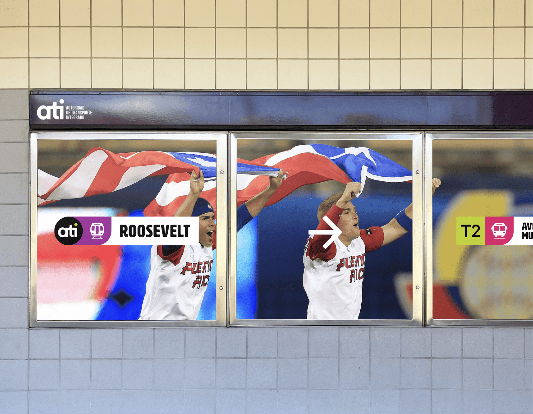
Roosevelt Station Window Graphic. Large window graphics feature ATI branding over a photo of Puerto Rican fans celebrating at Roosevelt station.
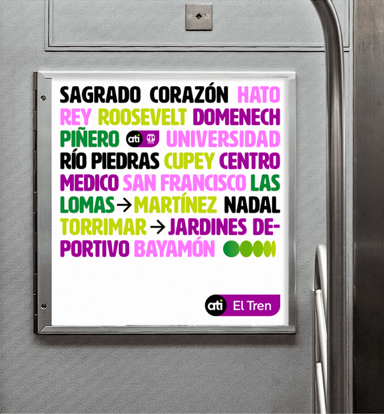
ATI Typography Poster (Train Stops). A poster lists ATI train stops in bold, colorful typography inside a train car.

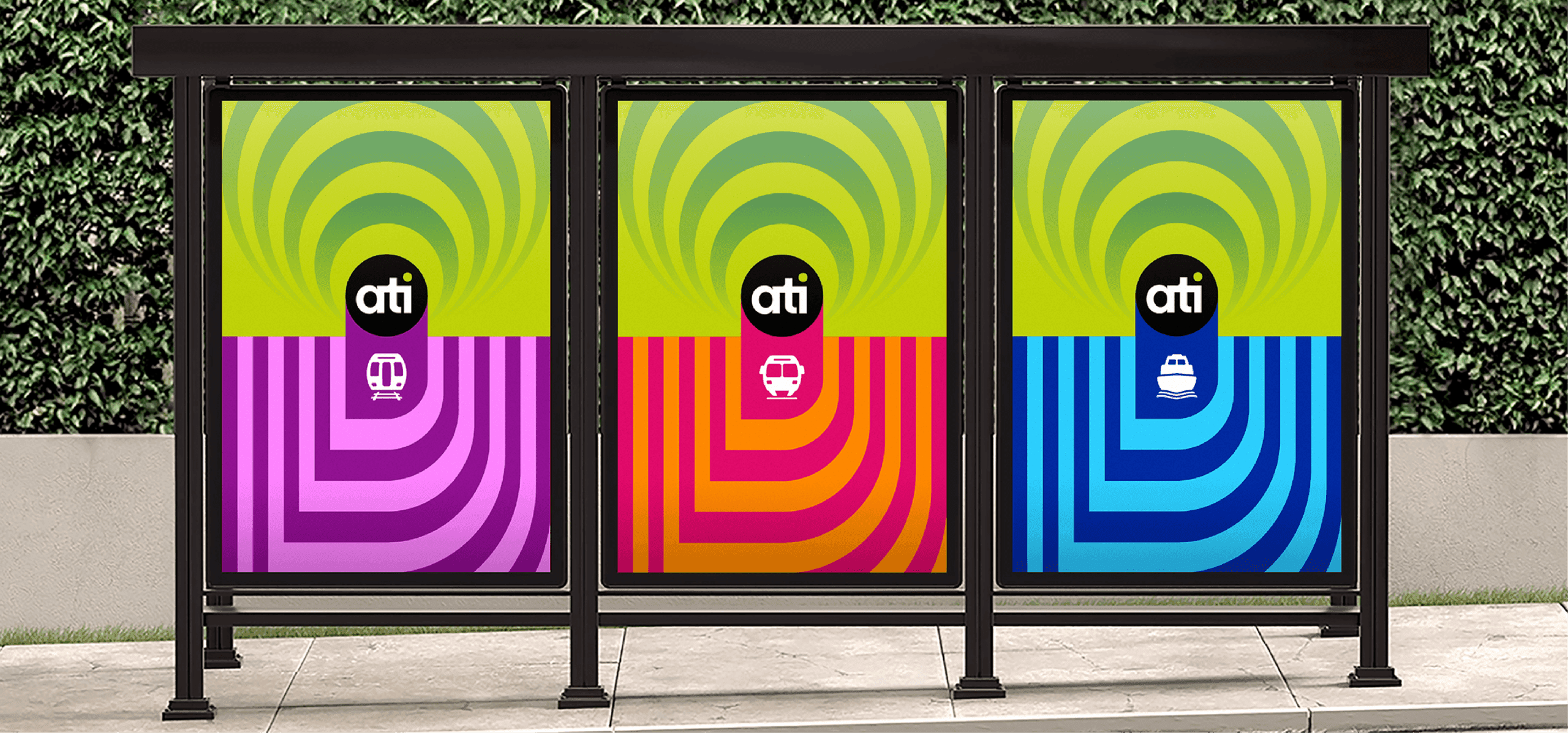
Three modes, one system

Our imperative was to build a powerful identity that could unify the transit authority’s vast services and fleet. To start, there were 40 distinct bus operators, 3 ferry lines, and metro rail system, all with completely different identities. Now, each mode is unified through the ATI logo and holding shape, while differentiated by color. The result is a system that repeats identically across vehicles, station wayfinding, and ticket kiosks, so a rider can spot their route and connections at a glance, building ATI’s trust and recognition.
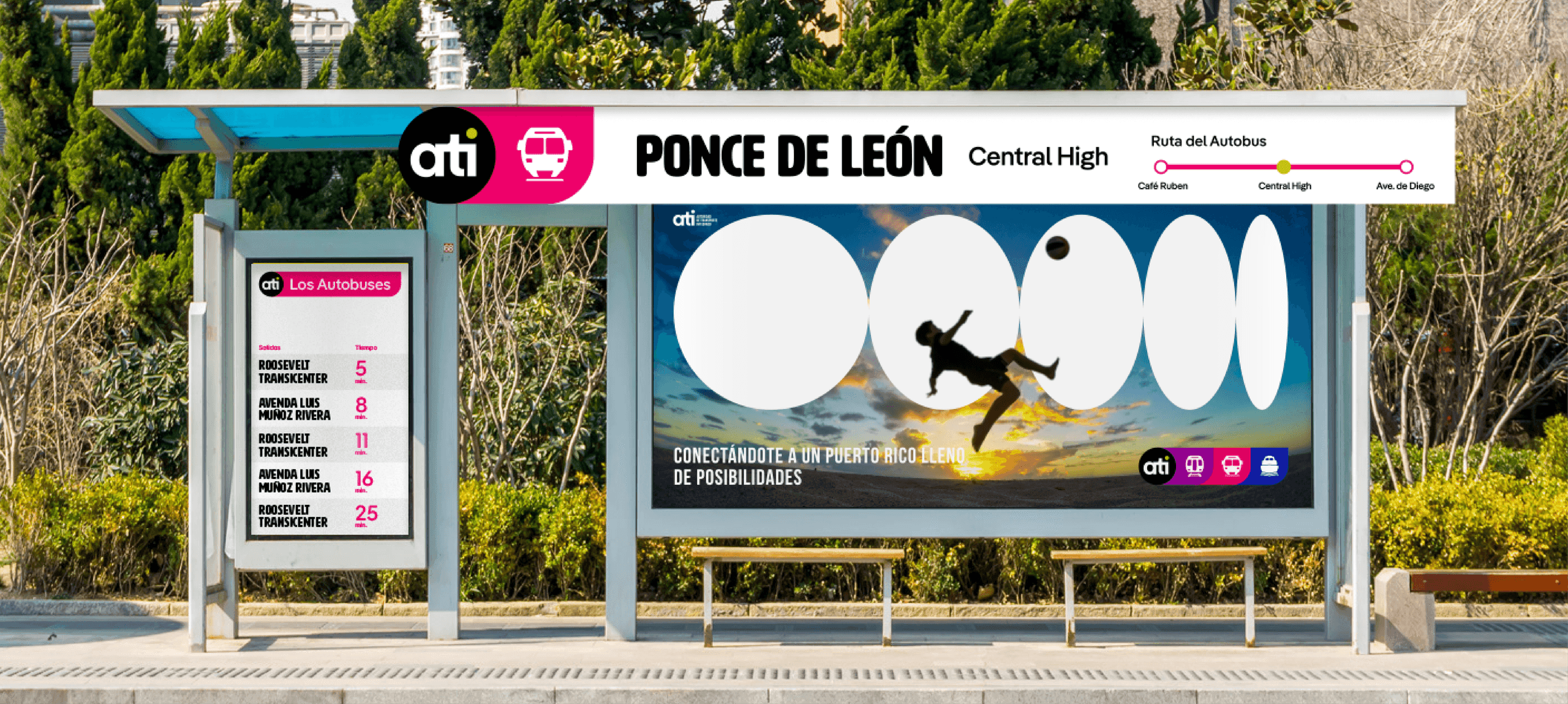
ATI Bus Shelter Ad — Ponce de León. A bus shelter displays ATI branding, a bus route map, and a large photo promoting ease of travel.
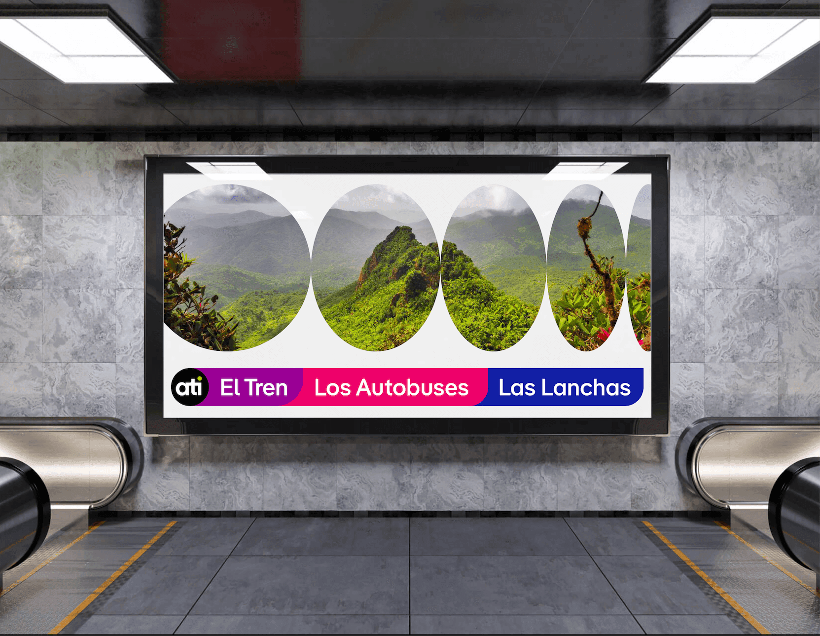
ATI Rail + Bus + Ferry Billboard. A large billboard inside a station highlights ATI’s train, bus, and ferry services with lush Puerto Rico landscape photography.

Making it ownable

In order to drive adoption and growth, we determined that the transit brand had to be recognizable, unified, informative, and flexible. To that end, we built a custom icon system, based on the circular graphics of the ATI parent brand. By having ownable and distinct iconography, the transit authority can communicate with riders with even more specificity and care.
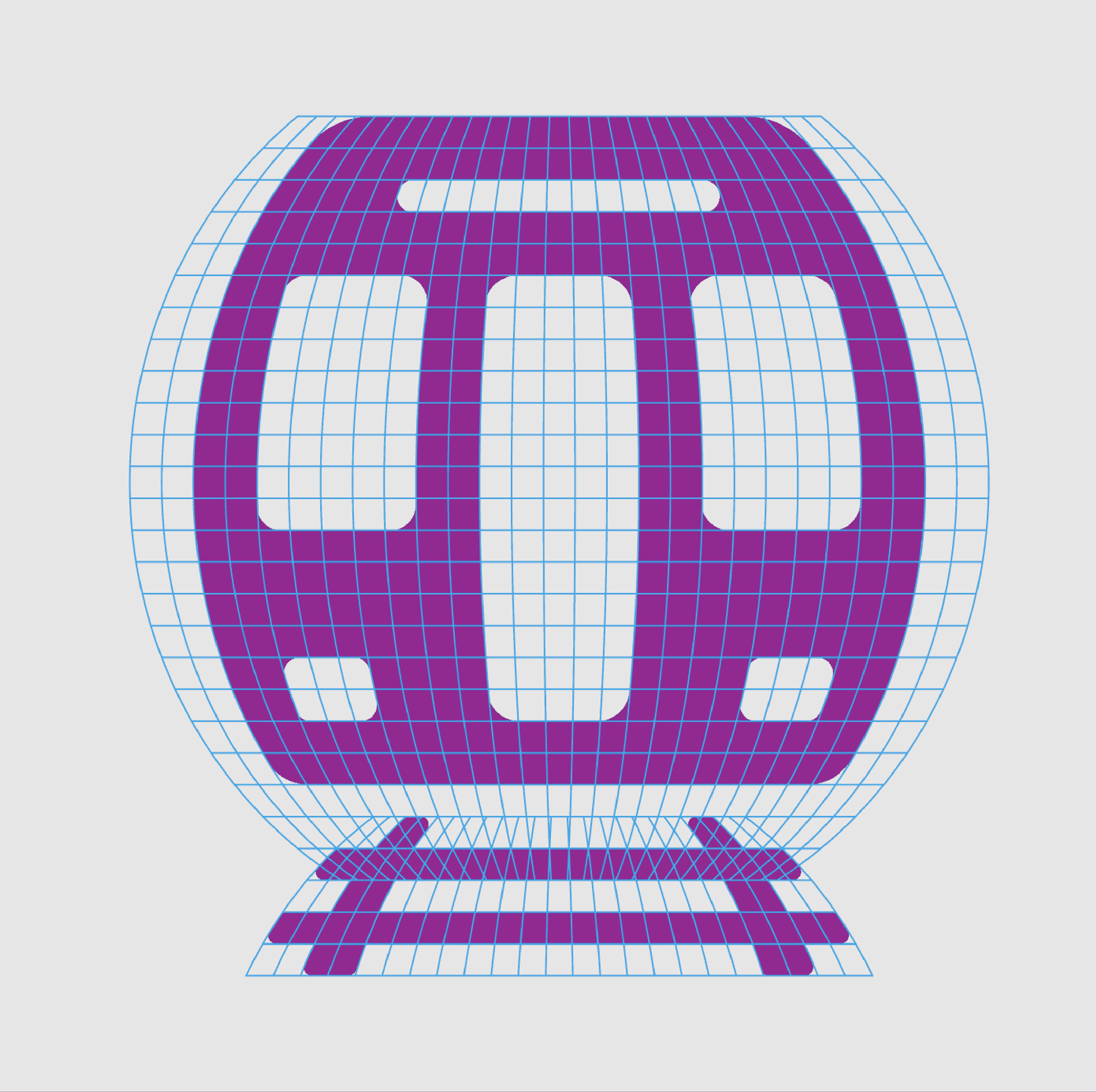

ATI Train Icon (Grid Illustration) A stylized purple train icon is shown with a blue grid distortion effect.

Like what you see? Look at some more

PRIA Brand Graphic. Gradient arcs and a bold monogram introduce PRIA’s modern, confidence-driven identity.
Etsy headquarters
Doghobble Wine Farm Packaging Boxes. Doghobble Wine Farm wine boxes featuring bold, varietal-inspired floral emblems in clean vertical compositions.
View all work