What if you had the power to navigate policy?
That was our question to kick-start the brand positioning, identity, and messaging for PRIA, your Policy Risk Impact Agent. In a complicated world where policy is everywhere and explanations are general, vague, and contradictory, PRIA’s founders saw an opportunity for tech that could reveal what policy means at the individual level. They wanted to help everyday Americans, and we wanted to help them succeed.

We started with a rigorous research and positioning phase to flag the common pitfalls of analogous categories and chart a new strategic path. It would have been easy to capitalize on the audience’s fear and anxiety around finances, healthcare, and retirement. But we recommended a more powerful approach: a position based on confidence and possibility, and a vision for the future where every American can understand the policies that matter to them.

From that position of strength we created an visual and verbal identity that’s practical, understandable, and relatable. We designed a brand that boosts confidence and know-how so that everyone feels empowered to navigate the policy decisions that impact their lives and their goals.

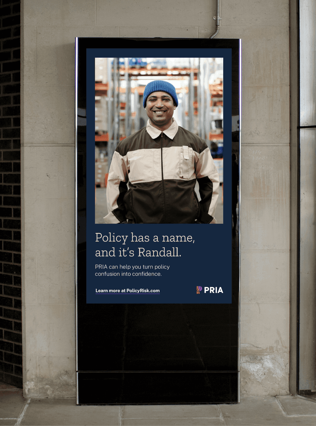
Digital Kiosk Ad. A portrait-driven ad reinforces PRIA’s human-centered approach to making policy understandable.
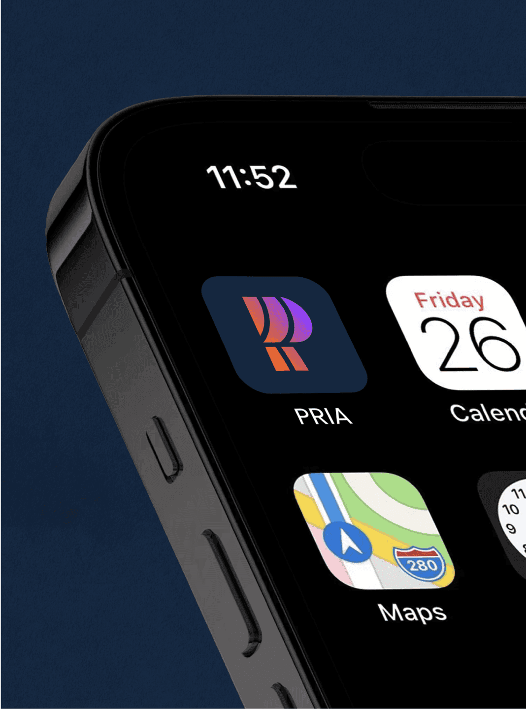
App Icon Close-Up. The PRIA monogram becomes a sleek, high-contrast app icon designed for instant recognition.
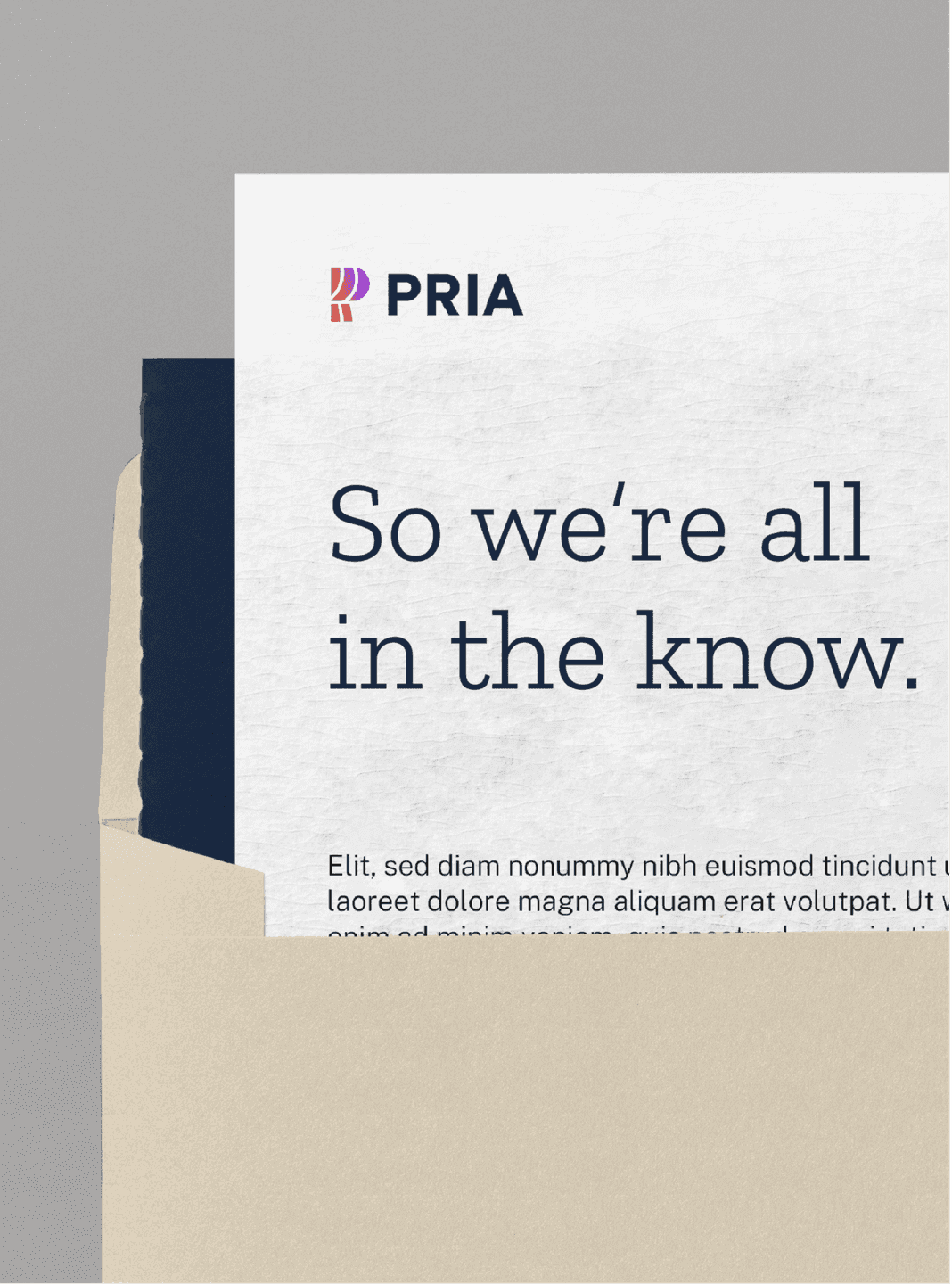
Branded Letterhead. Clean typography and subtle branding support PRIA’s clear, trustworthy communication style.
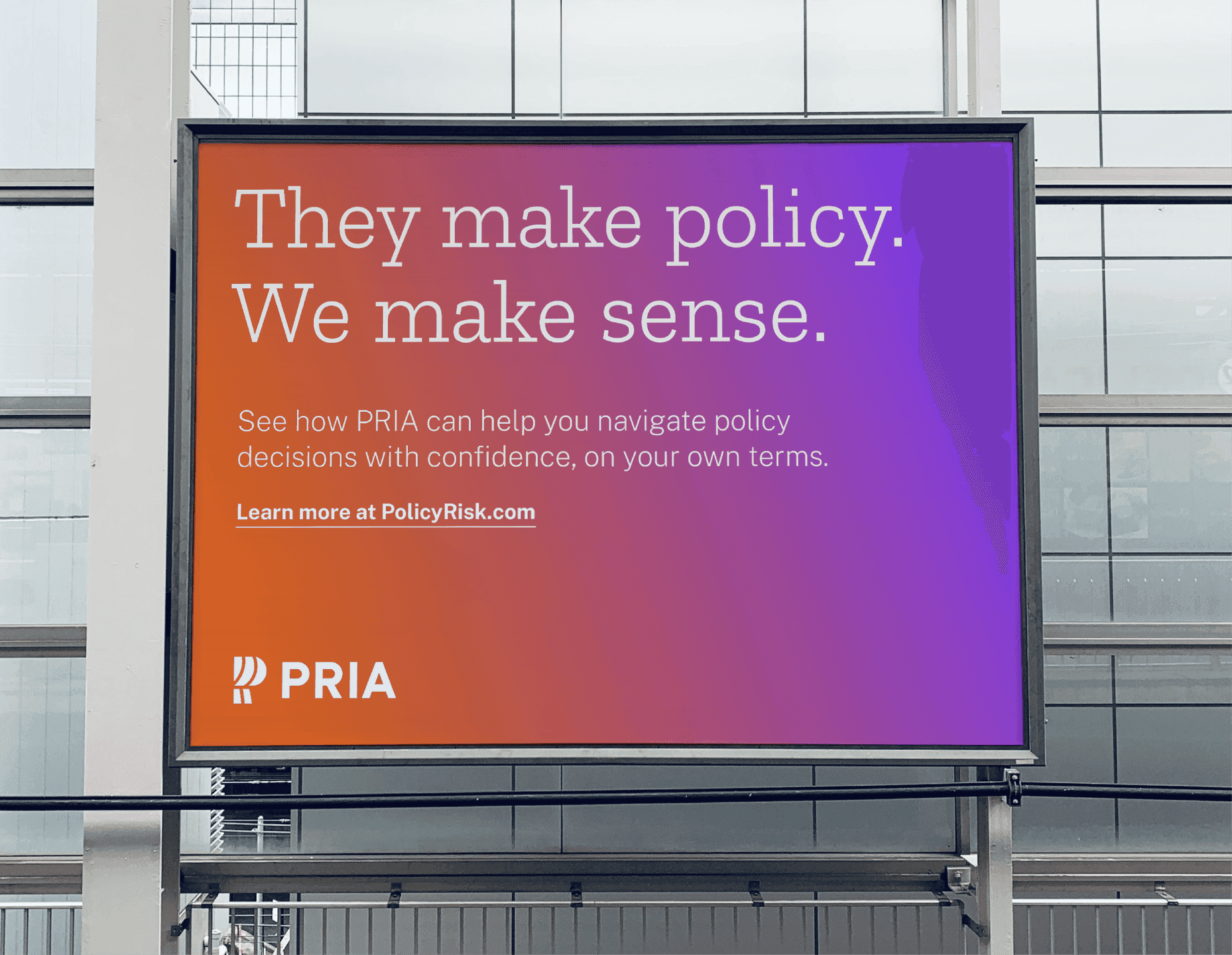
Gradient Billboard. A bold headline set against a vibrant gradient highlights PRIA’s promise to bring clarity to policy.
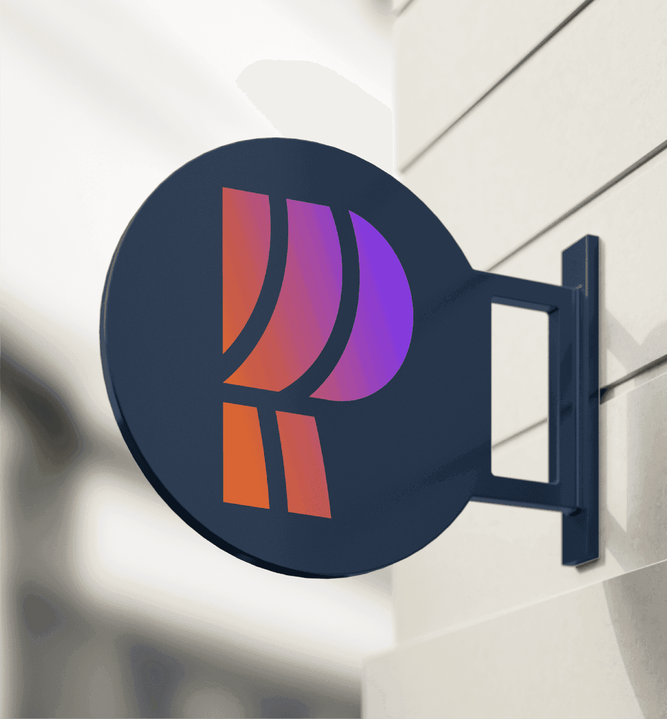
Exterior Signage. A metal sign featuring the PRIA monogram adds a polished, modern presence to the built environment.

Pulling back the curtain

The logo takes its cue from PRIA's core idea of pulling back the curtain on how policy affects you personally. The mark is a stylized P built from the folds of a curtain being drawn open, and that same curtain shape reappears throughout the system as a standalone graphic. It's a small piece of visual storytelling that tells audiences what PRIA does for them.
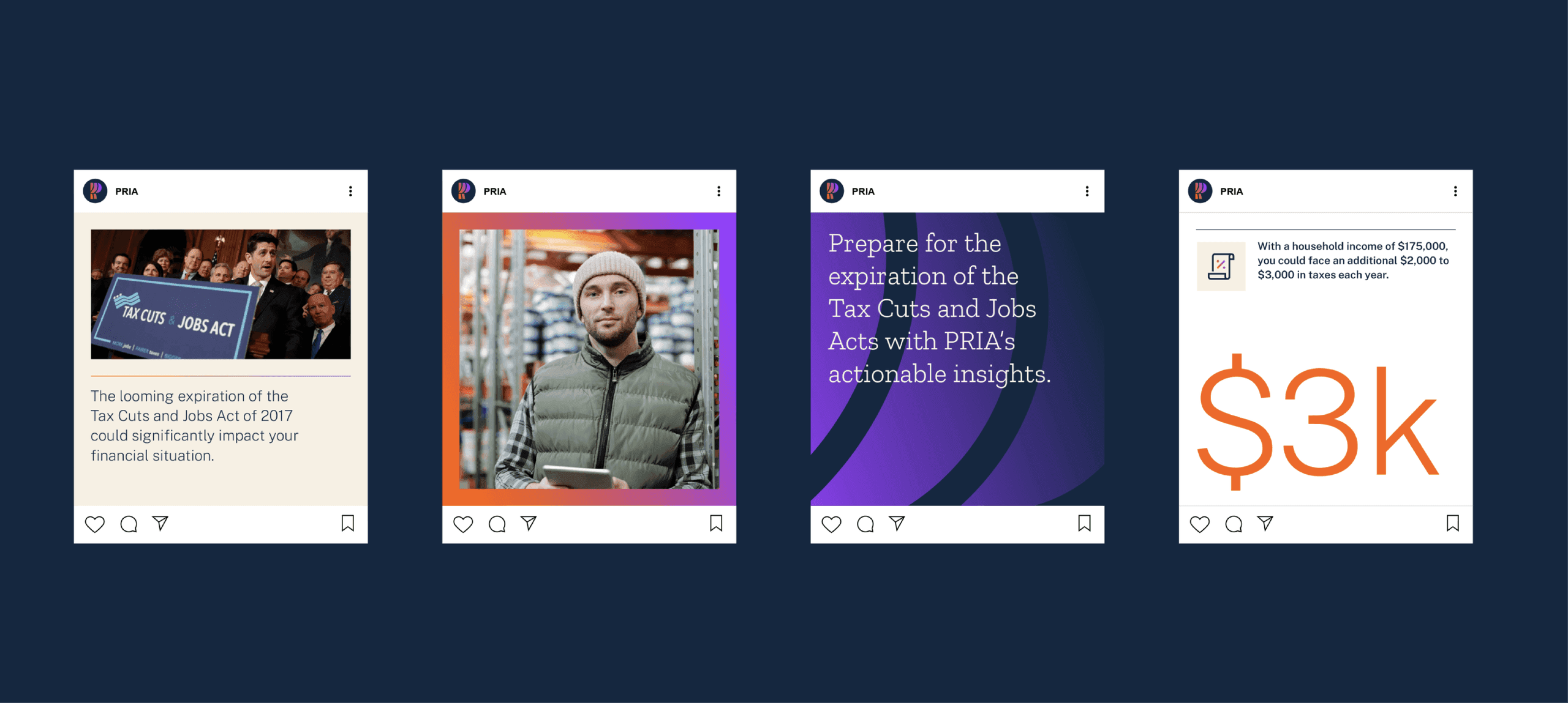

Social Media Grid. A mix of photography and graphic posts showcases PRIA’s informative, accessible content strategy.
Split-Layout Messaging. A calm portrait paired with a reassuring headline communicates PRIA’s role as a confidence-builder.

Plainspeak

Trust is built at every touchpoint, type included. Headlines run in Zilla Slab, an approachable and human serif, while body copy runs in Public Sans, the clean, functional typeface designed by the U.S. Web Design System itself. The pairing gives PRIA the credibility needed for serious policy information without losing its warmth. Photography follows the same instinct: real people in natural light, looking straight at the camera because policy is personal and it affects us all.
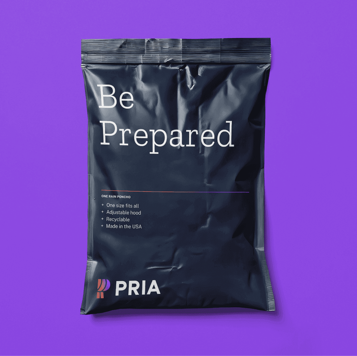

Preparedness Raincover Kit Packaging. A minimal navy pouch with crisp typography reinforces PRIA’s tone of readiness and reliability.

Like what you see? Look at some more

Stonehenge Social Post. A bold social graphic overlays Stonehenge with Trainline’s heart icon and the headline “Completely Un-Henged.”
Rethink Your Milk. Bold typographic graphic with swirling pink-orange background promoting MuYu’s modern milk alternative.
BABY EINSTEIN toy with Einstein illustration in the background
View all work