How do you create space for a 175 year old 
institution to be itself?
It’s not everyday that we get to step into a project where the goal is to capture the spirit of somewhere as old and as iconic as Oakland Cemetery. As with any institution of this age, Oakland has spent it’s almost two centuries growing and evolving and the team at Oakland was starting to feel the aches of a brand that no longer reflected who they were.

Son&Sons was eager to jump in and help them through these growing pains. Through many visits and conversations a central idea started to crystalize—Oakland is more than just a cemetery.

Son&Sons helped the Historic Oakland Foundation reimagine Oakland Cemetery for the next generation of Atlantans. We built a brand that reflects the diverse and radiant layers of activity that play out every day. From gardeners, historians, neighbors, and artists, Oakland has a unique and special place for every visitor — not just the dead.

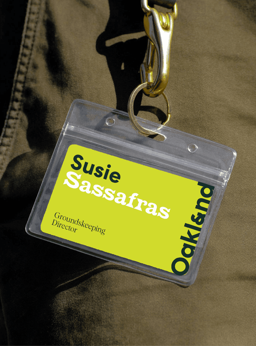
A bright Oakland-branded staff badge with bold typography hangs from a lanyard, featuring the name Susie Sassafras.
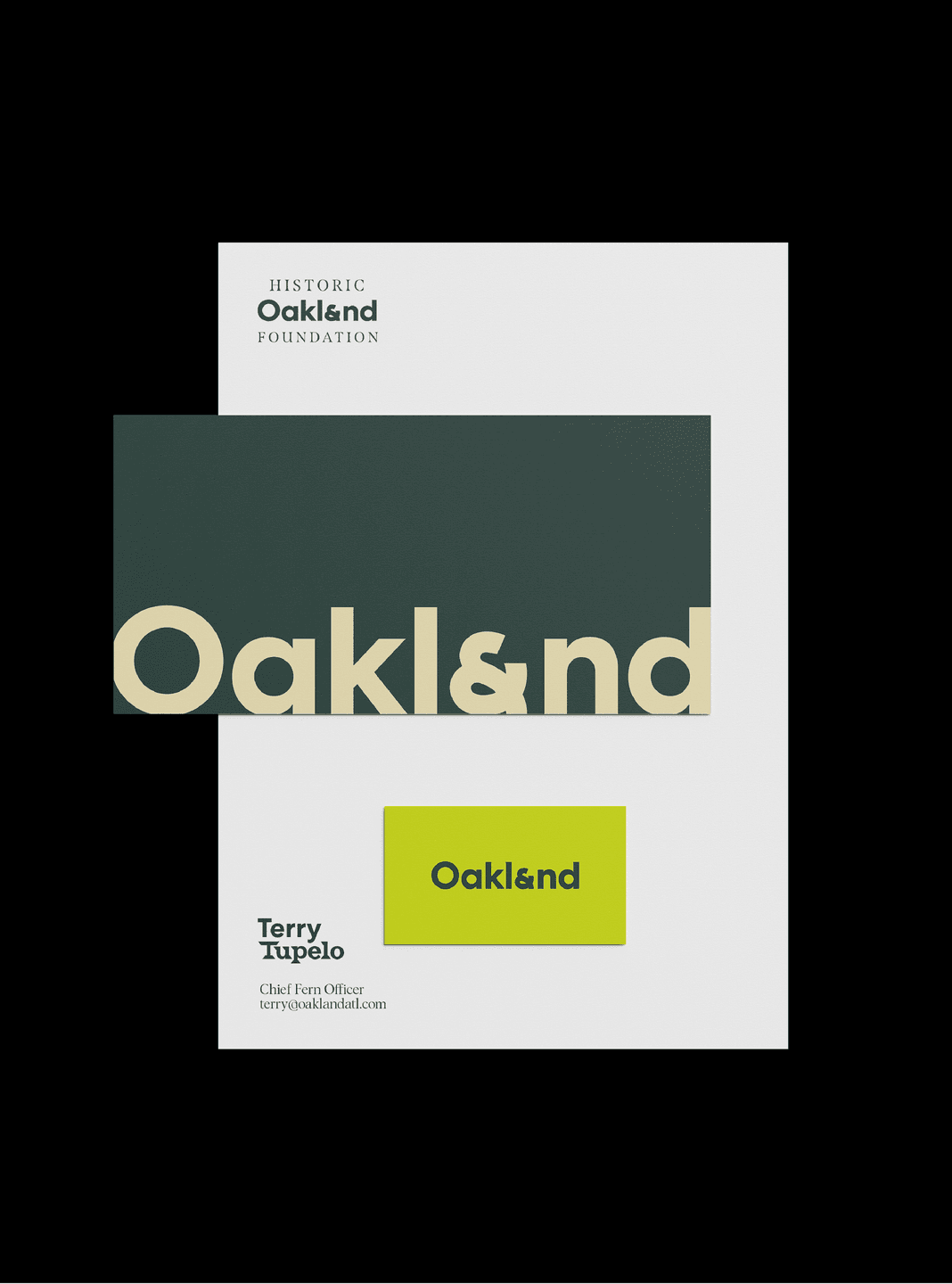
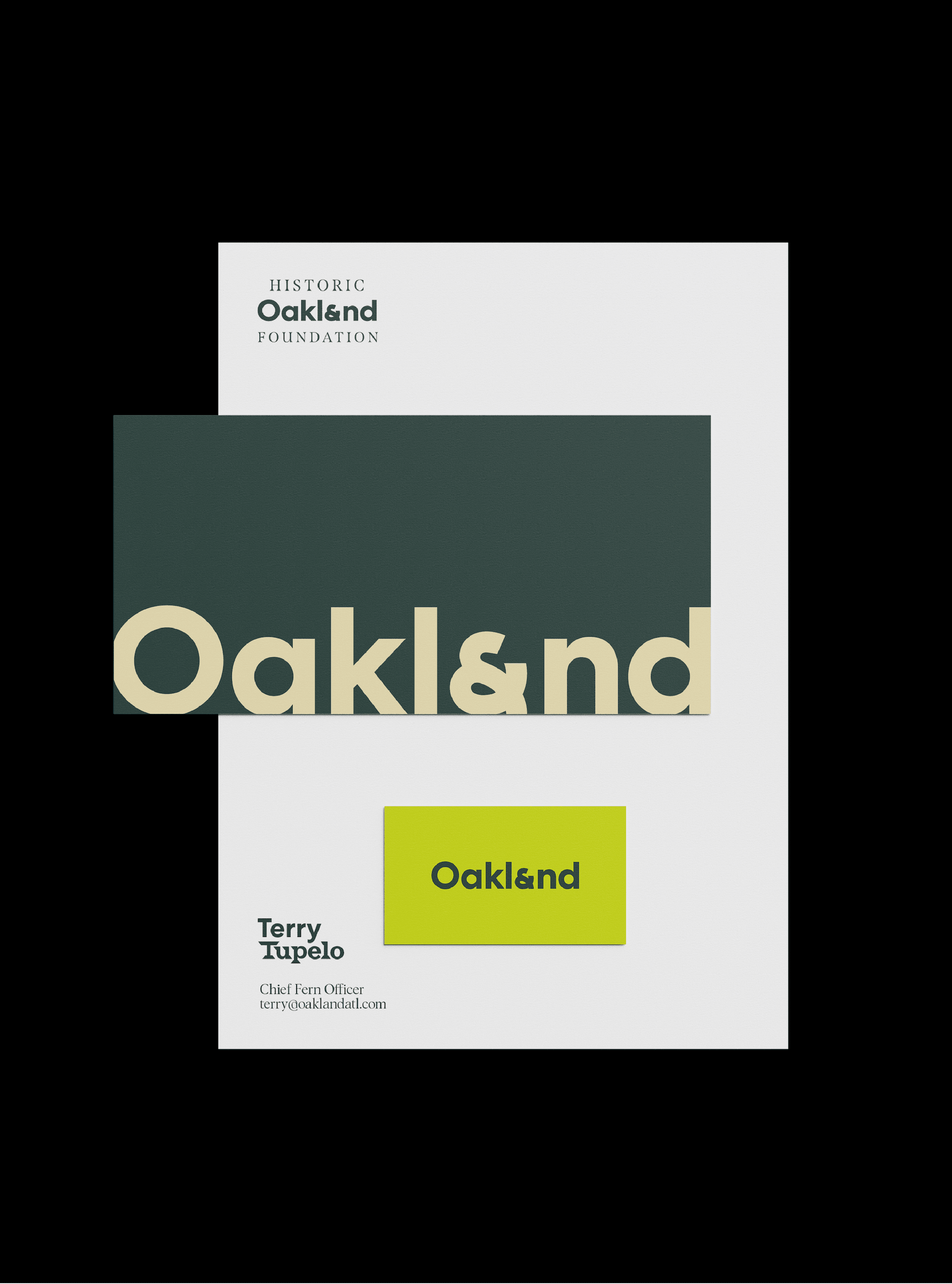
Oakland Business Card, letterhead, and envelope
T-shirt
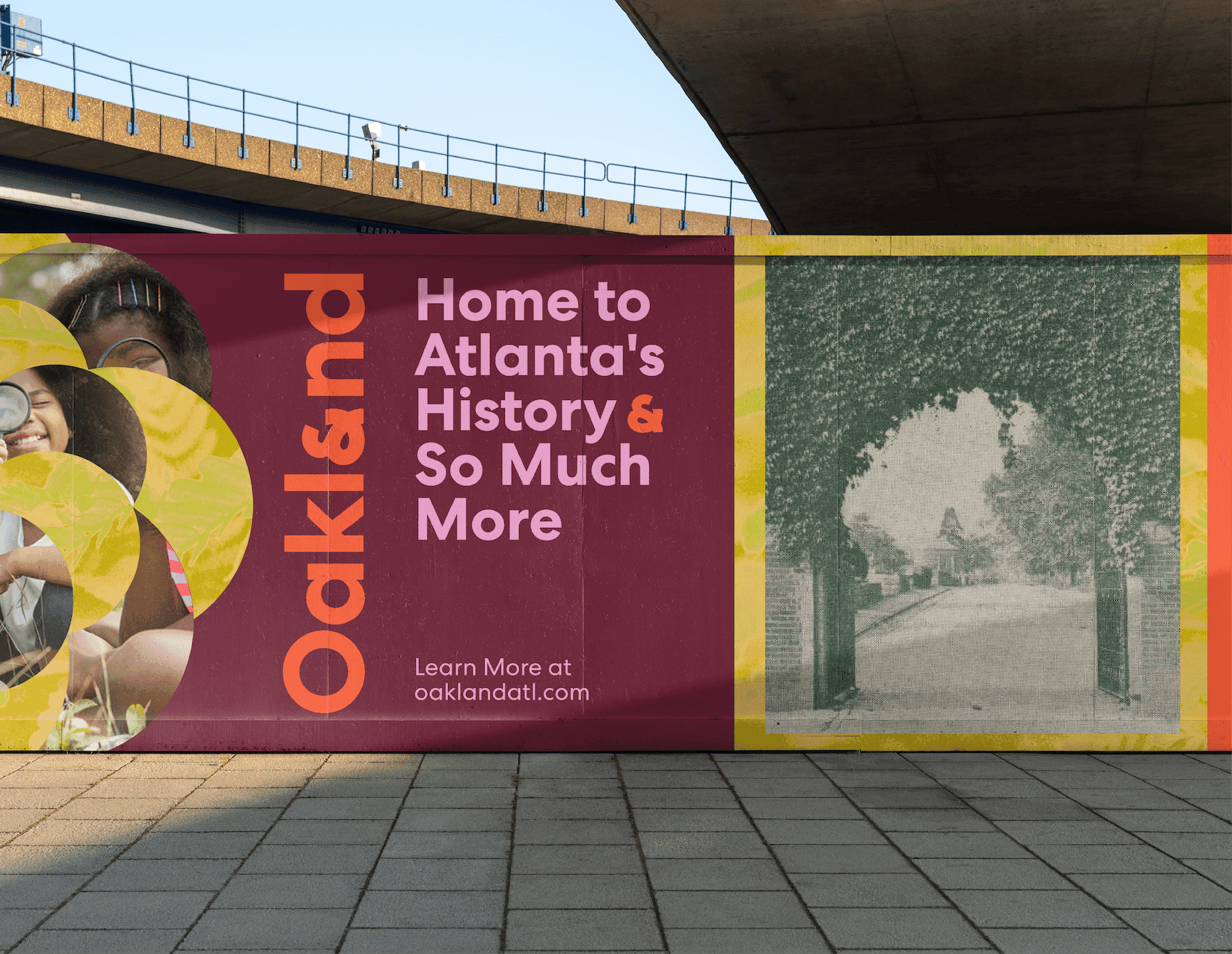
A colorful Oakland billboard displays the vertical Oakland logo, family imagery, and the message “Home to Atlanta’s History & So Much More.”
A collection of black-and-white Oakland logo explorations and typography studies spread across printed sheets.

& So Much More

We knew almost immediately that making the shift from Oakland Cemetery to just Oakland felt so right, and as we started to dive into all of the programing and possibility that Oakland is, the ampersand started to push its way into a lot of our exploration. The fact that the name Oakland already ended in the word ‘and’ was kismet, we were sold. 
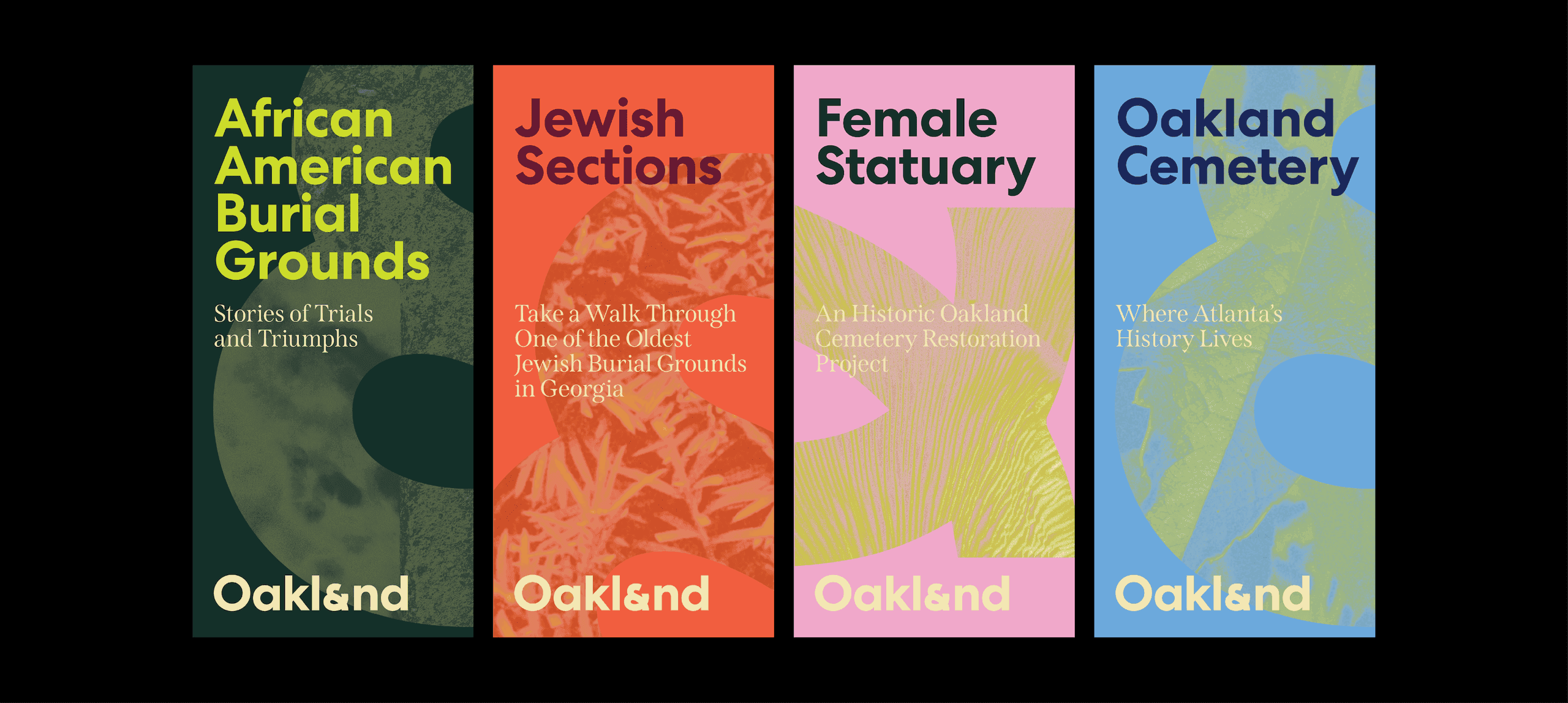
A set of Oakland Cemetery Brochures highlights key cemetery themes, including African American Burial Grounds, Jewish Sections, Female Statuary, and Oakland Cemetery history.
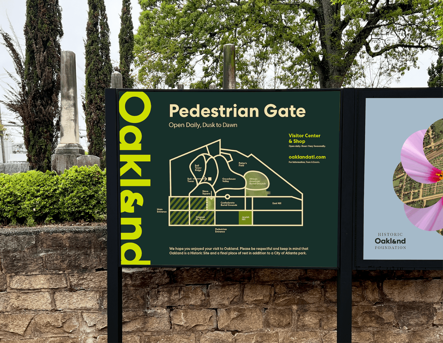
Exterior Oakland Cemetery signage displays the Pedestrian Gate map, wayfinding information, and bold vertical Oakland branding against a cemetery backdrop.

This identity is alive

It’s multi-dimensional in that every activation employs layers of imagery that link to Oakland’s history, natural beauty, and their friendly, welcoming culture. Oakland is a living place where Atlantans come to get to know our city even better.
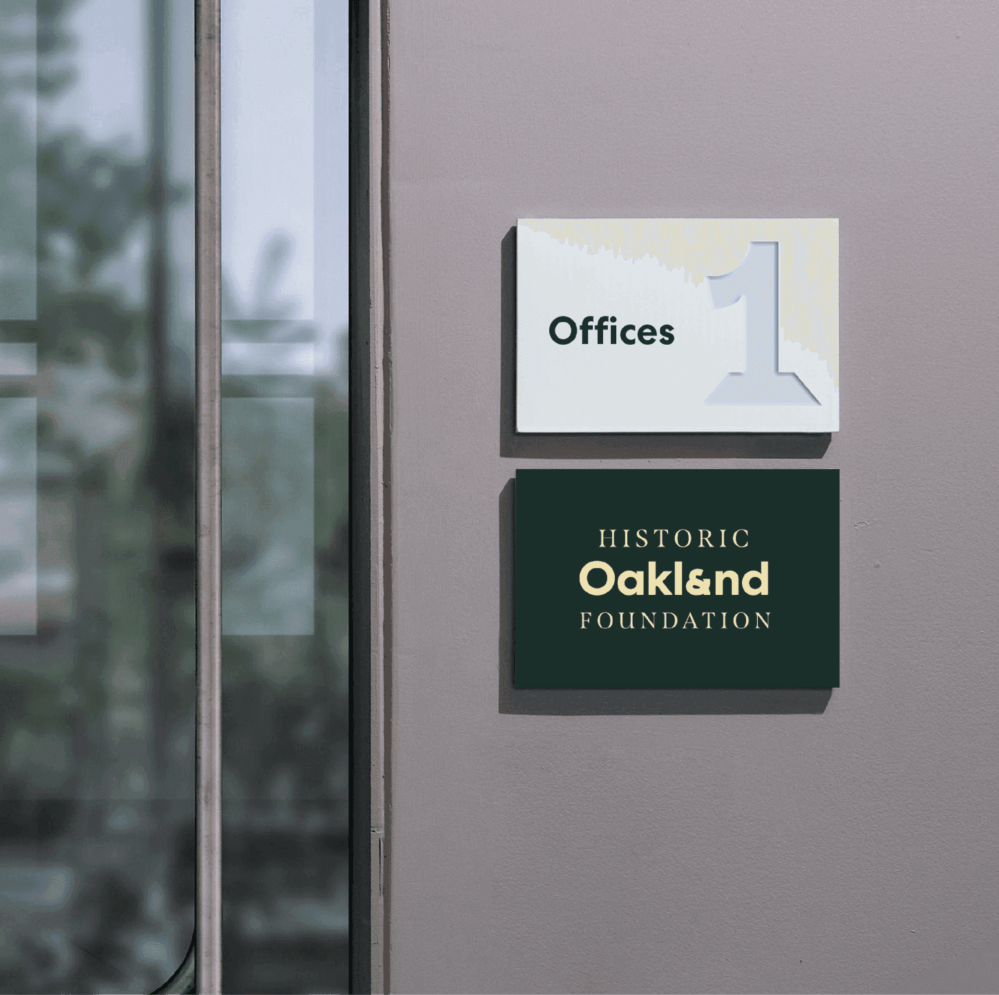

Interior signage for the Historic Oakland Foundation features the Oakland wordmark on a dark plaque beside a minimalist office number sign.

Like what you see? Look at some more

A bold blue Atlanta History Center logo
Whoosh Logo graphic
Stonehenge Social Post. A bold social graphic overlays Stonehenge with Trainline’s heart icon and the headline “Completely Un-Henged.”
View all work