Me + You, connected through food.

MUYU began with a group of Peruvian farmers and a remarkable product: a plant-based milk made from quinoa and tarwi. These two complementary crops have been rotated through the same plots for thousands of years, rooted in farming wisdom that's ancient and proven. What the growers needed was a brand that could introduce these products to new consumers, while enriching the communities that make them. So we helped MUYU find its position and voice, and designed a packaging system that stands out from the shelf.


Truth

We started with a disconnection. The foods we eat and the ways we consume them reflect a widening gap between modern life and the ecosystems we depend on — and things don't go well when we're separated from the source of our food, the people who grow it, and the land where it's grown. As that gap widens, so do the problems: personal health, community wellbeing, and a shared climate all suffer.

MUYU sits at the center of that story with something hopeful to say. The name itself means Me + You — food as the thing that connects us to one another, to nature, and to a shared future. The brand's deeper purpose emerged clearly: to promote food biodiversity for an abundance of better food, and to sustain the small, fragile farming communities growing the healthiest food in the world — often for others, rarely for themselves. MUYU makes nourishment more generous, fair, and equitable, all the way back to the grower. It's an invitation to unity through delicious food.

"We are nature. Sometimes we forget it. MUYU brings us back into connection with the world and the people around us."

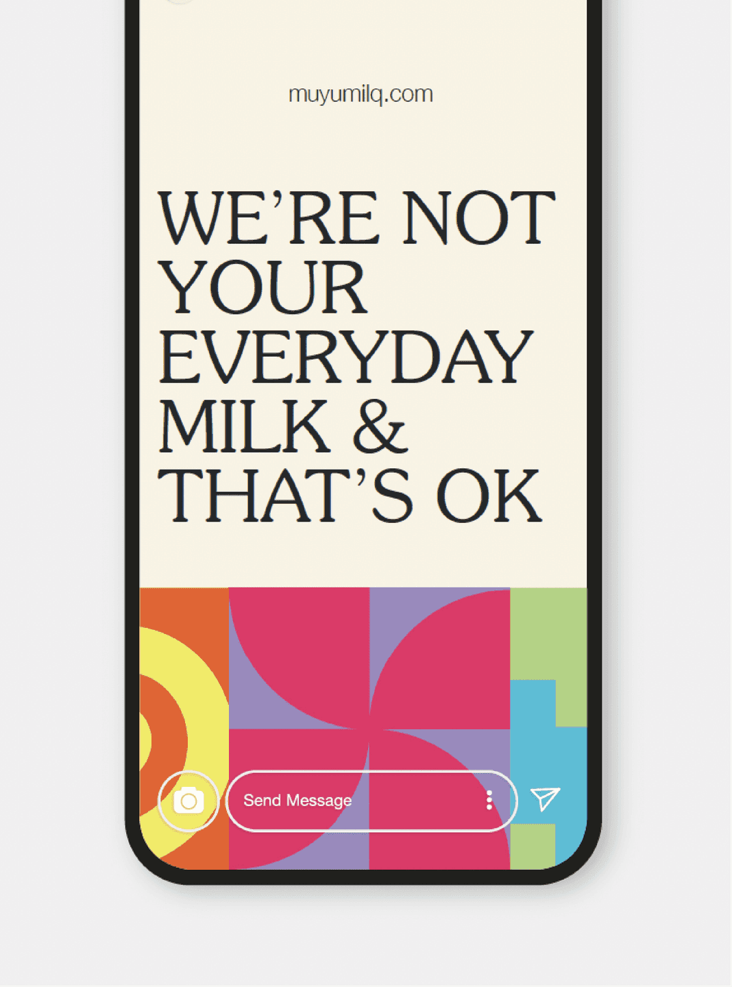
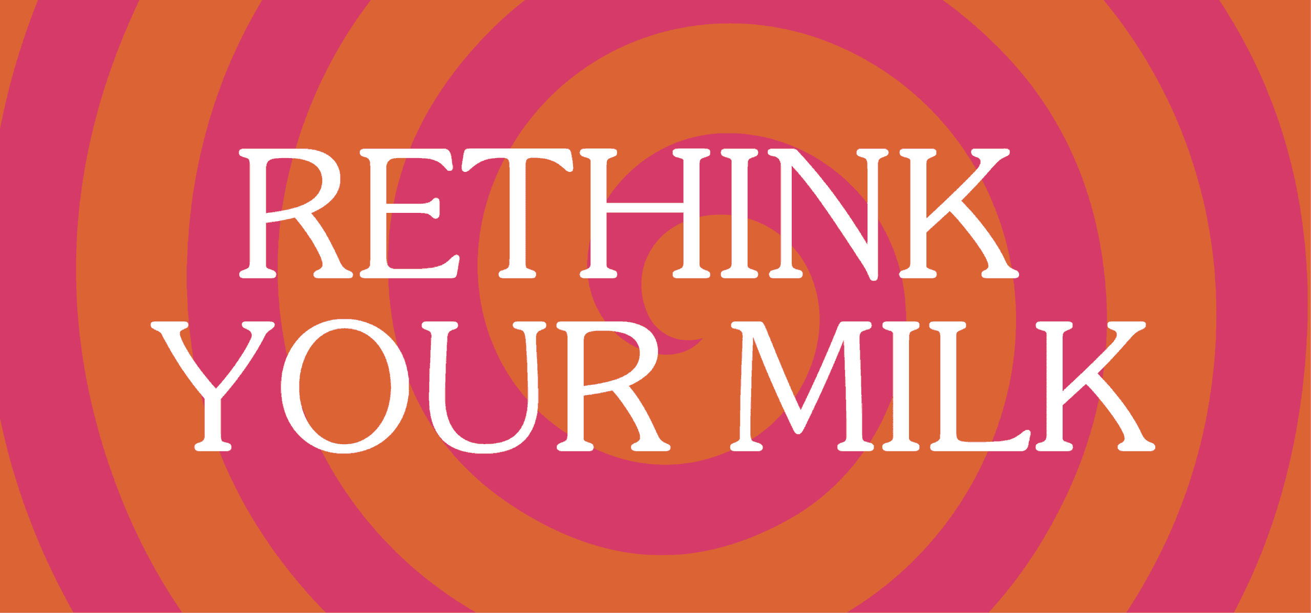
We’re Not Your Everyday Milk. Mobile graphic featuring expressive serif typography over geometric color blocks.
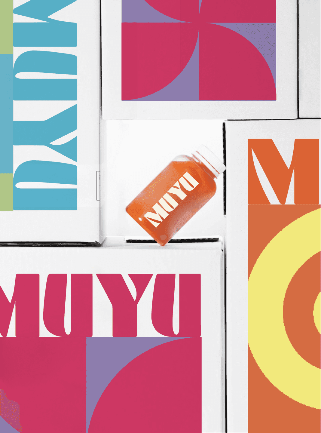
MuYu Packaging System. Stacked delivery boxes and a bottled drink showcasing MuYu’s bright, geometric brand language.
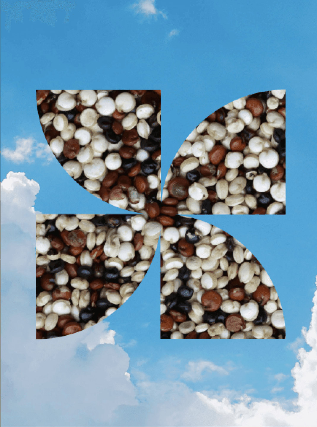
Quinoa Pinwheel Graphic. Pinwheel logo filled with multicolored quinoa grains against a blue-sky backdrop.
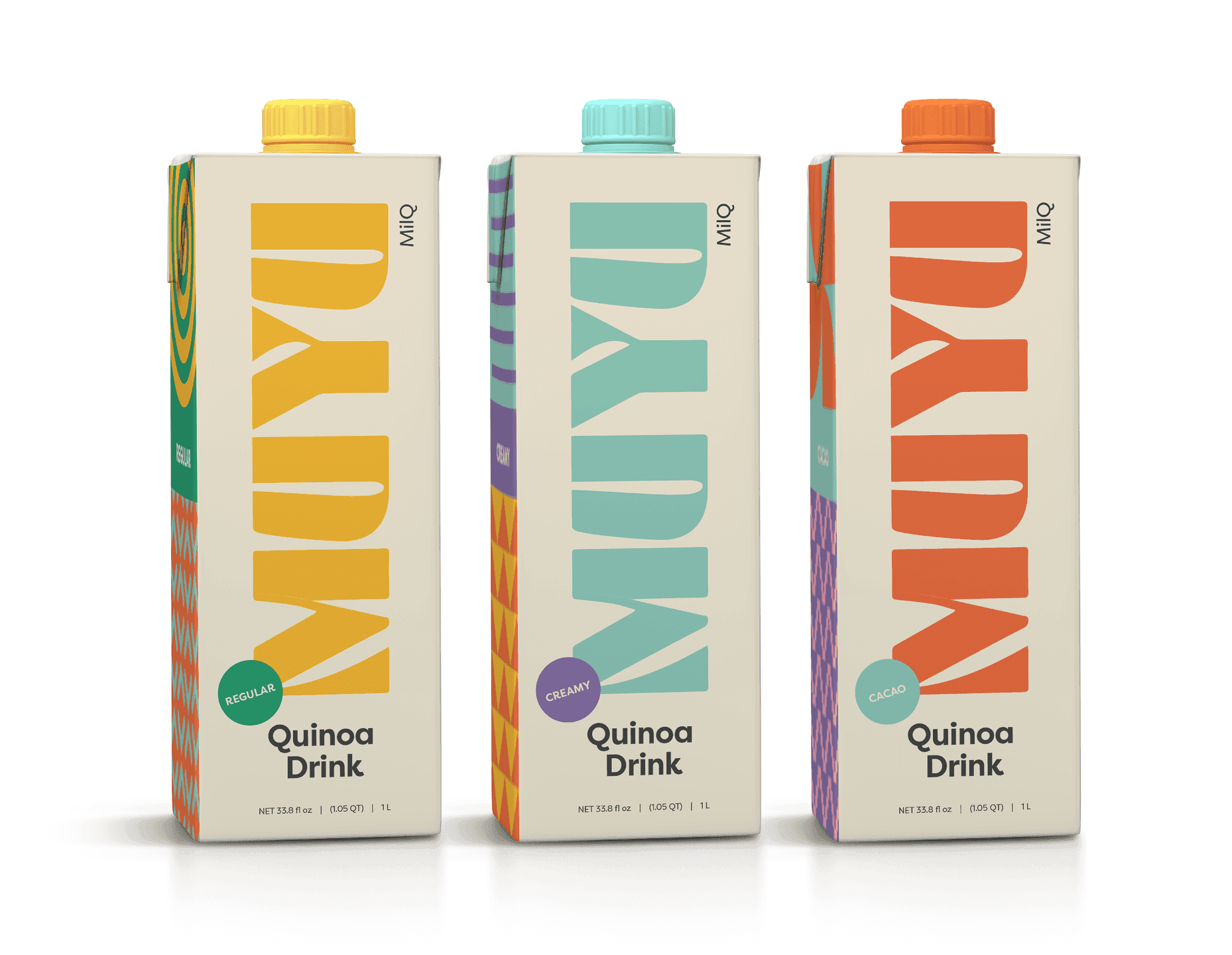
Quinoa Drink Lineup. Three MuYu quinoa drink cartons in different flavors with bold vertical wordmarks.
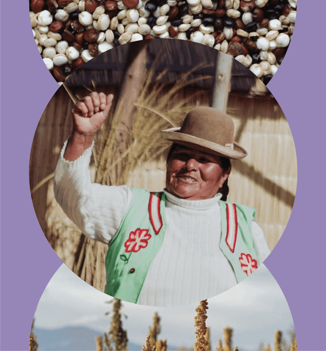
Community Portrait. Photograph of an Indigenous woman celebrating, framed by MuYu’s circular graphic system.

Beauty

We ran a quick-fire positioning workshop with the MUYU core team, then showed how their earlier thinking could naturally evolve to a new level — a unique, ownable position built around mutual participation and shared benefit. The idea: consumers enjoy healthy, sustainable food in ways that enrich the people and communities who make it, combining the best of eco-tech with ancient wisdom, old ways and new.
The voice we built refused to preach. It's honest, funny, and refreshingly humble — a brand happy to be part of the mix rather than the whole story. We don't want to be your only milk. We're not the perfect milk, but we're doing a lot of things right. Even a seven-year-old gets a line. That confidence-without-arrogance became MUYU's signature.

"We don't want to be your only milk. We just want to be part of the mix."
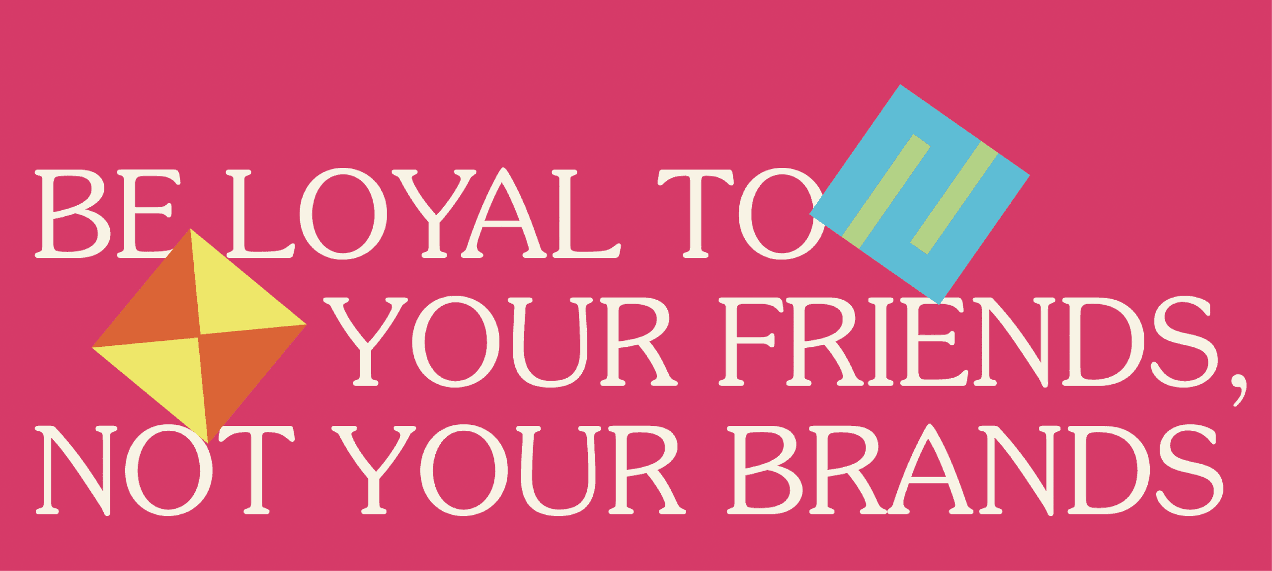
Brand Message Graphic. Typographic poster reading “Be loyal to your friends, not your brands” with playful geometric shapes.
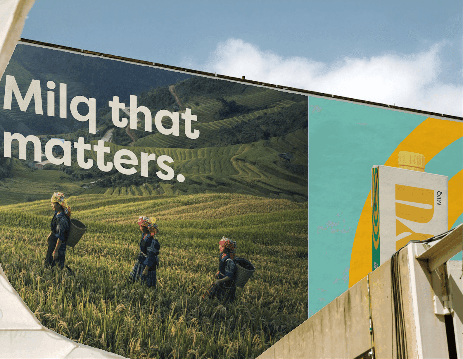
Milq That Matters. Billboard showing farmers walking through lush fields beside MuYu product imagery.

Impact

We optimized MUYU's core identity into an intentional, simple design system — typography, illustration style, image direction, and design manner — and captured it all in a set of visual identity guidelines. Then we brought it to market: a retail packaging suite for Creamy, Original, and Chocolate, print-ready production files, plus sales sheets and point-of-sale pieces for in-store moments. We designed proof-of-concept mock-ups that show how the whole system comes to life across every activation. The result is a brand as thoughtful as the farming behind it — one that makes diversity delicious, renews our connection to the earth, and gives a group of Peruvian farmers a confident, market-ready way to share their ancient harvest with the world.
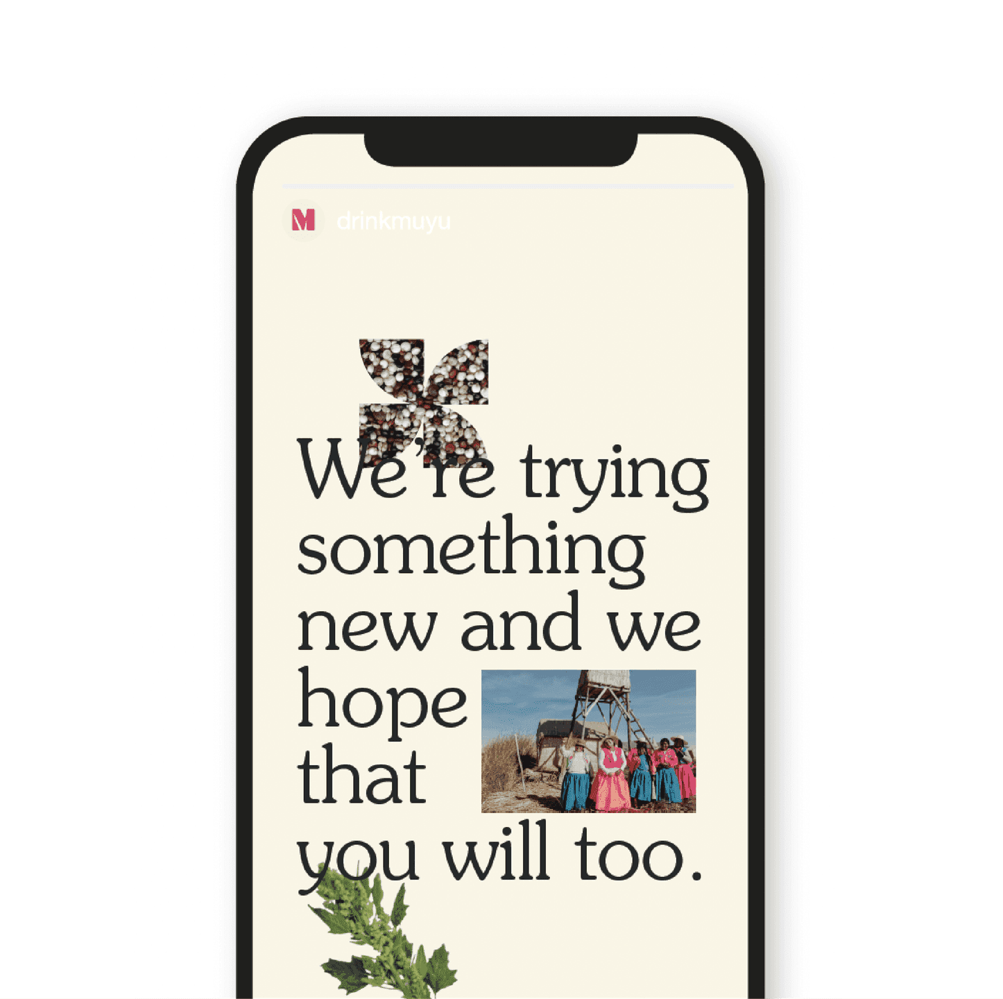
Try Something New. Social story layout with serif text, quinoa pinwheel, and a photo of a group of women in traditional dress.
“We make diversity delicious.”

Like what you see? Look at some more

PRIA Brand Graphic. Gradient arcs and a bold monogram introduce PRIA’s modern, confidence-driven identity.
Stonehenge Social Post. A bold social graphic overlays Stonehenge with Trainline’s heart icon and the headline “Completely Un-Henged.”
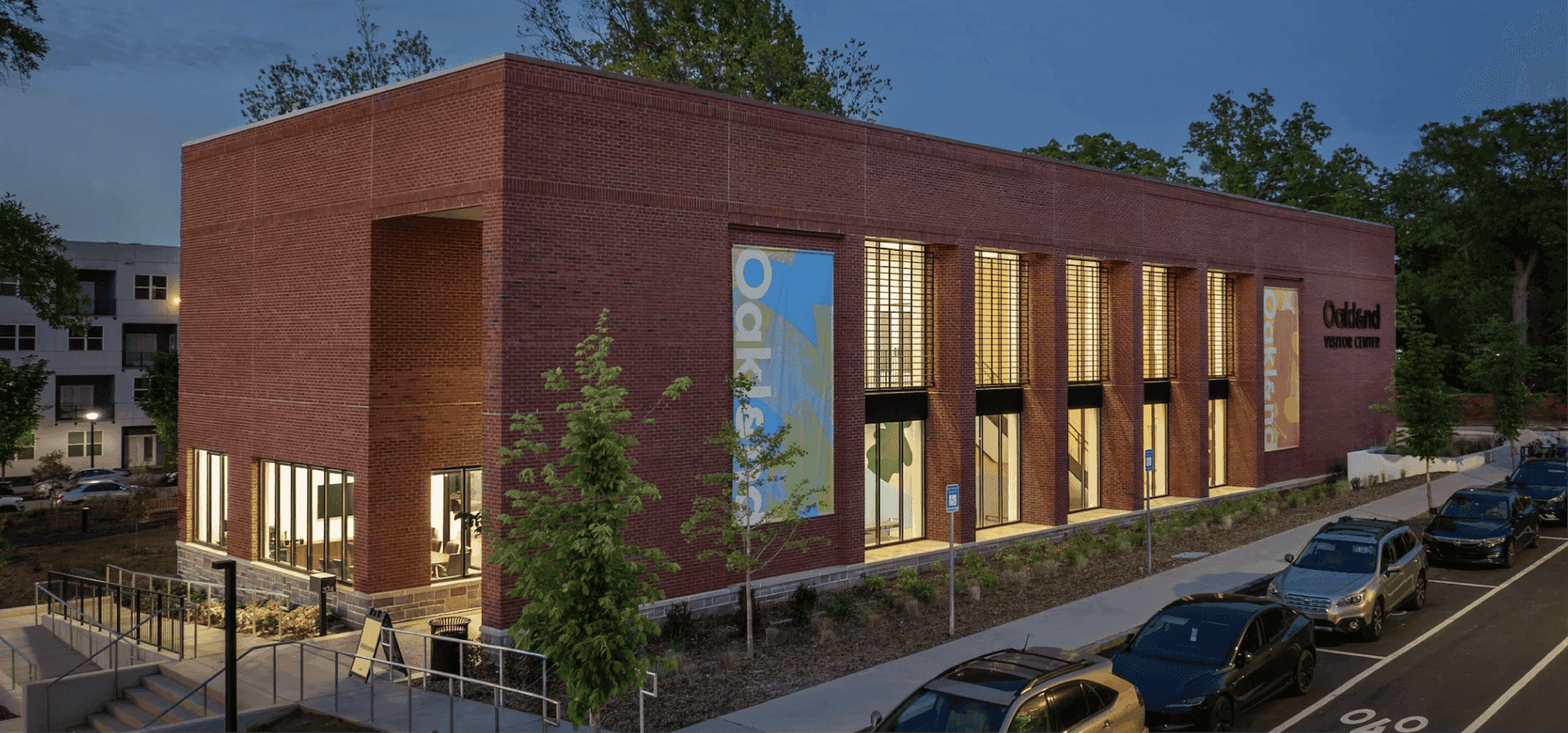
Etsy headquarters
View all work