When has a district brand earned the right to be an icon?

Elevating the Icon
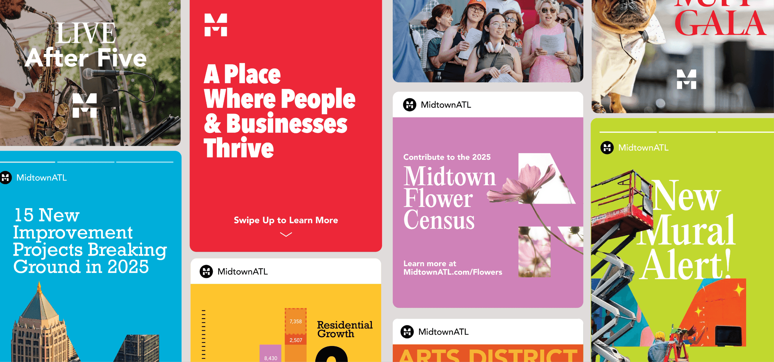
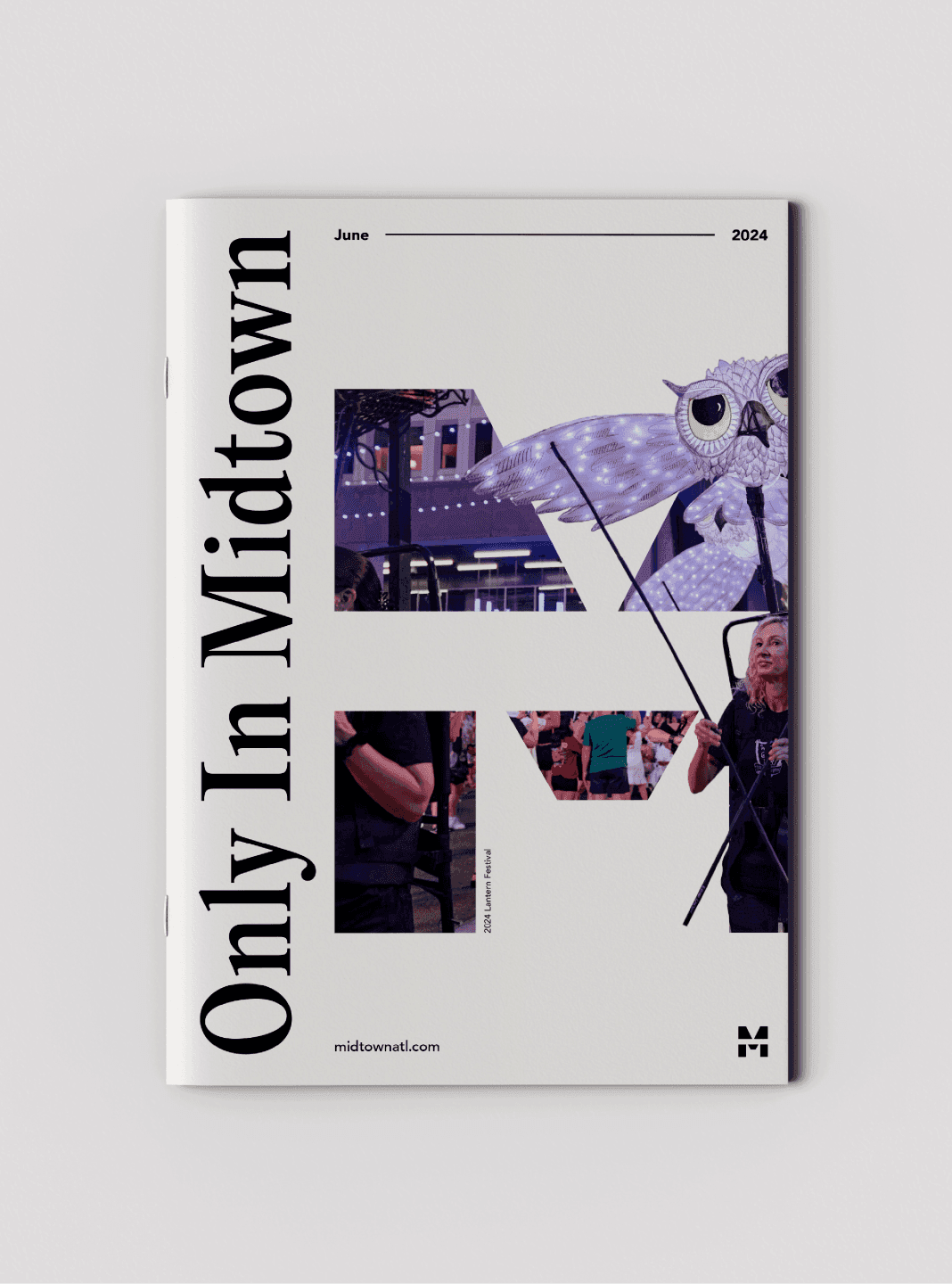
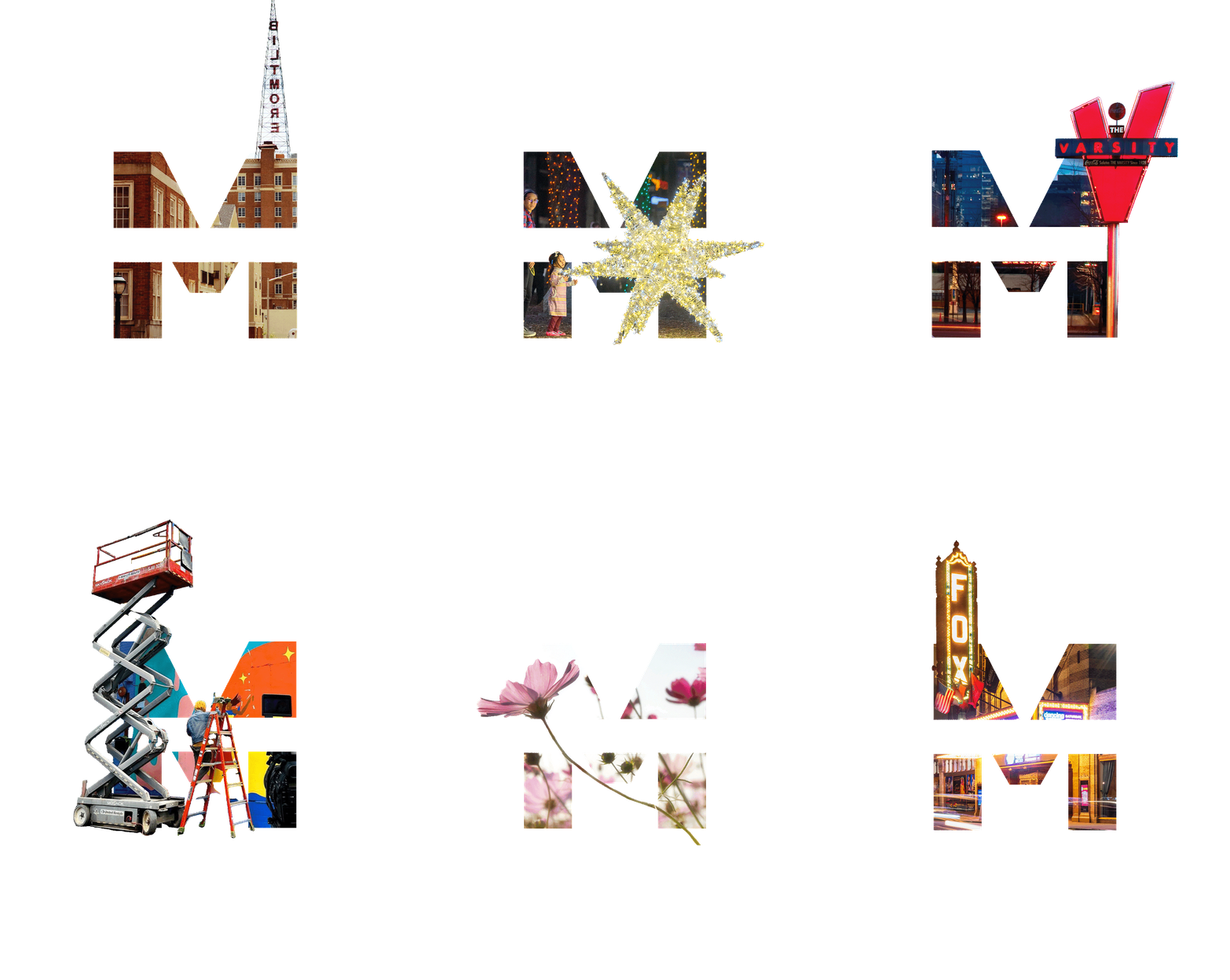
Midtown built recognition and equity into their wordmark through great work and consistent use. Now, it was time to reap the reward. We elevated the Midtown M to full icon status as a monogram, capable of carrying the brand on its own. As a graphic, it can tell the story of all the incredible sights and experiences you can find in the district. As an identifier, it can sign Midtown Alliance’s work in a powerful shorthand.
Fully fresh
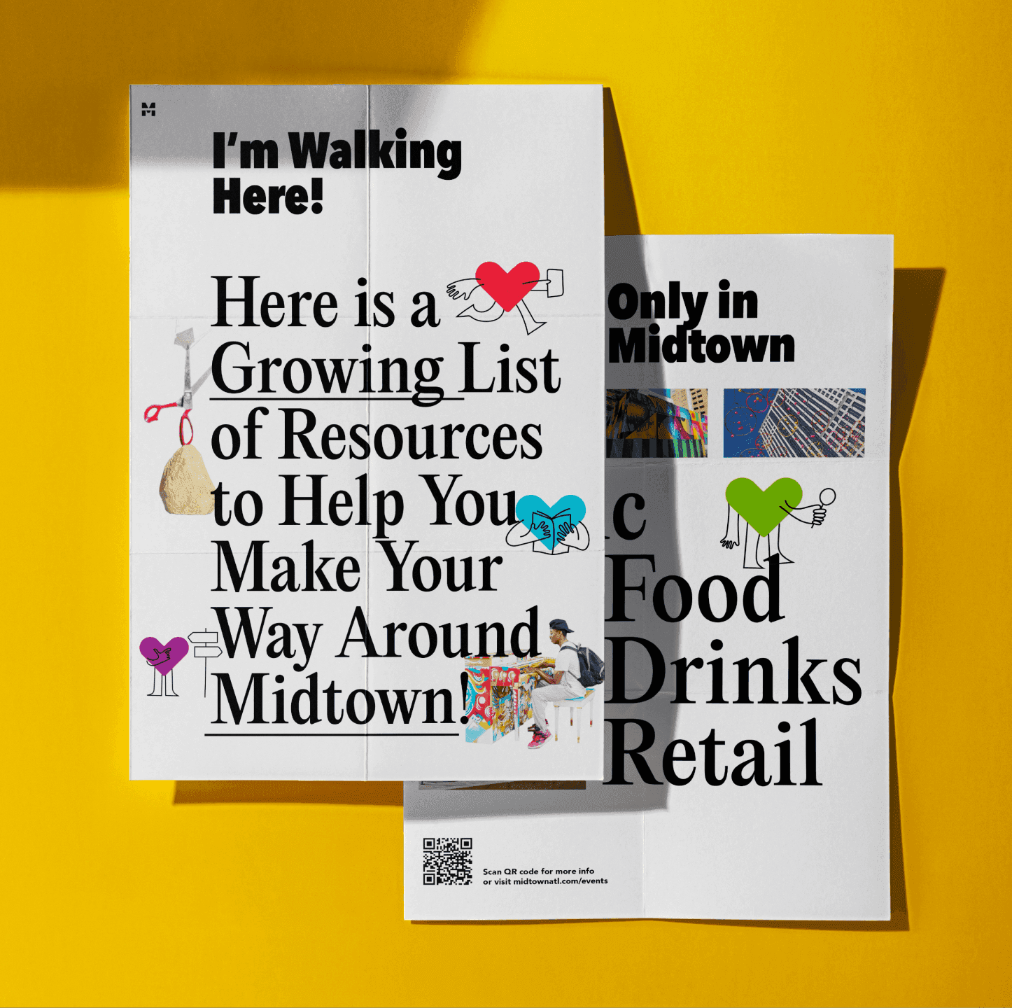
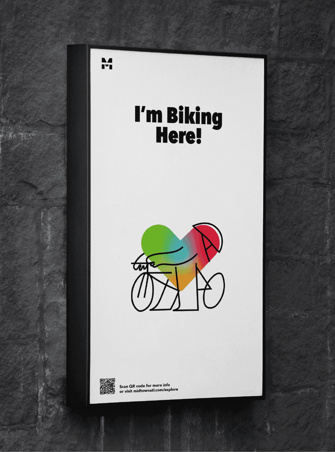
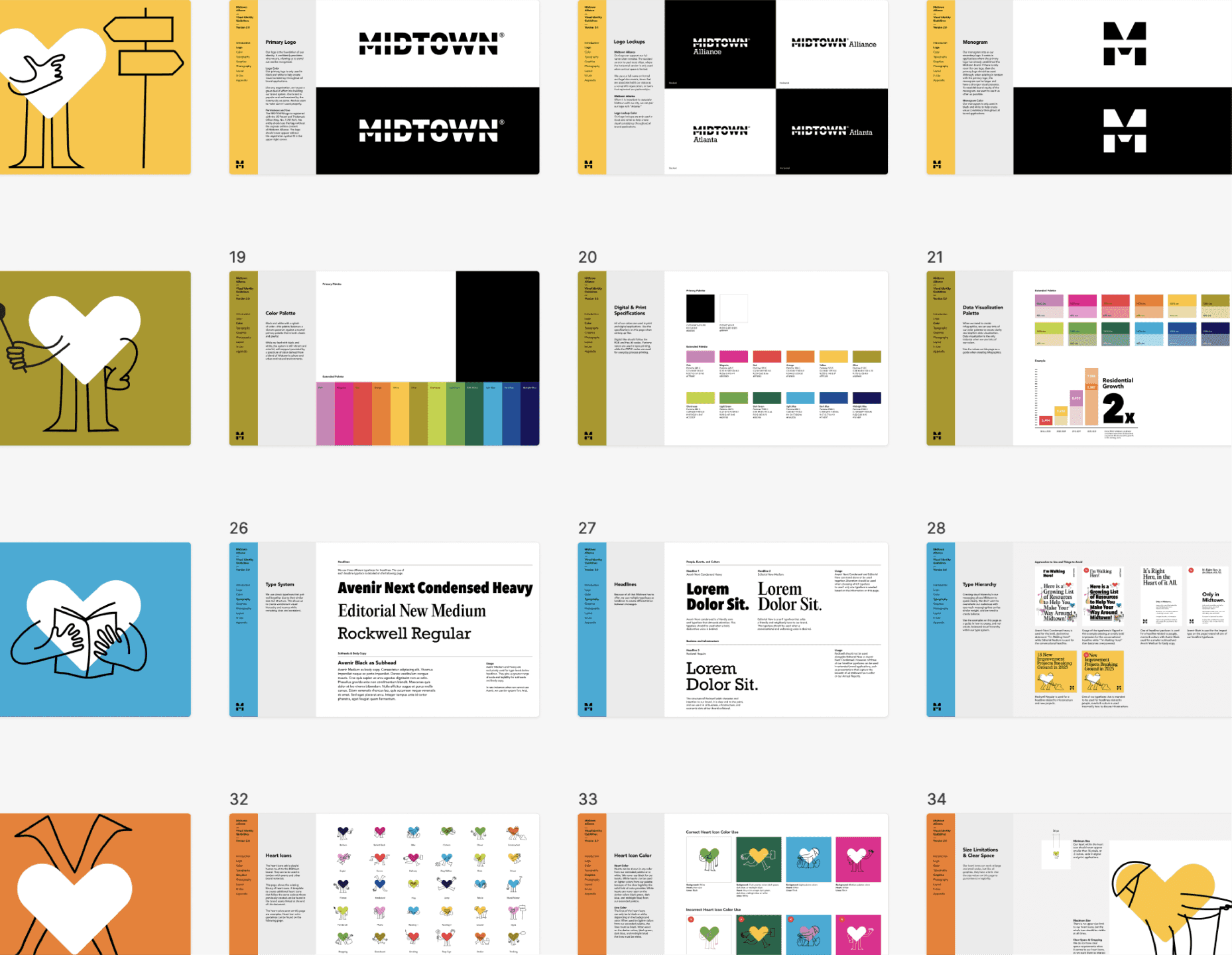
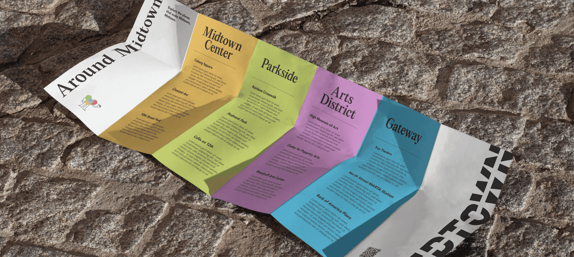
But it’s not all big moments and bold graphics. This was a full system refresh, including type and color. To help them tell the full story of Midtown, we added a condensed sans for bold headlines and an editorial serif for publication-worthy content. By shifting our leading colors to black and white, we were able to amp up their expanded color palette for contrast in digital application, retaining the rainbow while upping the vibrancy. We also added a sweet system of heart characters to communicate, with love, the way to behave in the district.