A unified identity for a neighborhood on the rise

Central Atlanta Progress and the Atlanta Downtown Improvement District had done great work for decades but that work lived across two names and a huge swath of touchpoints that weren't connected in people's mind. Son&Sons gave both organizations a single, flexible identity system built to amplify their work and catapult Downtown Atlanta into its next chapter.

Truth

Downtown was on the edge of big transformation, new residential and retail development, a growing student population, and major venues drawing visitors from across the world. But for most Atlantans, their concept of Downtown had drifted from central business district to a but the neighborhood was known mostly through its landmarks rather than as a cohesive place. People could name the Aquarium or Mercedes-Benz Stadium without ever picturing the streets, blocks, and daily life connecting them. The identity needed to do two jobs pulling in different directions: project the scale and momentum of everything Downtown is becoming, while staying grounded and specific enough to feel like an actual neighborhood rather than a skyline. And because the brand would only work if the people living, working, and building there wanted to carry it too, the system had to be built for participation from the start.

Downtown Traveler’s Guide in Pocket A colorful “Welcome Downtown” weekend guide peeks out of a back pocket.
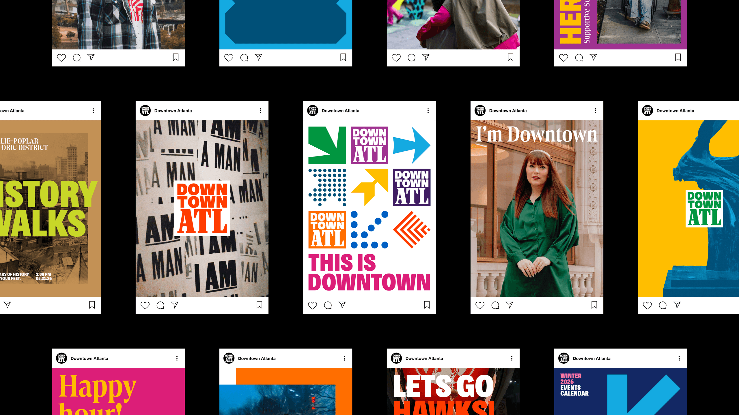
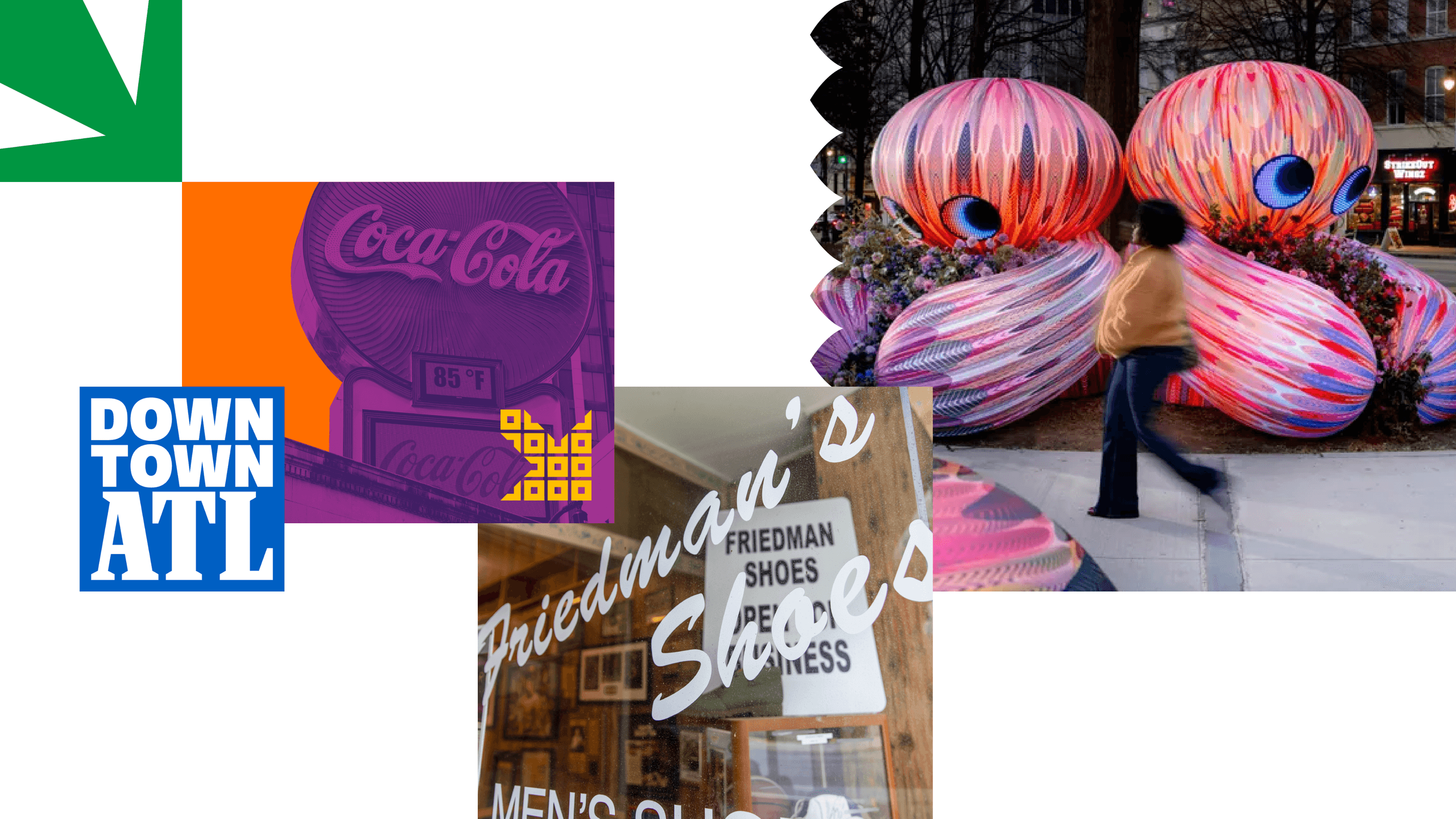
Downtown ATL Visual Grid. A grid of Downtown ATL imagery featuring local culture, graphic icons, mosaic tile details, and neighborhood flowers.
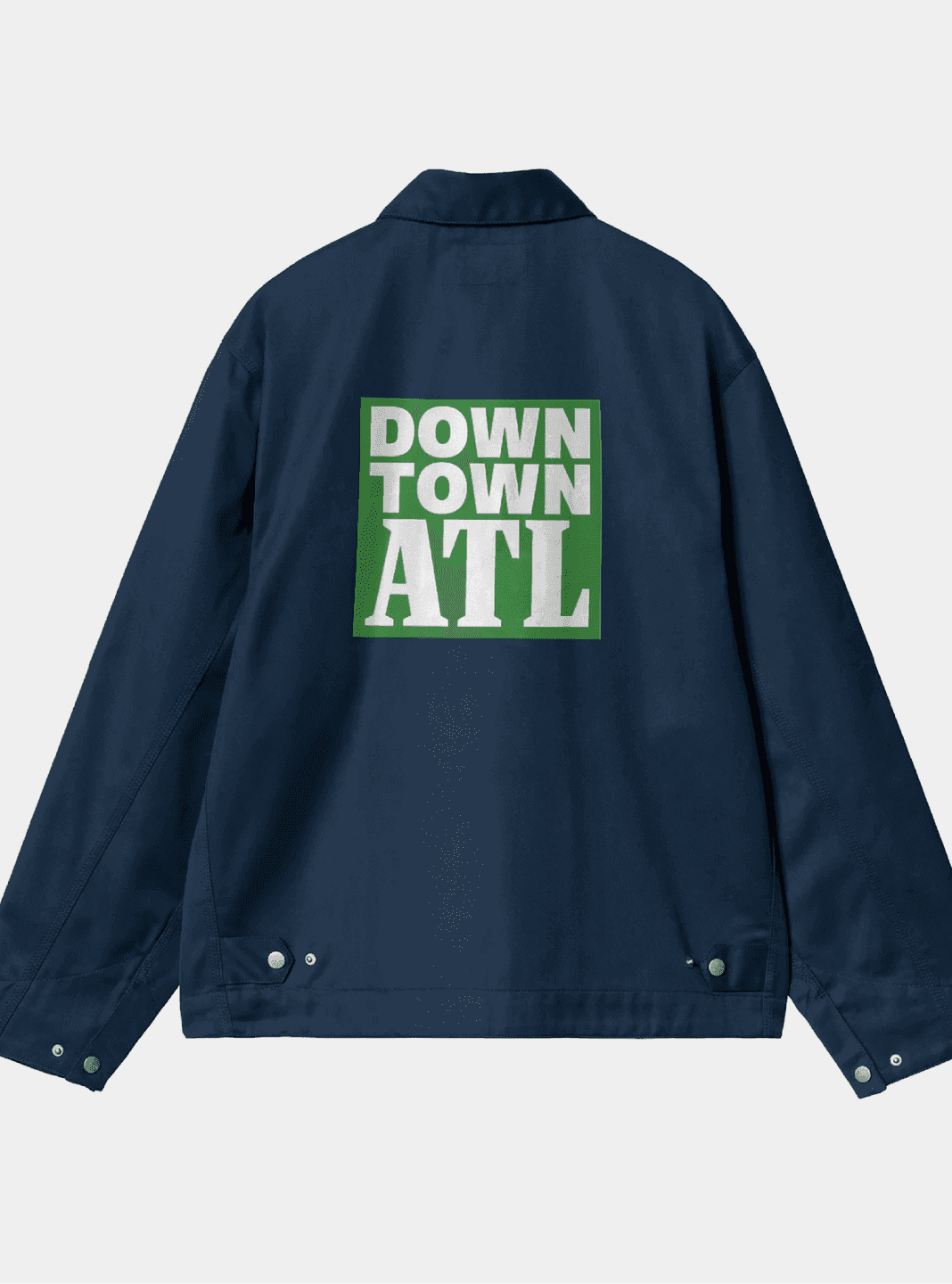
Downtown ATL Jacket. A navy jacket displays a large Downtown ATL logo printed on the back.
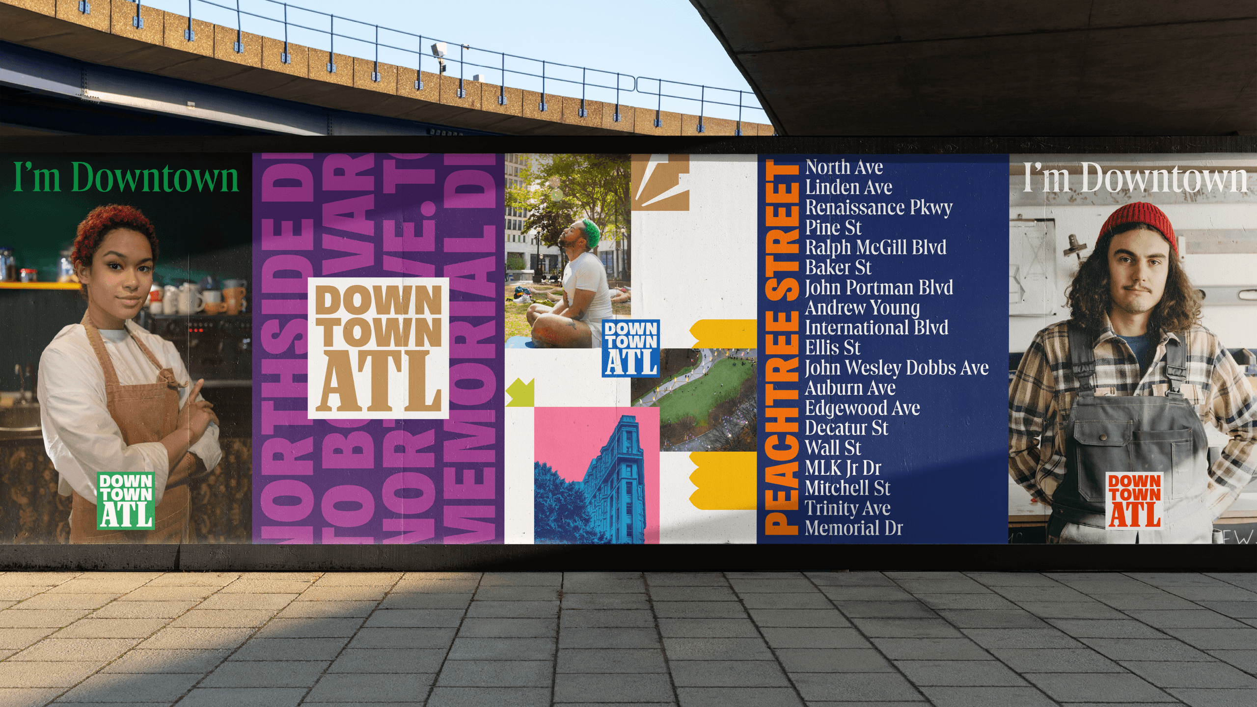
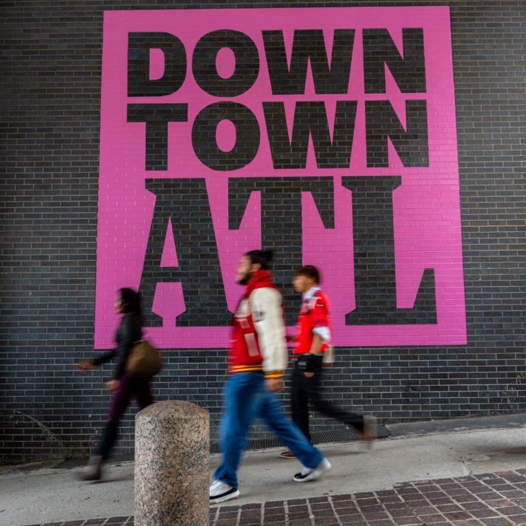
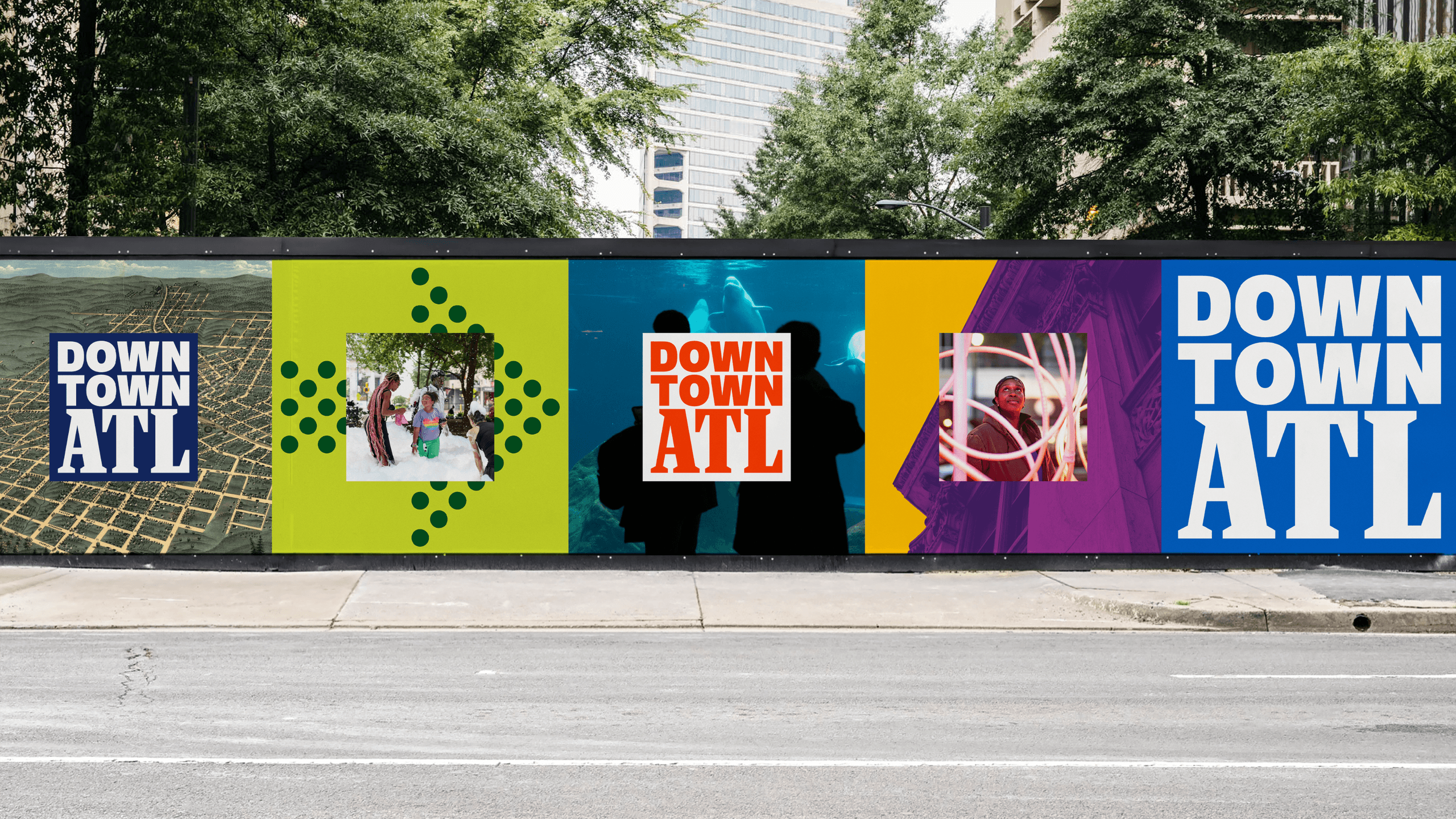
Downtown ATL Street Mural Wall. A vibrant wall installation showcases Downtown ATL branding alongside local photography.
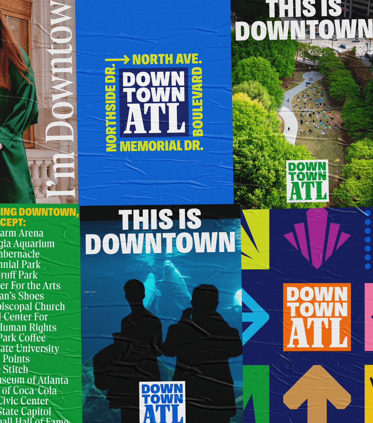
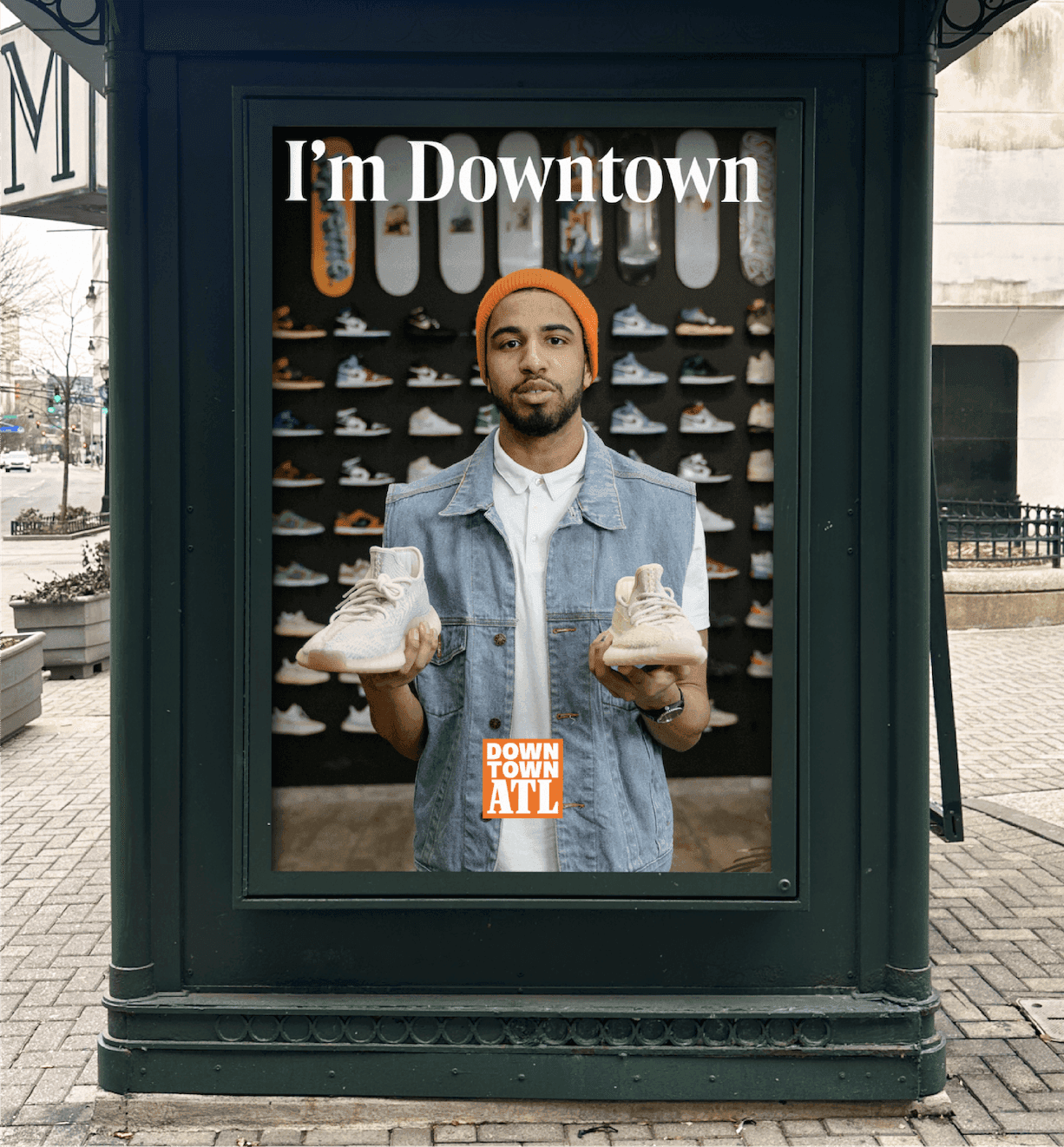
“I’m Downtown” Poster. A Downtown ATL poster features a local shop owner holding sneakers beneath the headline “I’m Downtown.”

Defining a district

A eureka insight during our Truth phase was that part of our job would be to communicate what is even considered “Downtown”. Up to that point, everyone we spoke defined the neighborhood boundaries differently.

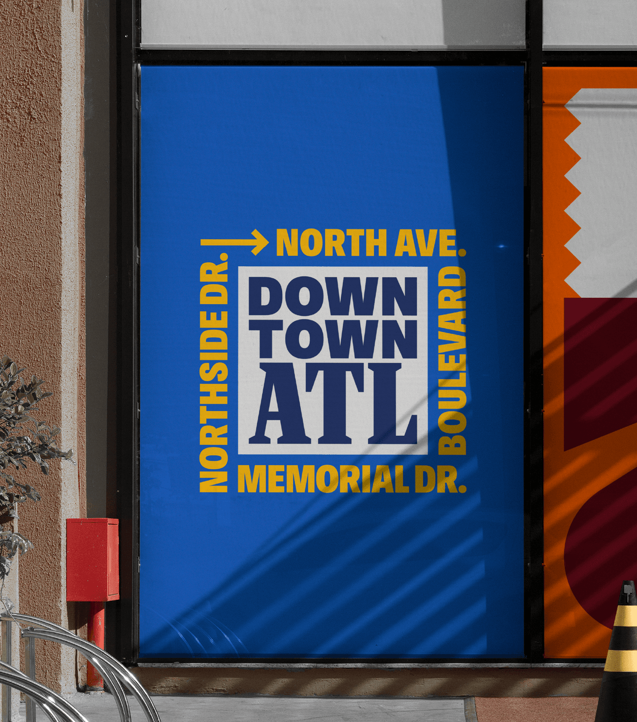
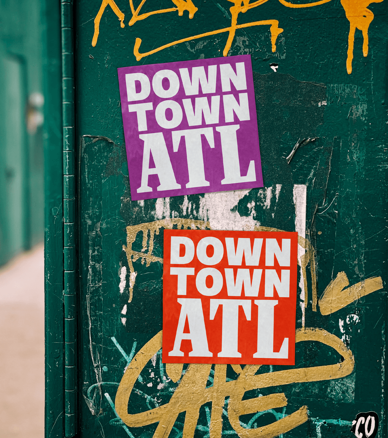
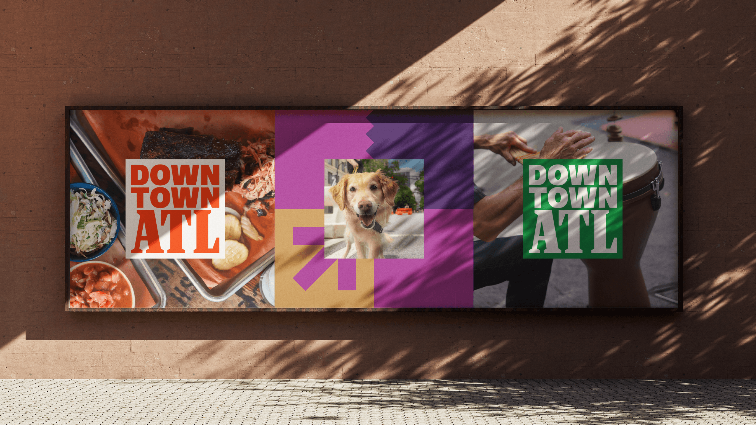
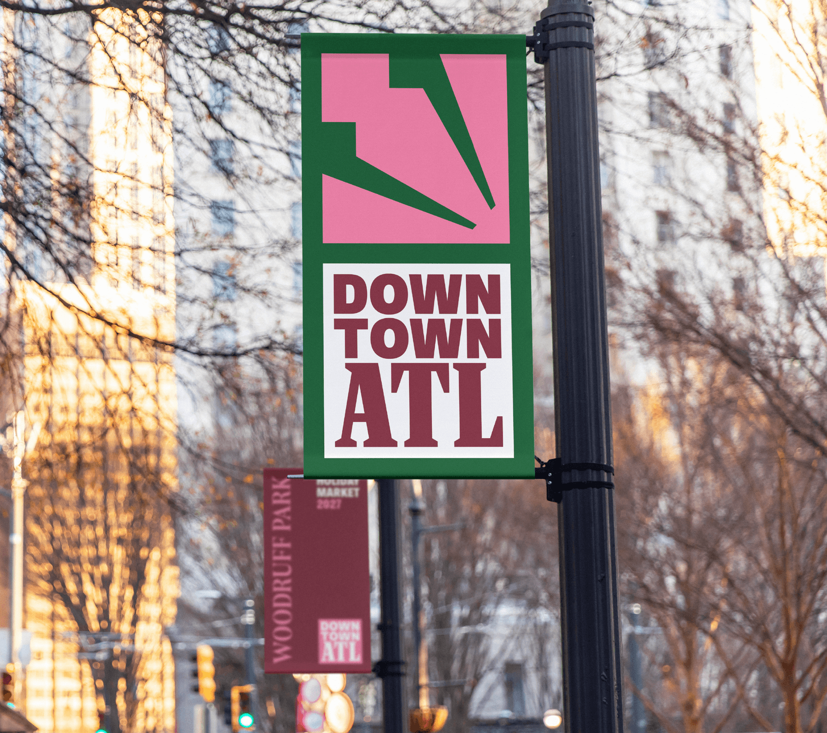
The square mark traces Downtown's real boundary streets, North Avenue, Memorial Drive, Northside Drive, and Boulevard, turning the logo into something closer to a map than a symbol. Wherever it shows up, on a manhole cover, a food truck, a stadium jumbotron, the shape repeats the same fact: this exact is Downtown. The color inside can shift, green for a park event, orange for a historic city map, hot pink for a concert poster, while the boundary stays locked in place, so the system can flex endlessly while remaining clear and defined.

Downtown ATL Directional Billboard. A large Downtown ATL billboard displays colorful arrows and icons above the message “This Is Downtown.”
Downtown ATL Business Cards. A collection of Downtown ATL business cards and identity designs featuring bold color blocking and graphic patterns.

I'm Downtown

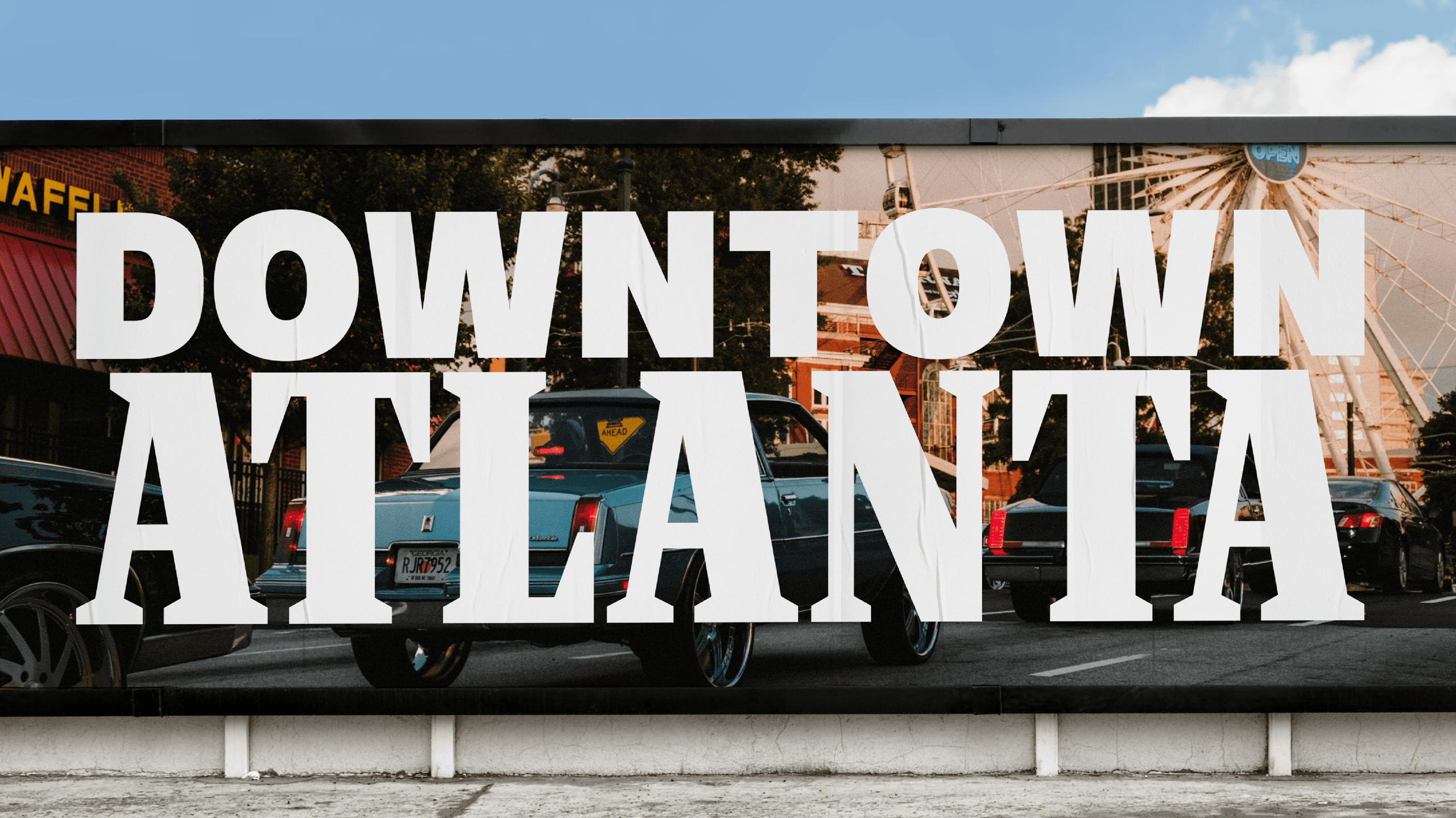
The result is a single identity carrying CAP and ADID's work into public view for the first time as one voice: a boundary-true logo system, a full messaging platform built to flex across a dozen audiences without losing its throughline, and a campaign designed to scale from a resident's Instagram story to a stadium jumbotron. Where the two organizations once needed a paragraph to explain who did what, Downtown Atlanta now has a system built to say it simply: We're Downtown.

Downtown ATL Manhole Cover Mark. The Downtown ATL logo appears engraved into a textured metal manhole cover.

Like what you see? Look at some more

PRIA Brand Graphic. Gradient arcs and a bold monogram introduce PRIA’s modern, confidence-driven identity.
Midtown Social Graphics Grid. A colorful grid of Midtown ATL social posts highlights local events, community updates, public art, and neighborhood initiatives.
WELCOME TO THE FUTURE. CADY CONFERENCE SCREEN
View all work