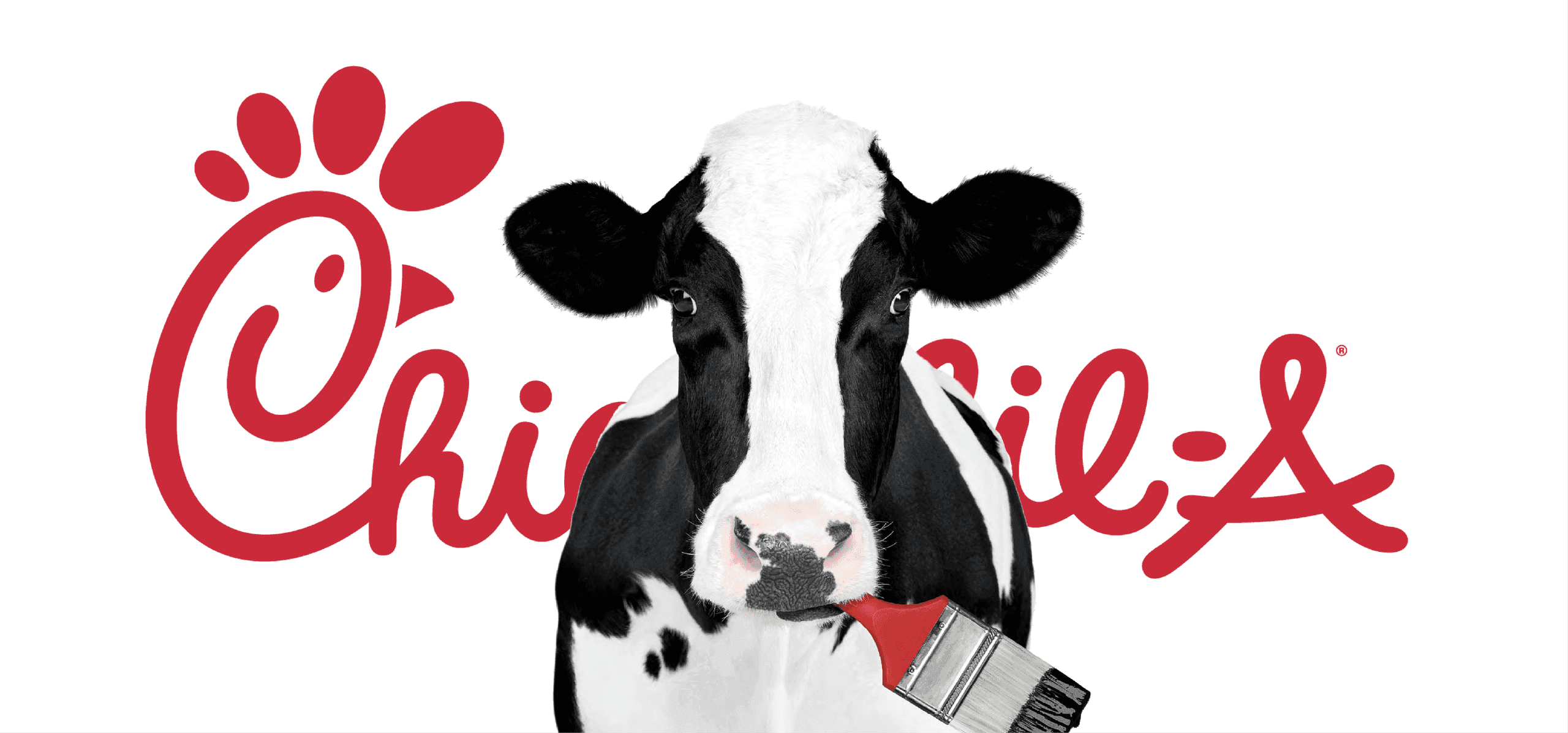
Chick-Fil-A Cows
Can you take an icon and help it tell a better, more cohesive story?
Moo Neue
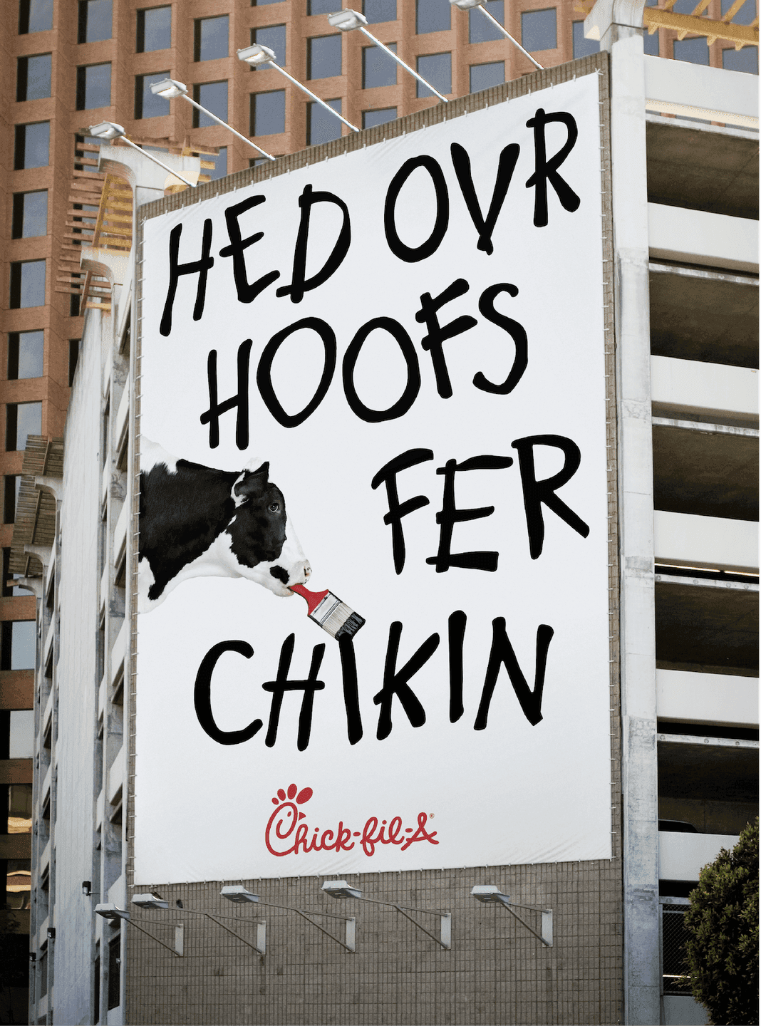
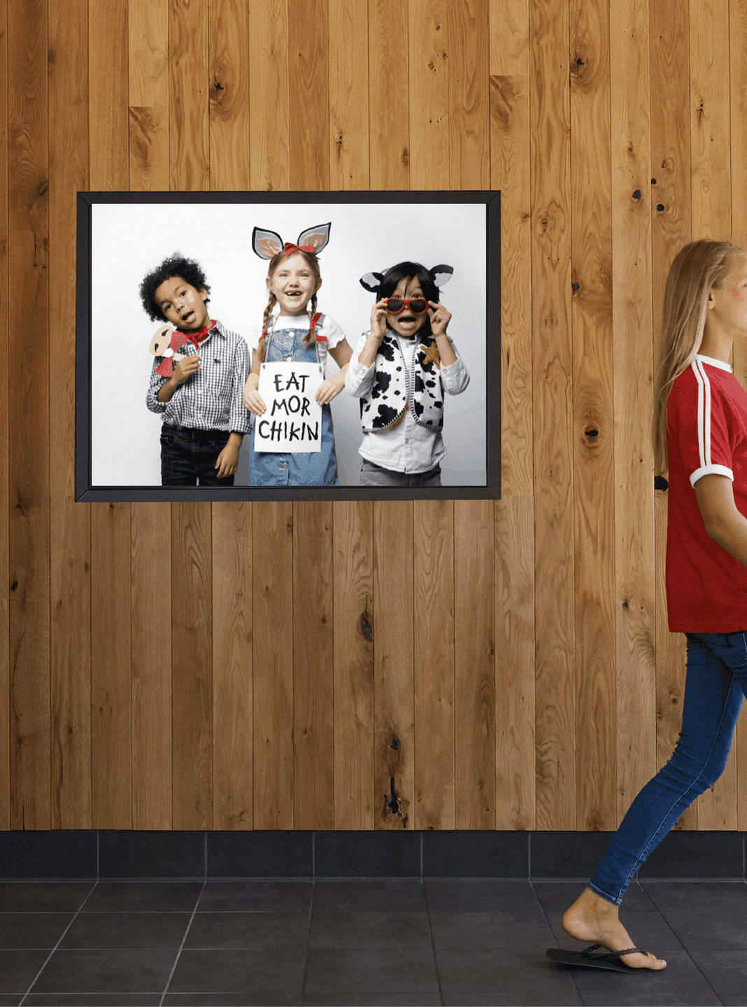
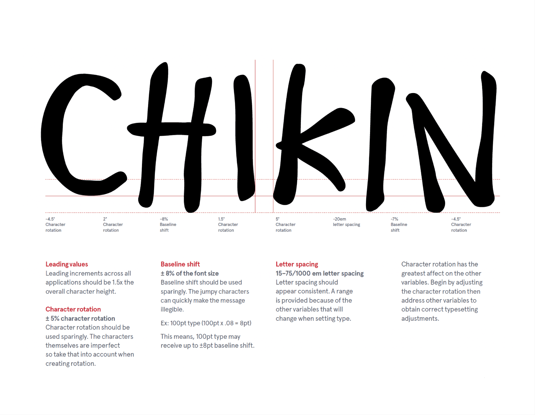
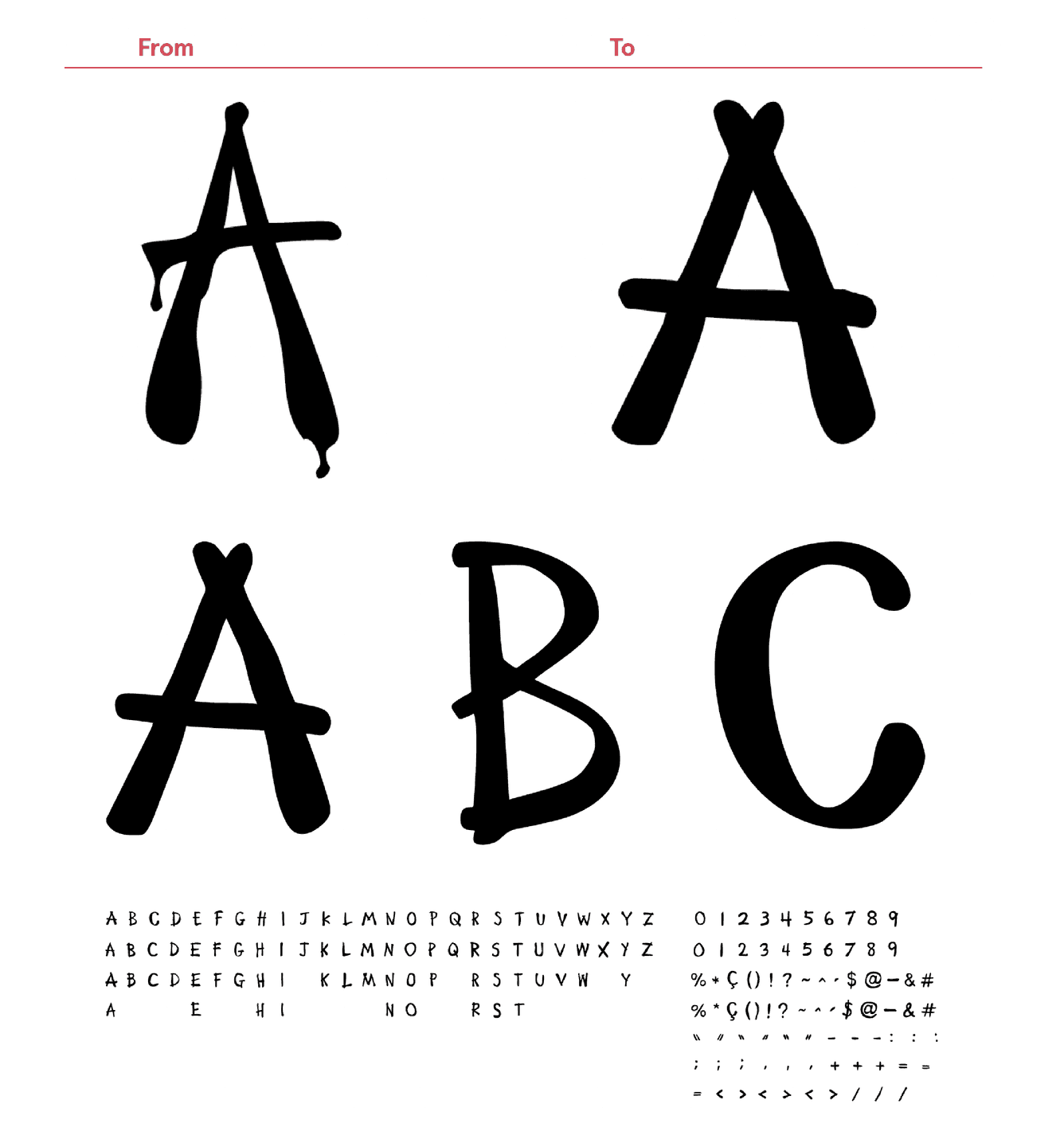
One of the core assets of the Cow’s brand library was the cow scrawl typeface found on billboards across the country. The original scrawl had not been updated since it’s creation in 1995 and needed a less murder-y refresh. We created a simplified version of the type, adding additional character options for all letters and creating a fully functional typeface, Moo Neue, that would make applications 10x easier than before.
Let's Play!
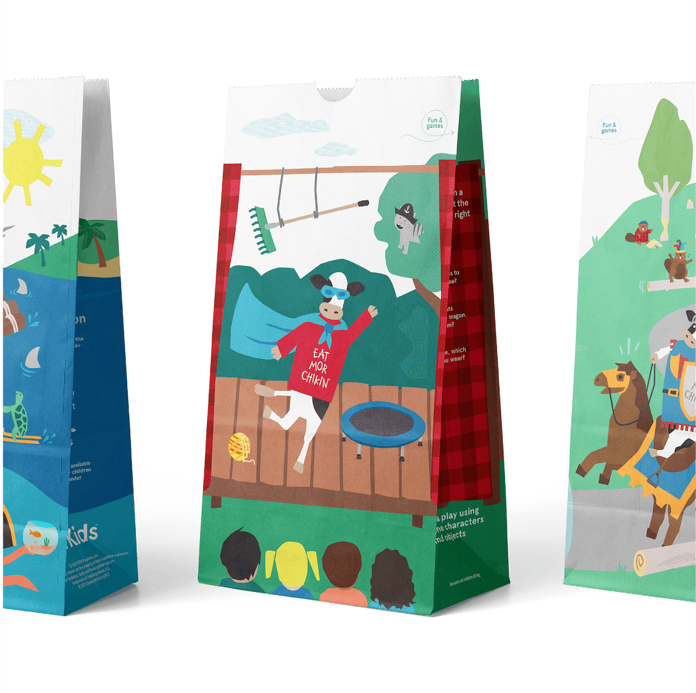
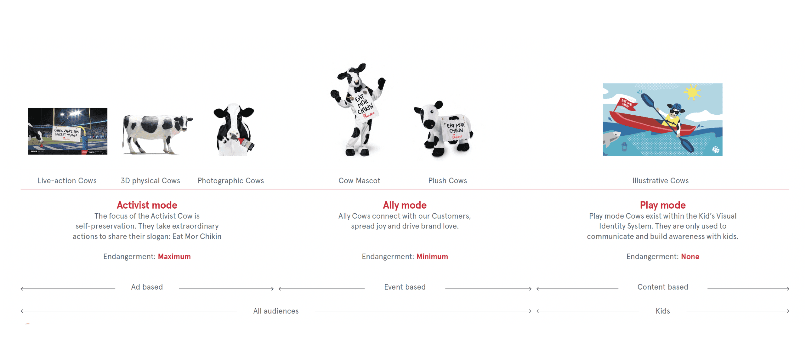
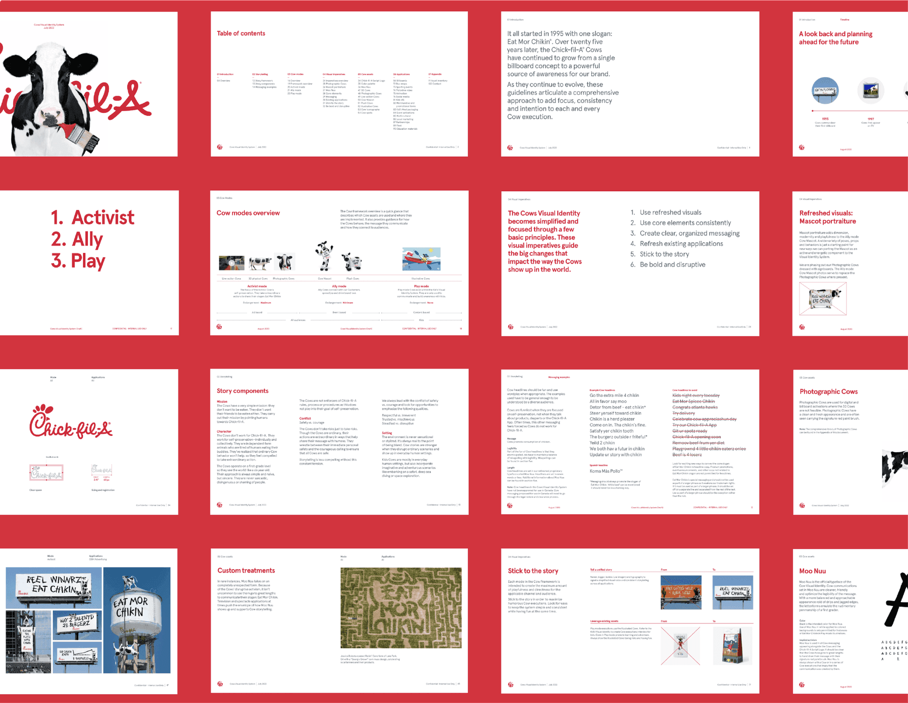
The Cow has three modes of interaction, and the most whimsical of those is Play mode. In this mode, the Cow is able take on imaginative storytelling in an illustrative way that is engaging for Chick-fil-A’s youngest audiences. As a part of this project, Son&Sons was able to help imagine what kind of stories the Cow got to tell on the kid’s meal bags and how those stories could be told, creating an illustration style and narrative framework that would keep the bags enchanting for years to come.