More than a photograph.

CADY earned its reputation as the premiere senior photography company. But in a world of tech acceleration and an endless proliferation of great photography, a great photo was no longer enough. CADY knew they were already loved not just for its images, but for putting people at the center of everything they do. Our job was to help the brand own that truth. We helped them build a purpose, a story, an identity, and a voice that match what CADY means to the seniors, schools, and teams it touches.

Truth

We began with the young people at the heart of the business — and what we found was heavy. It's tough being a teen today: anxiety, depression, stress, bullying, body image, FOMO, self-harm — all amplified by a fragile sense of worthiness and self-esteem. Kids are struggling to keep it together, and so are the parents and teachers around them.

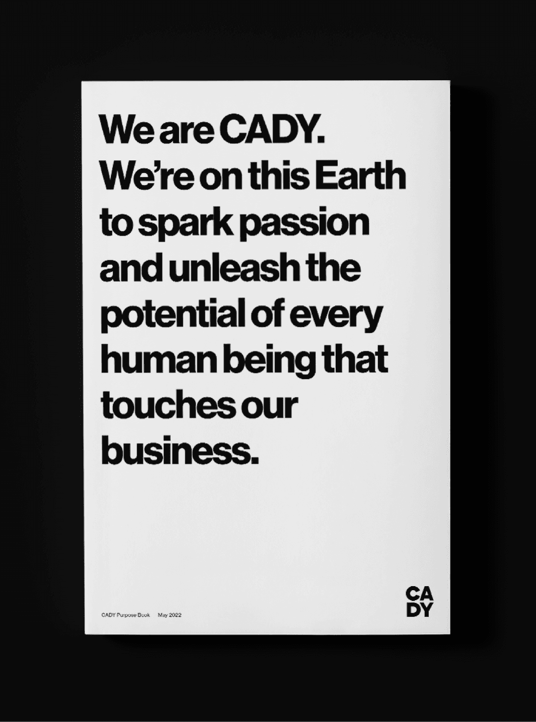
That reframed everything. CADY isn't in the picture business; it's in the human-potential business. A senior portrait isn't a transaction — it's a privilege, an invitation to an experience, a point of empowerment. A picture of who you are in this moment, and a picture of your potential. From that insight we shaped CADY's purpose: to spark passion and unleash the potential of every human being who touches the business. We named it Glow&Grow — awakening the Glow innate to each of us, and inspiring the Growth that turns passion into potential.

Mission Poster. A bold black-and-white mission poster stating CADY’s purpose with strong typographic presence.
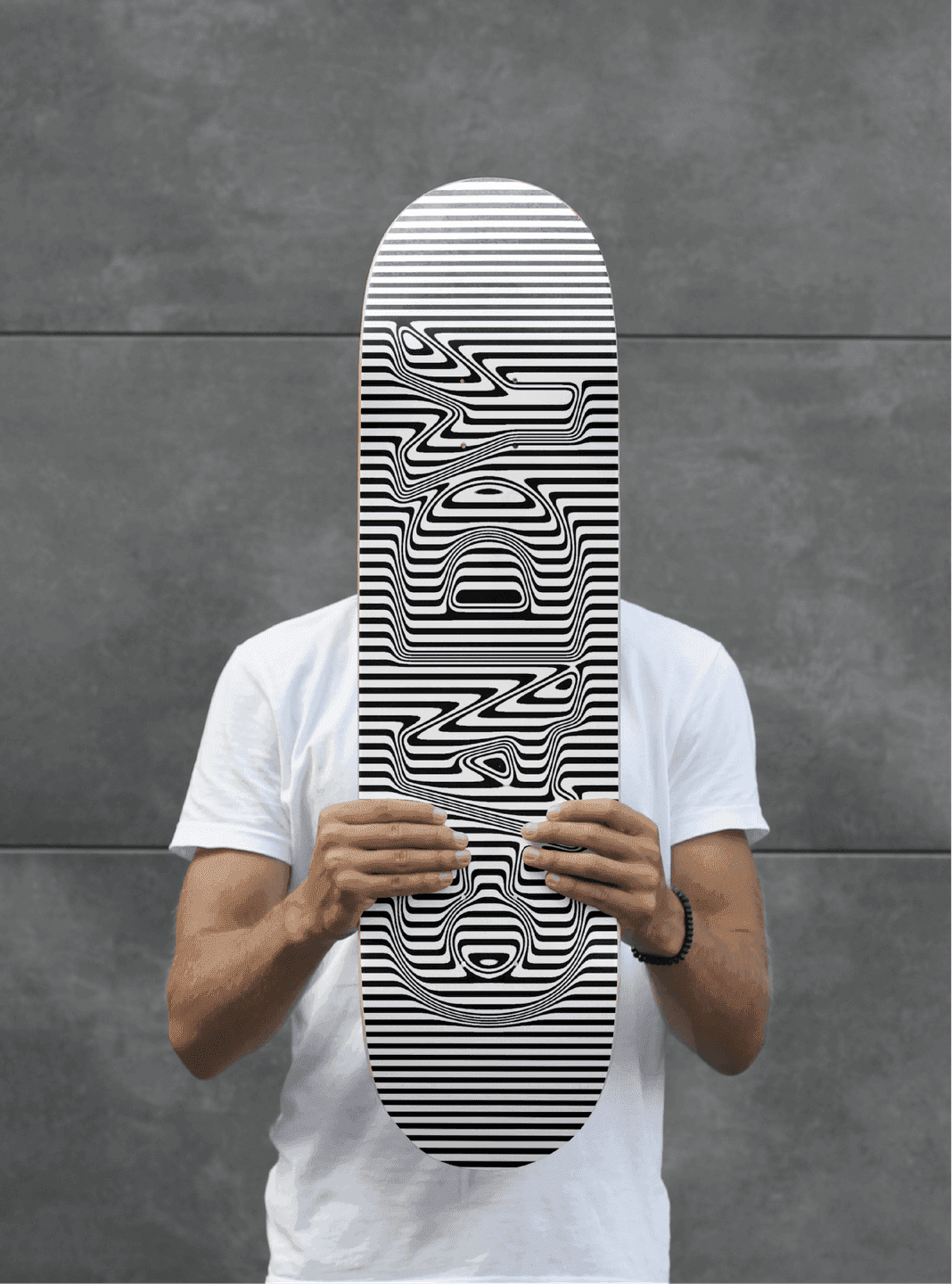
CADY Skateboard. A black-and-white striped skateboard featuring an optical, distorted CADY logotype.
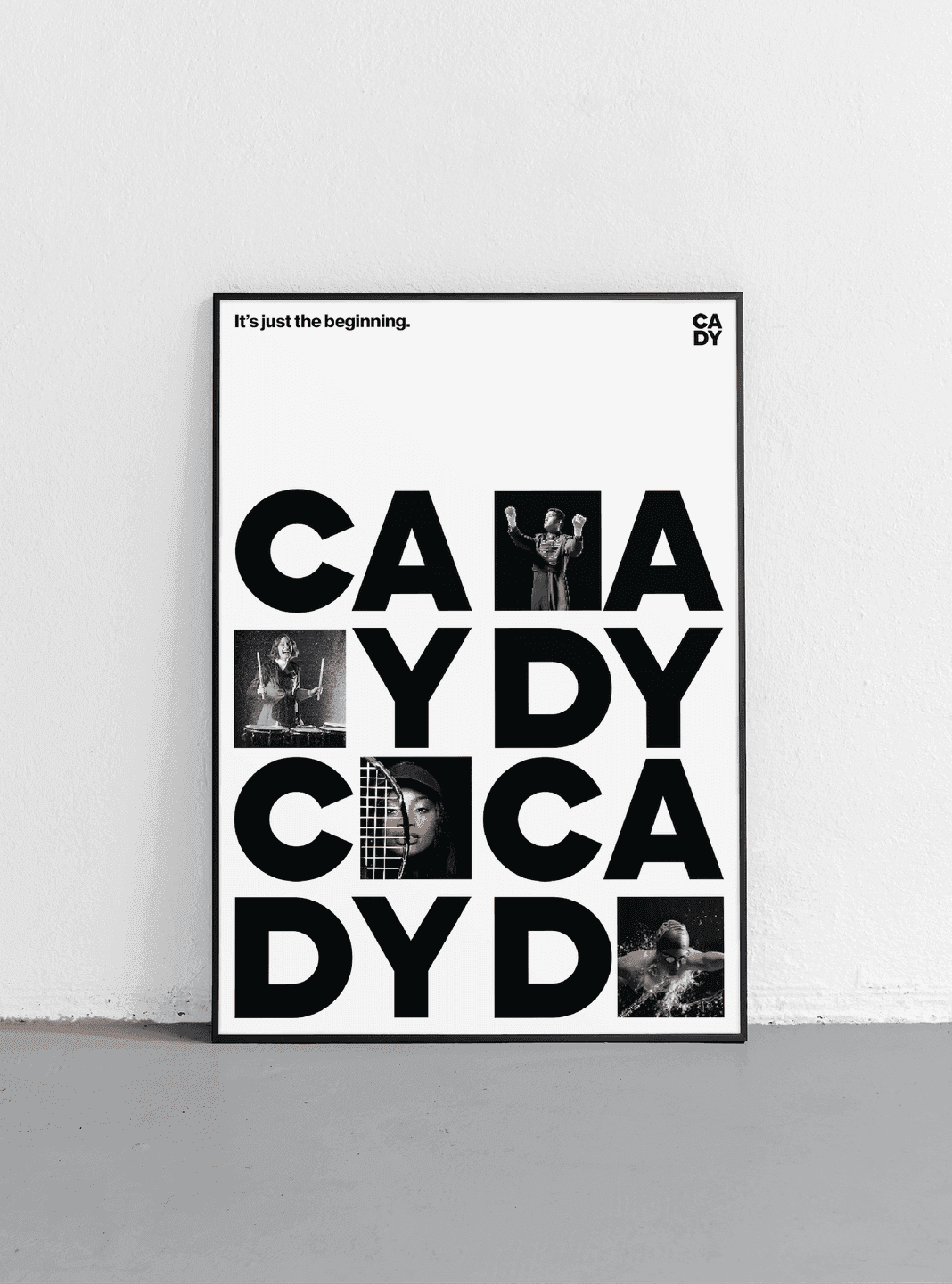
Photo Grid Poster. A modular poster mixing large CADY letterforms with inset student photography.
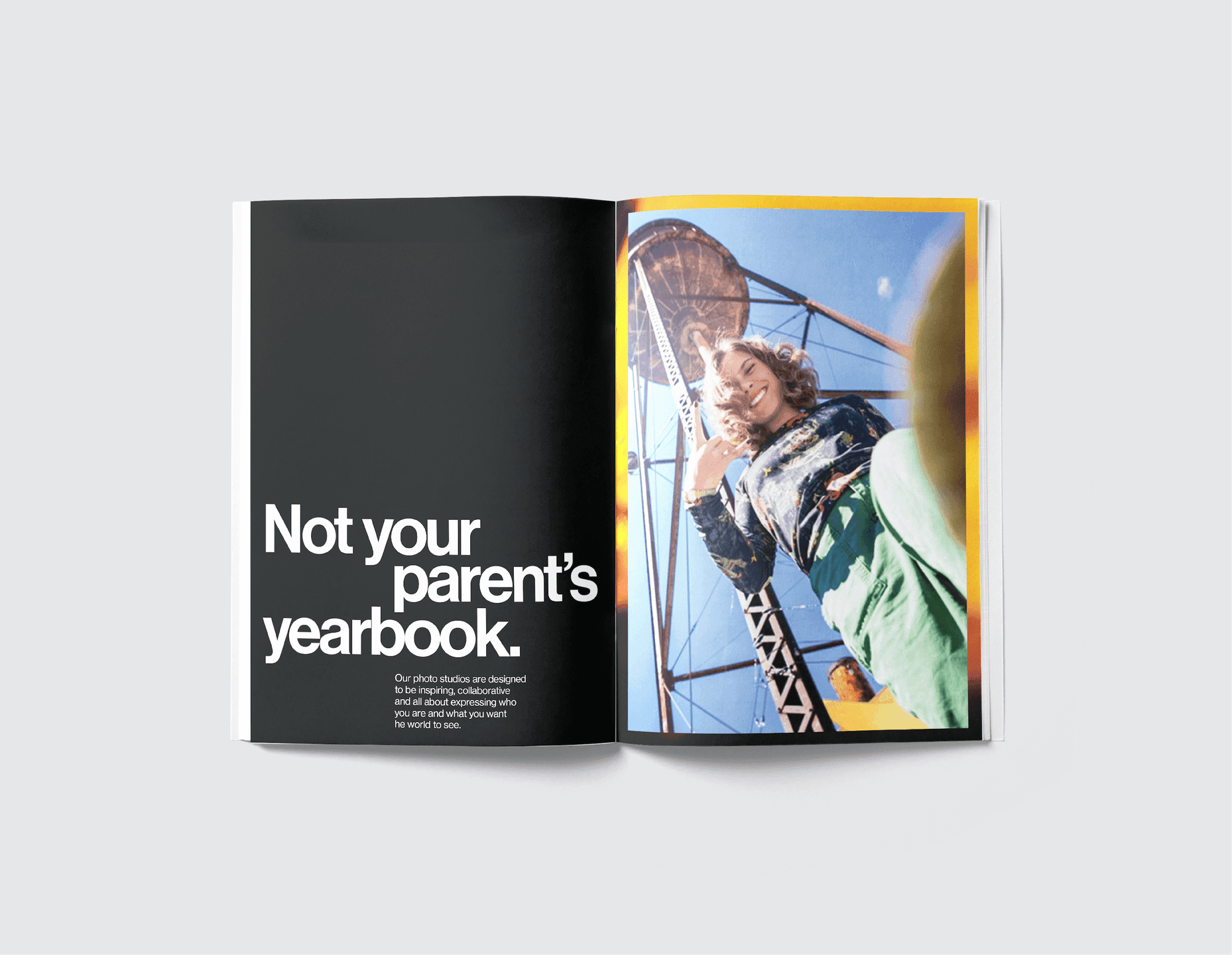
Yearbook Spread. A modern yearbook spread pairing bold typography with a full-bleed student portrait.
Textured Poster. A monochrome poster with a rippling, textured background behind oversized CADY lettering.

Beauty

Glow&Grow gave us a foundation with two audiences to serve. For seniors, the brand had to invite them to express their passion, celebrate their individuality, and bolster their spirit — be you, stay true to you, there's more to you than cap and gown. For CADY's own team, it had to build a culture of empowerment and set the expectation to show up and shine — awesome is a habit; pass it on.

We crystallized all of it into an iconic black-and-white identity — soulful, rich, and made powerful through its content. Black and white strips away the noise and puts the human spirit at the center, exactly where CADY's business lives. We built the visual identity, the voice, and the messaging to carry a brand that could set hearts on fire and still perform, day in and day out, across sessions, schools, and communities.
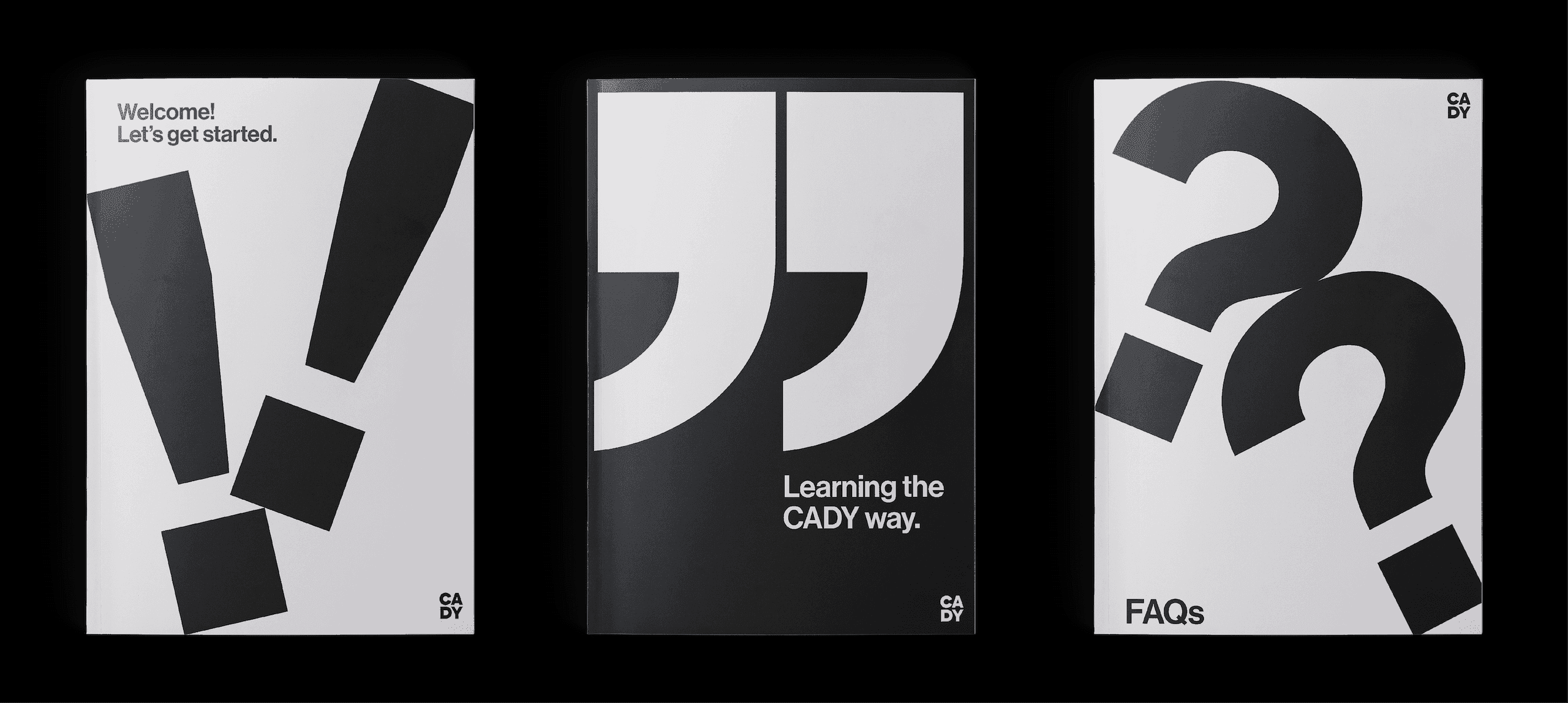
Orientation Guides. A set of black-and-white booklets using oversized punctuation to introduce CADY onboarding content.
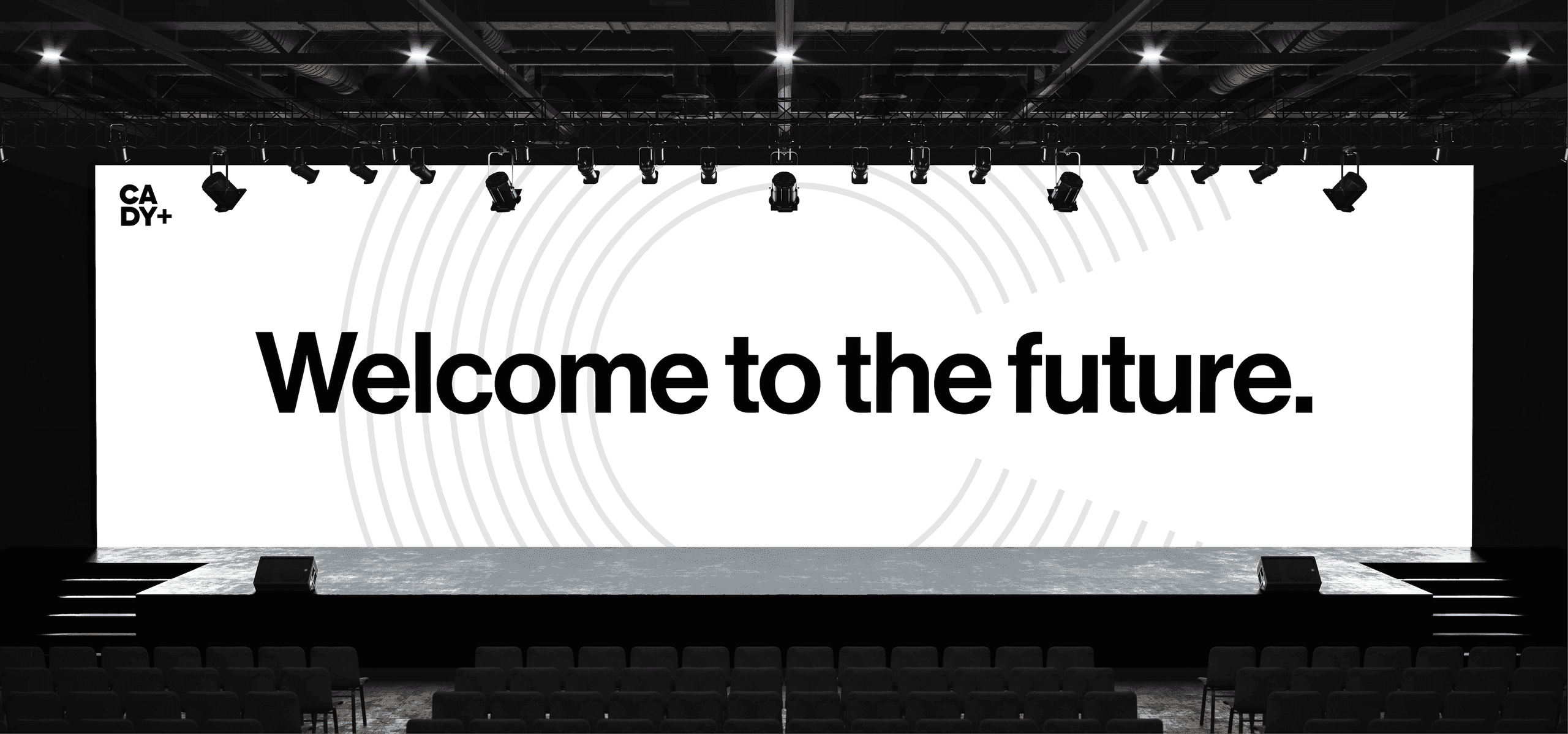
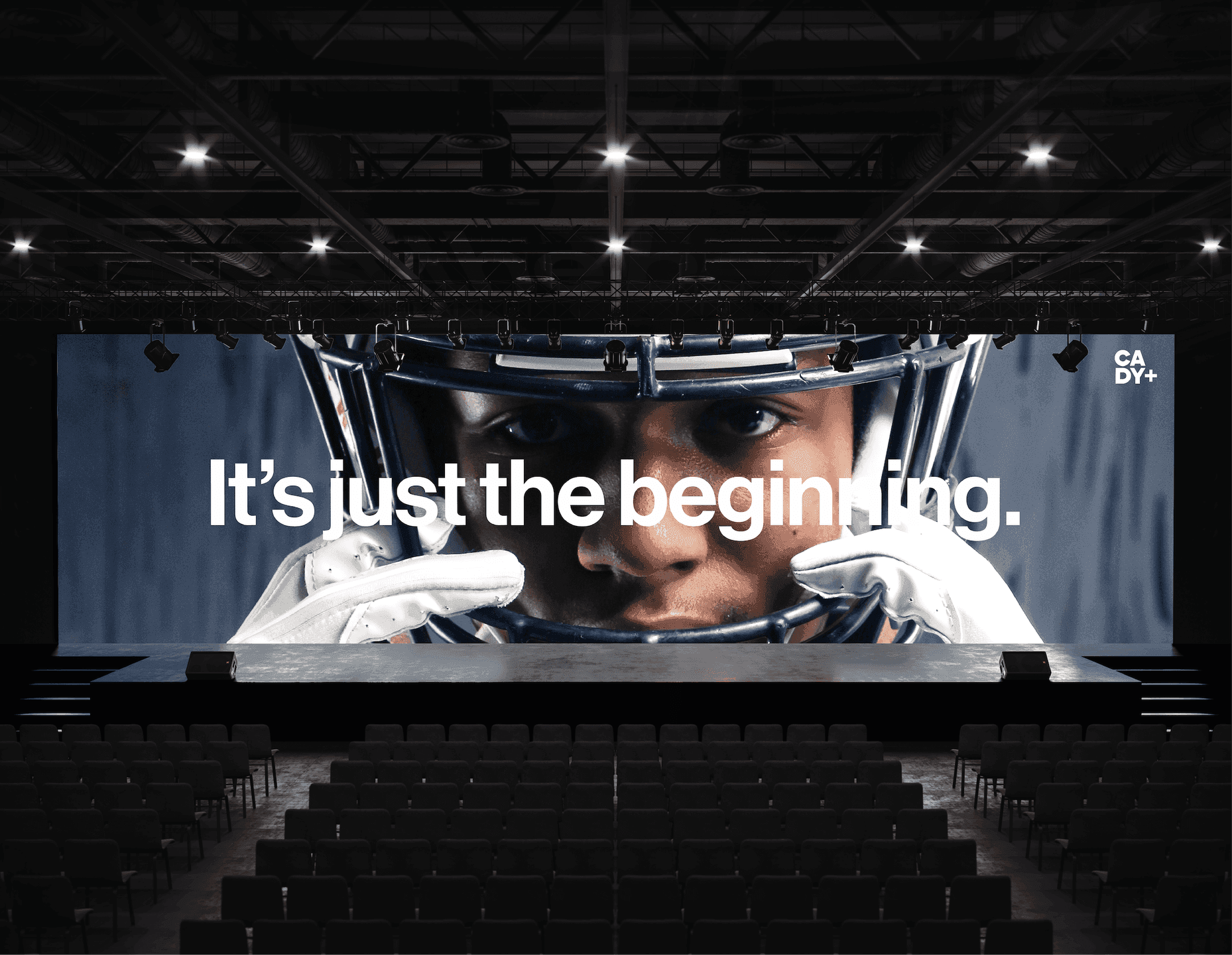
Stage Screen Graphic. A large event screen featuring a dramatic athlete close-up and the line “It’s just the beginning.”

Impact

We gave CADY a complete brand: purpose, corporate story, positioning, visual identity, voice, and messaging. It's a system built to give others permission to be extraordinary.

The result is a brand that reaches far beyond the yearbook. It lifts up the seniors in front of the camera, the team behind it, and the schools and families all around — celebrating the unique and sacred light in But it's loved for something more.
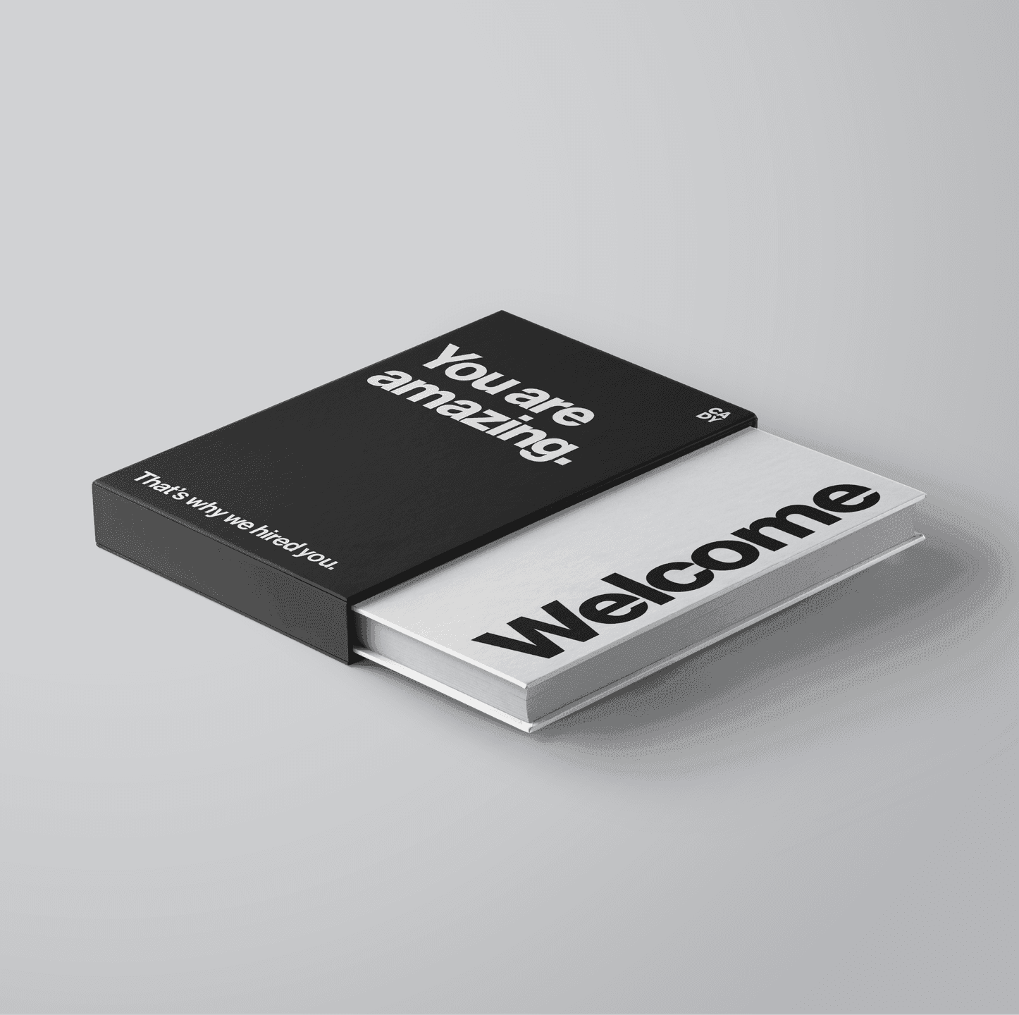
Welcome Kit. A premium welcome box and booklet using bold typography and a clean black-and-white palette.

Like what you see? Look at some more

BABY EINSTEIN toy with Einstein illustration in the background
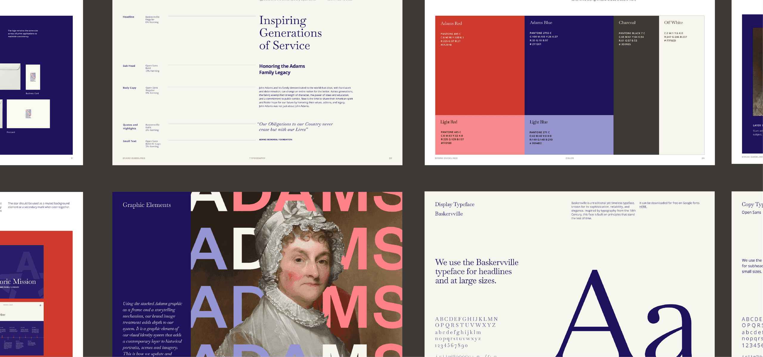
A detailed spread from the Adams Memorial Foundation brand guidelines, showcasing the organization’s color palette, typography system, layout standards, and visual identity principles inspired by the legacy of the Adams family.
Stonehenge Social Post. A bold social graphic overlays Stonehenge with Trainline’s heart icon and the headline “Completely Un-Henged.”
View all work