Baby Einstein
A brand built on curiosity.
Beauty
Curiosity became the foundation for our system of though. It was a learning philosophy and a design philosophy and we built it for the child and the parent. We articulated the belief that curiosity requires cultivation, and gave the brand a voice built around three moves: Be curious. Stay curious. Inspire curiosity.
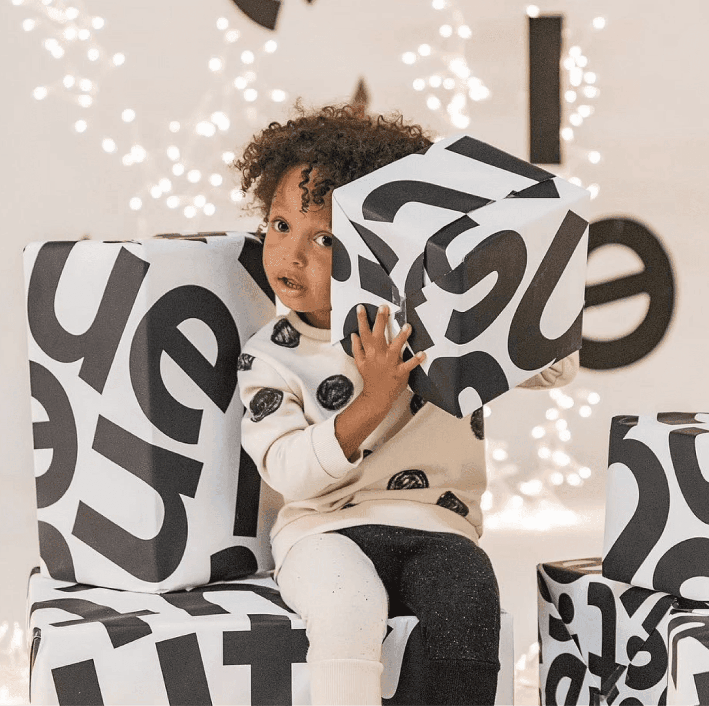
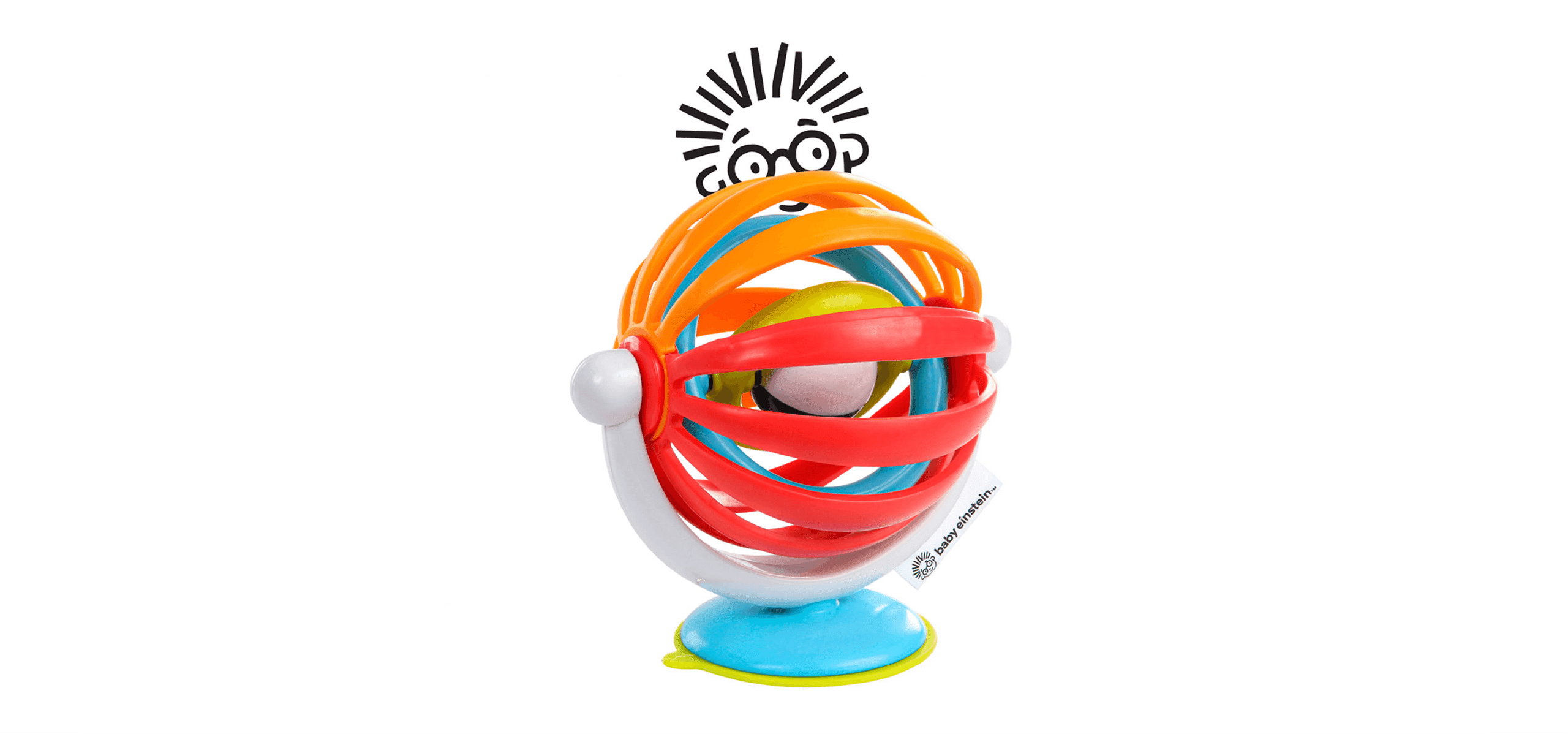
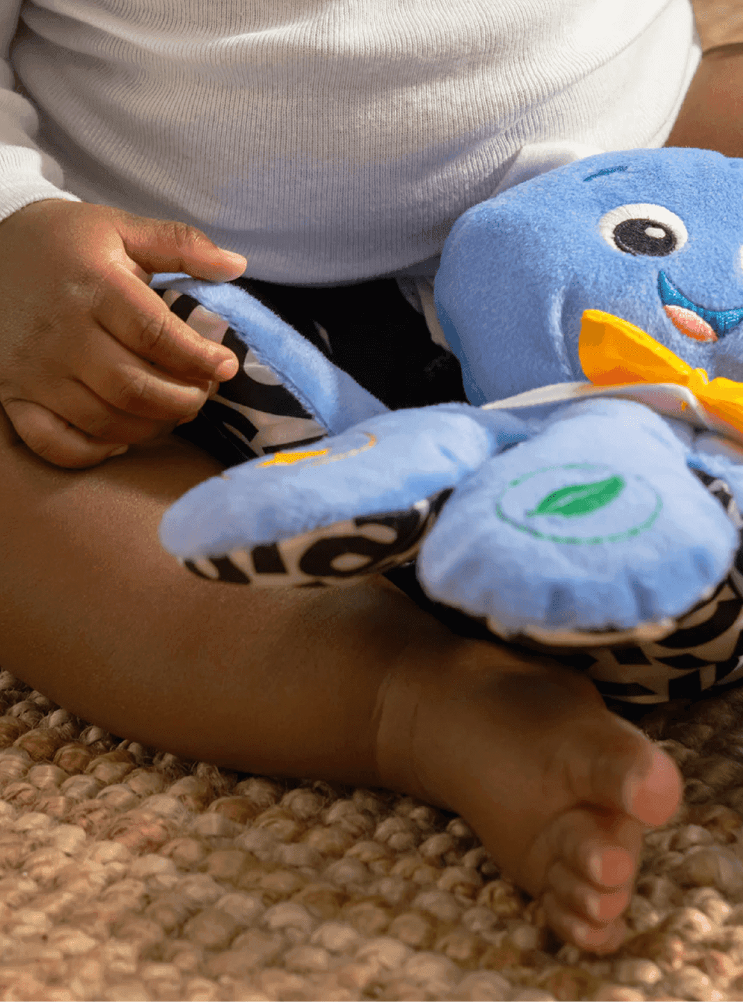
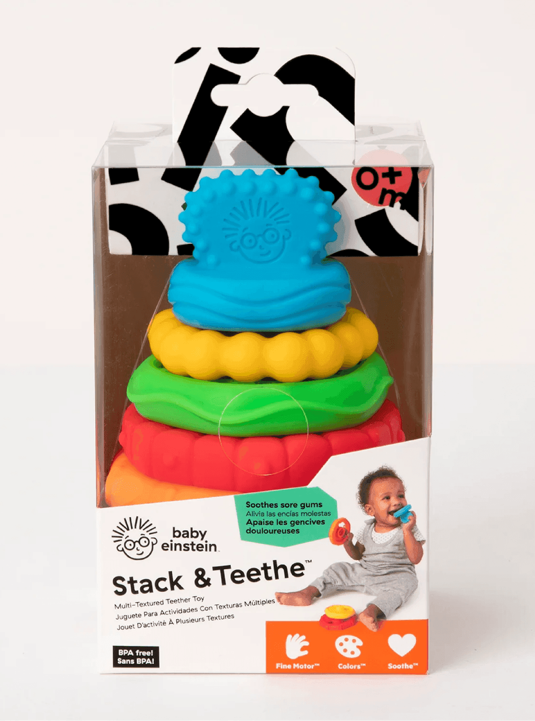
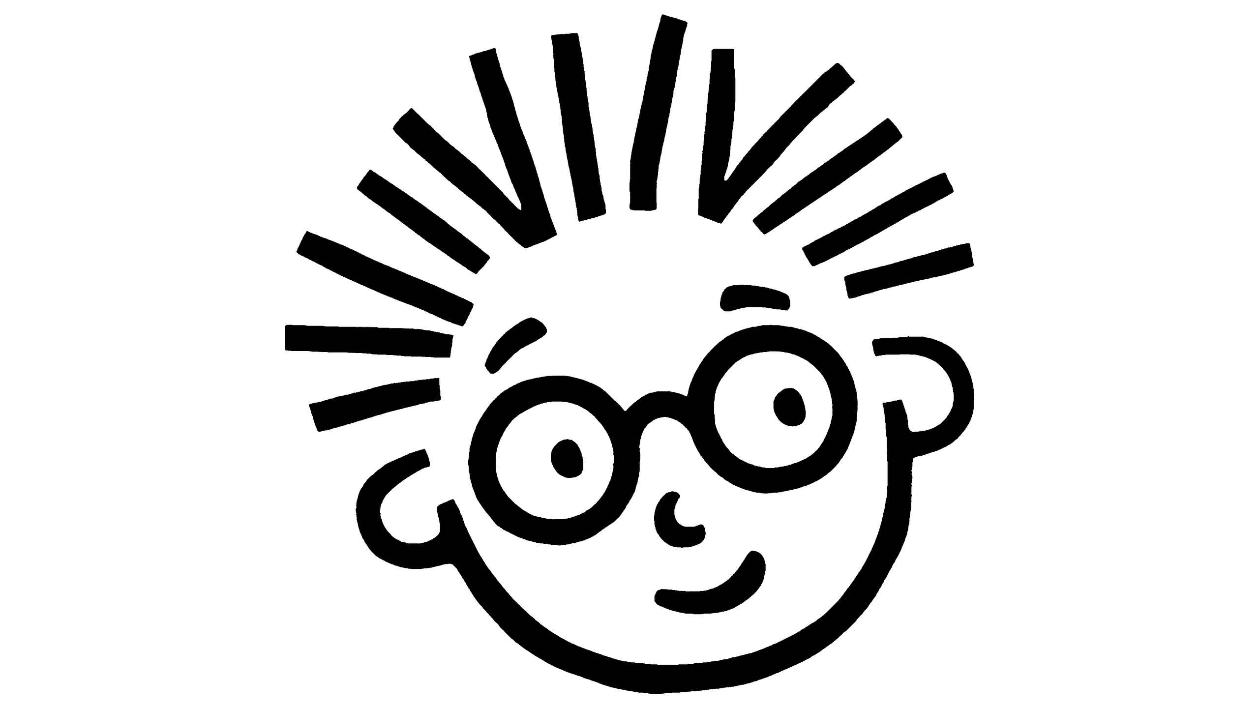
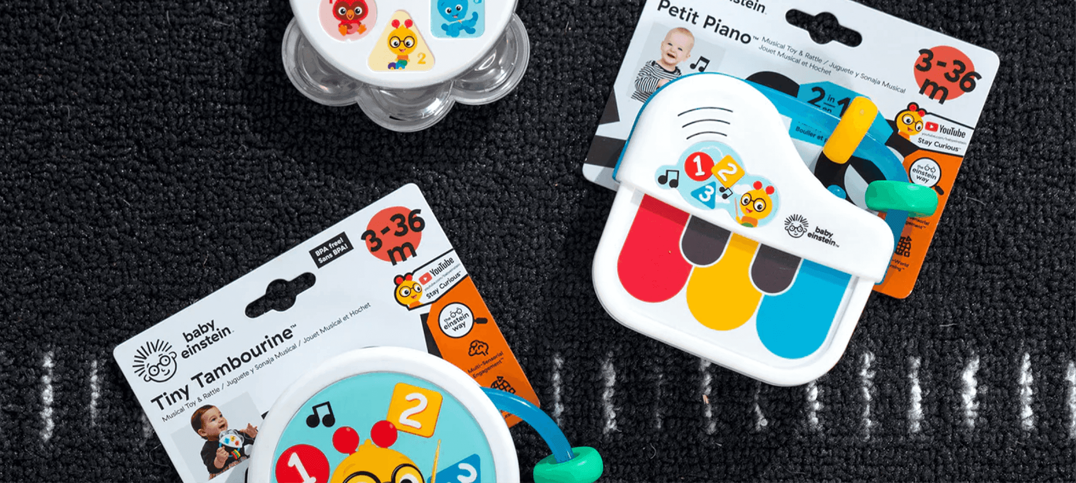
In that sea of primary colors, we took Baby Einstein black and white, with just a flair of rainbow. Black and white felt more evocative and more curious: smart enough for a baby, cool enough for a parent. We redrew the logo to give the little Einstein character a distinctive curious look on his face and we came up with curiosity storylines to give the previously flat cast of characters depth and a journey.
Impact
This was a rebrand that shifted everything at Baby Einstein and it demanded courage. The parent company, Kids2, went through their entire catalog and made hard calls, sunsetting bestselling products that didn't support the curiosity philosophy. The sales team had to stop being order-takers and start leading, re-selling Target, Walmart, and others on the new product philosophy.
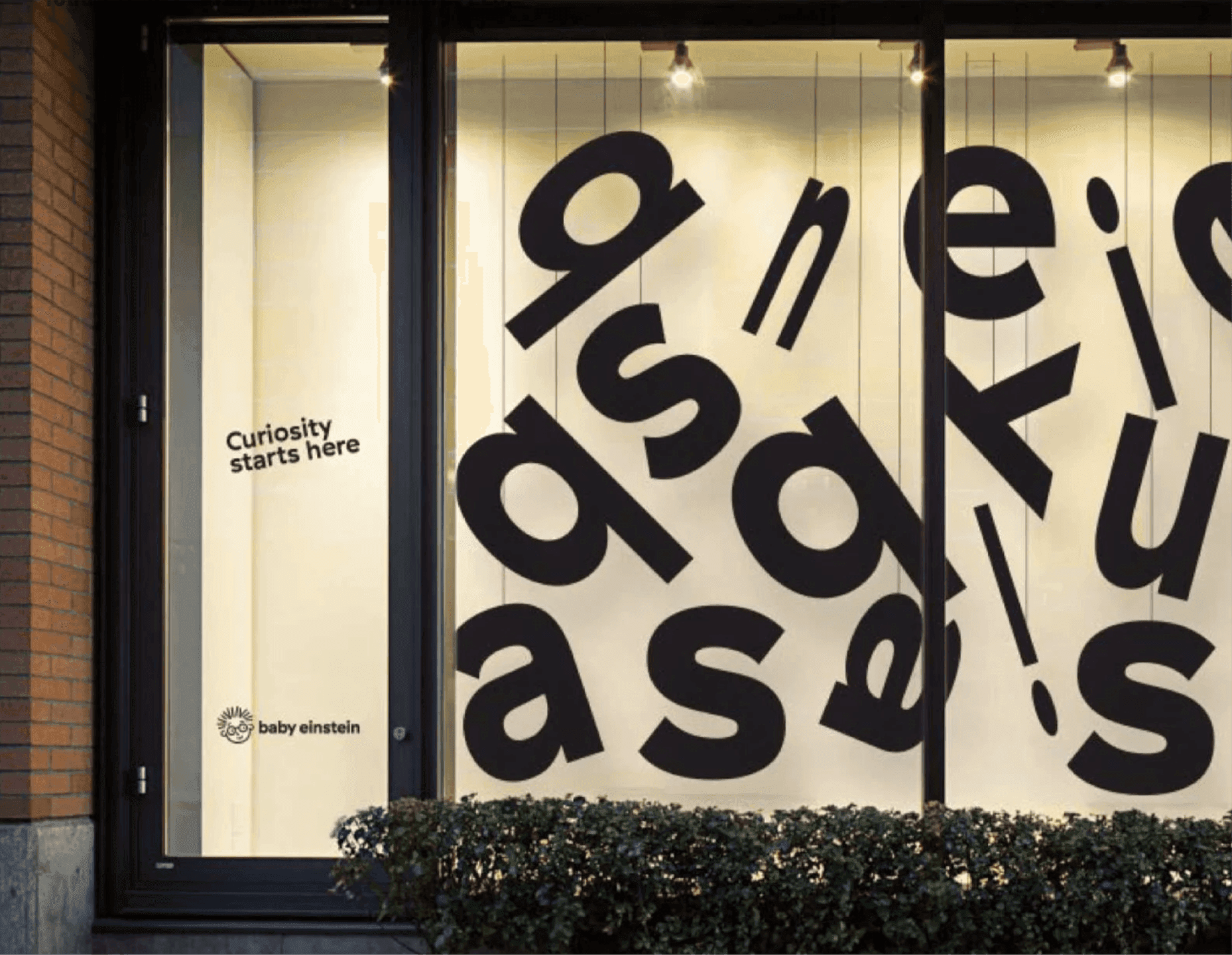
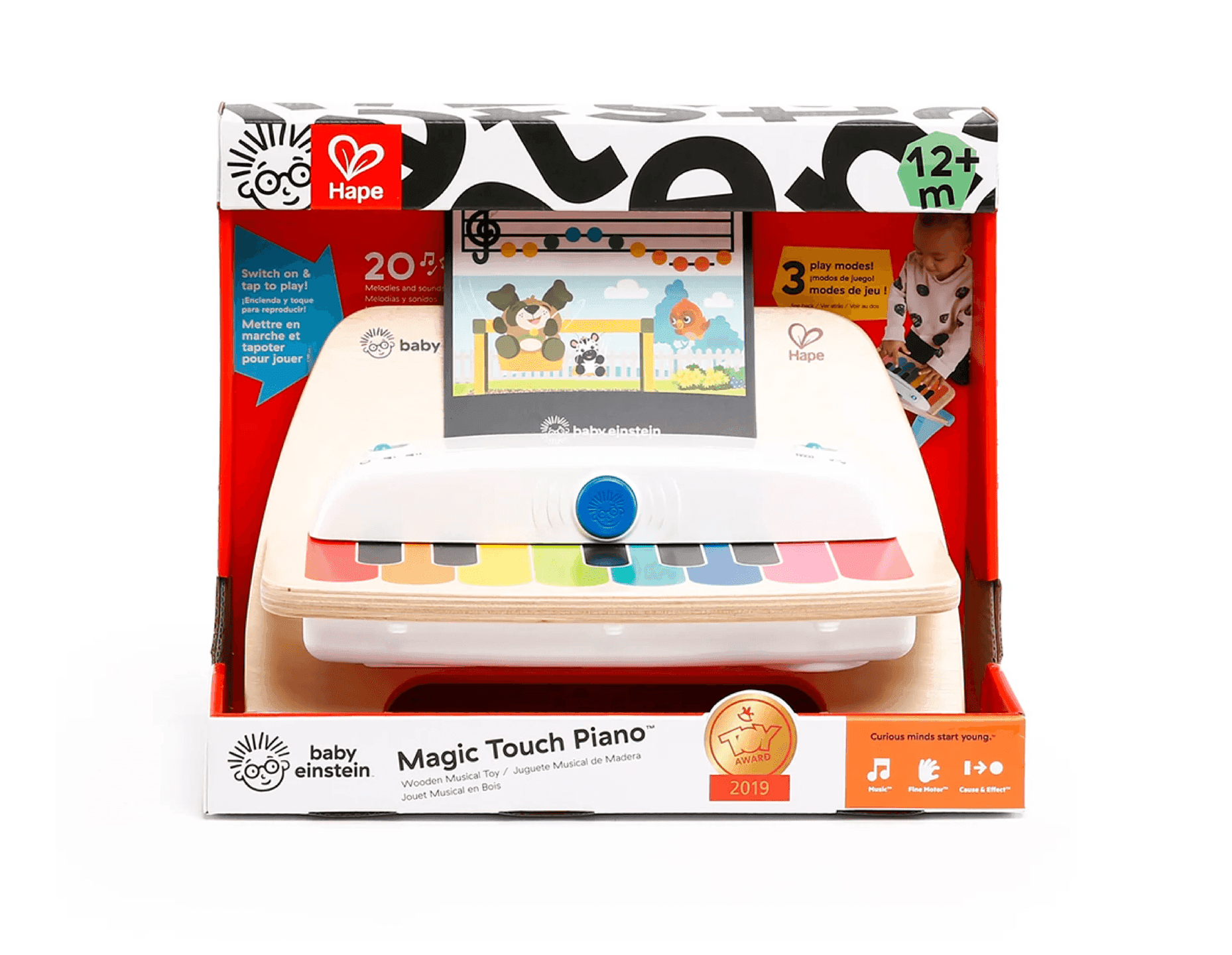
The payoff was remarkable. Hape, a leading wooden toy maker who had once dismissed Baby Einstein as "cheap American plastic", came back to the table after the rebrand. They co-created the Magic Touch wooden piano, which won the Spielwarenmesse Toy Award and became one of the category's most successful collaborations. Retailers would have never touched Baby Einstein embraced it: John Lewis in London even built a massive Baby Einstein installation (Fun fact, we literally stumbled onto it while doing research for another project). Most importantly, the company's self-image changed.
We gave Baby Einstein back its meaning and proved that in a category shouting about intelligence, the smartest thing a brand could do was get curious.