athenahealth logo on purple. The athenahealth logo and tagline appear centered on a purple background.

athenahealth

How do you bring simplicity and energy to a global health-tech brand that’s gotten muddied and complex?
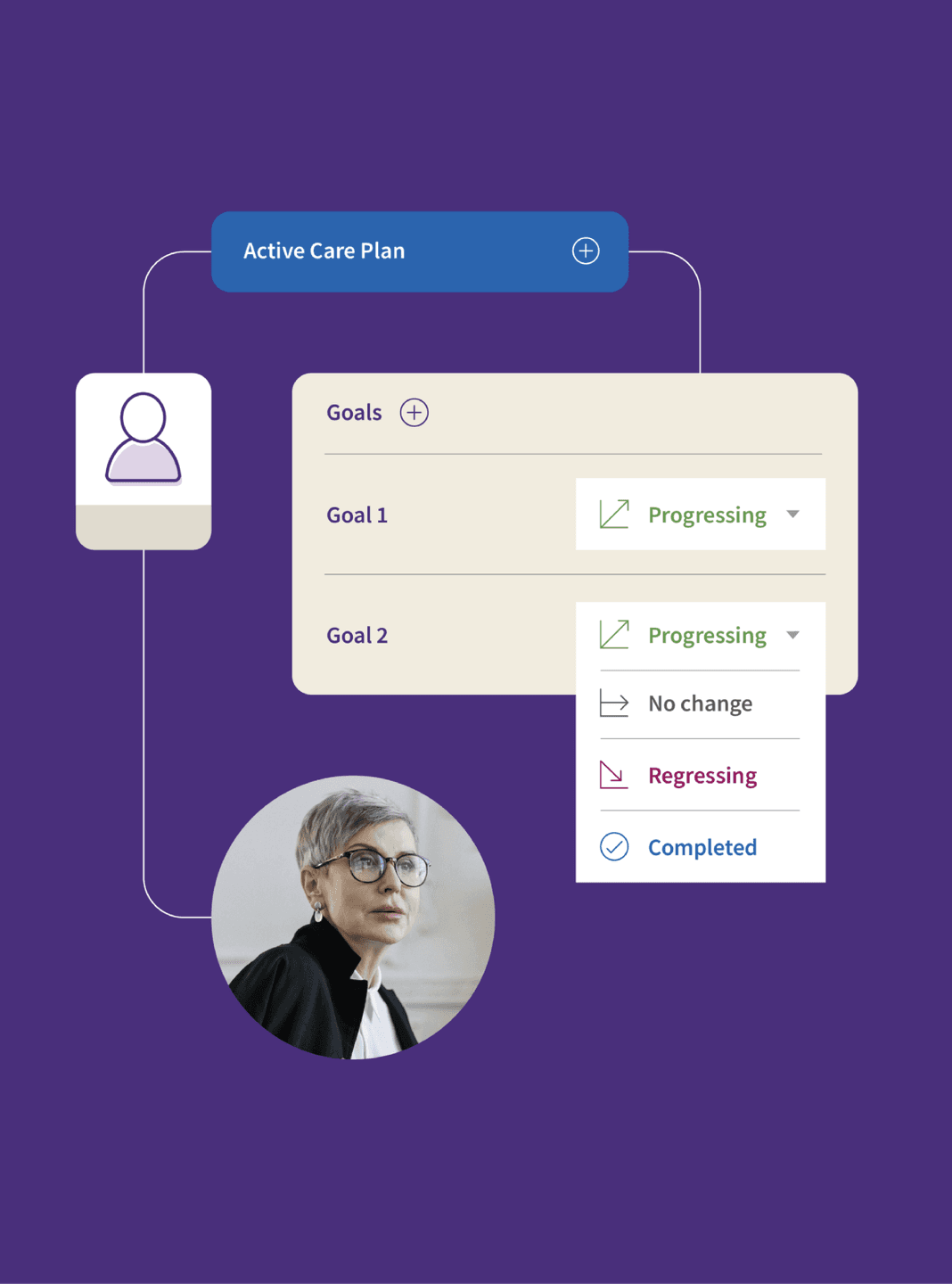

The athenahealth team brought on Son&Sons to simplify their brand system in order to enable brand consistency across the entire workforce. Like a lot of companies their size, athenahealth had lost their way when it came to applying their brand across a multitude of products, programs and brand activations. They needed help to take their existing system and streamline it in a way that their employees could understand and use.


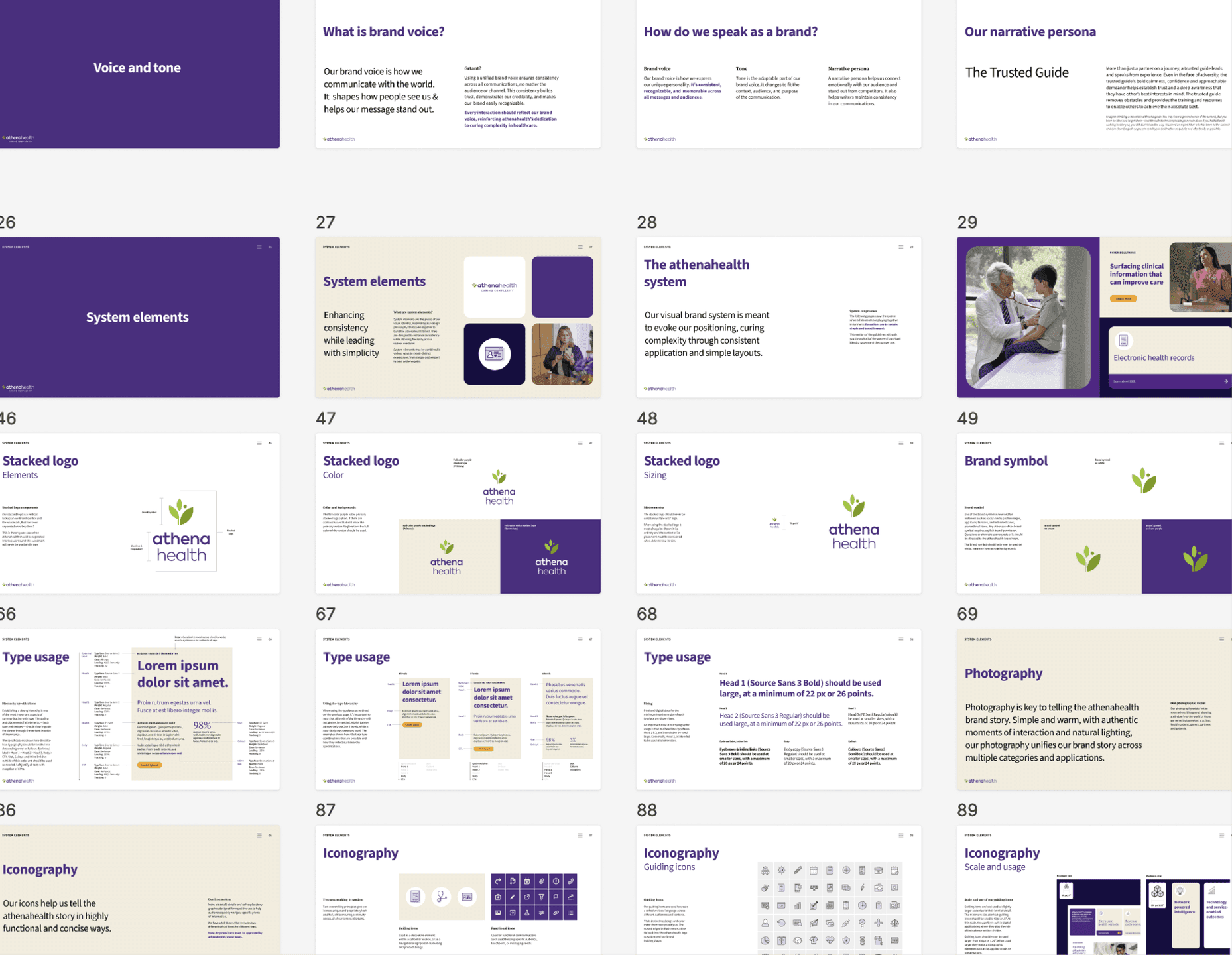
We stepped in and took the parts of their brand that were working well and amplified them, while cutting out the pieces that were creating confusion. Our work culminated in an extremely thorough and detailed brand guidelines document that enabled all employees working directly with brand to create assets that correctly lived up to where athenahealth was heading.

Active care
Social
Intelligence
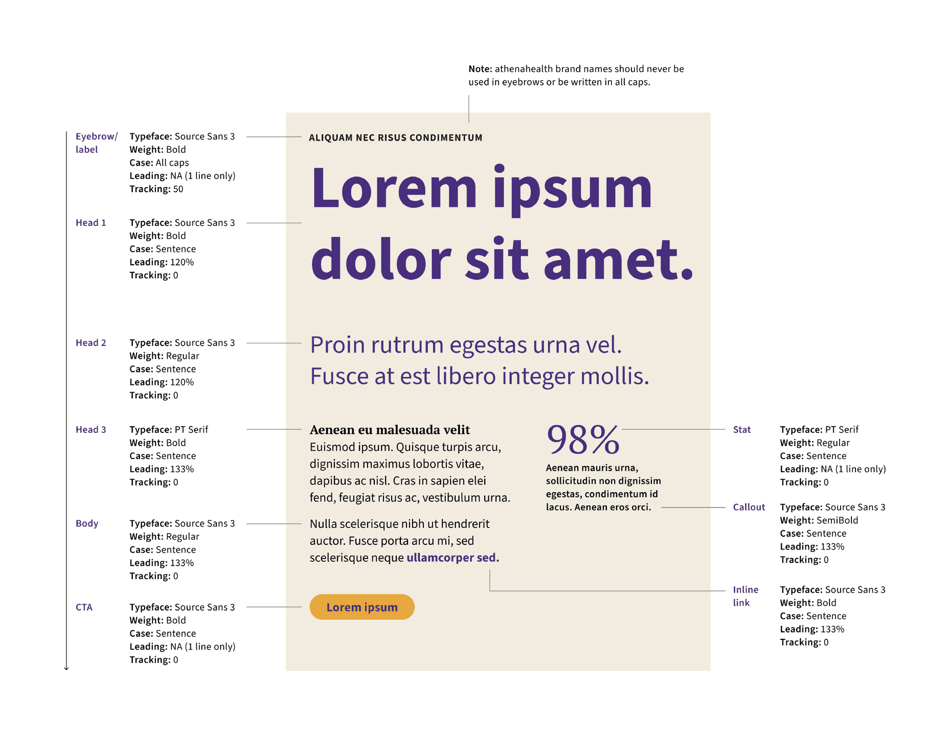
Typography layout guide. A typographic system diagram outlines type hierarchy, styles, and usage rules.
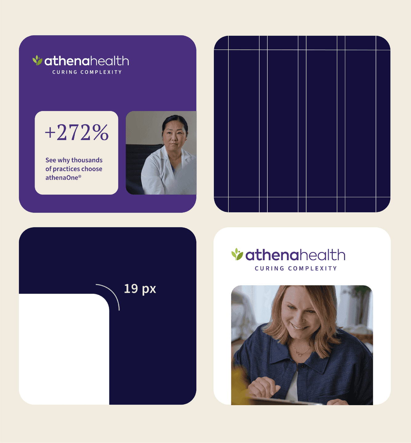
Modular Social Panel System. A grid of four rounded-corner social tiles demonstrating brand patterns, photography, metric callouts, and spacing rules.

Streamlining

For a brand that needs to communicate a lot of information quickly, we knew we needed to build out a system that reflected that complexity, but made it digestible. One of our solutions was a straightforward grid system that gave all communications an underlying structure and unified them across applications.
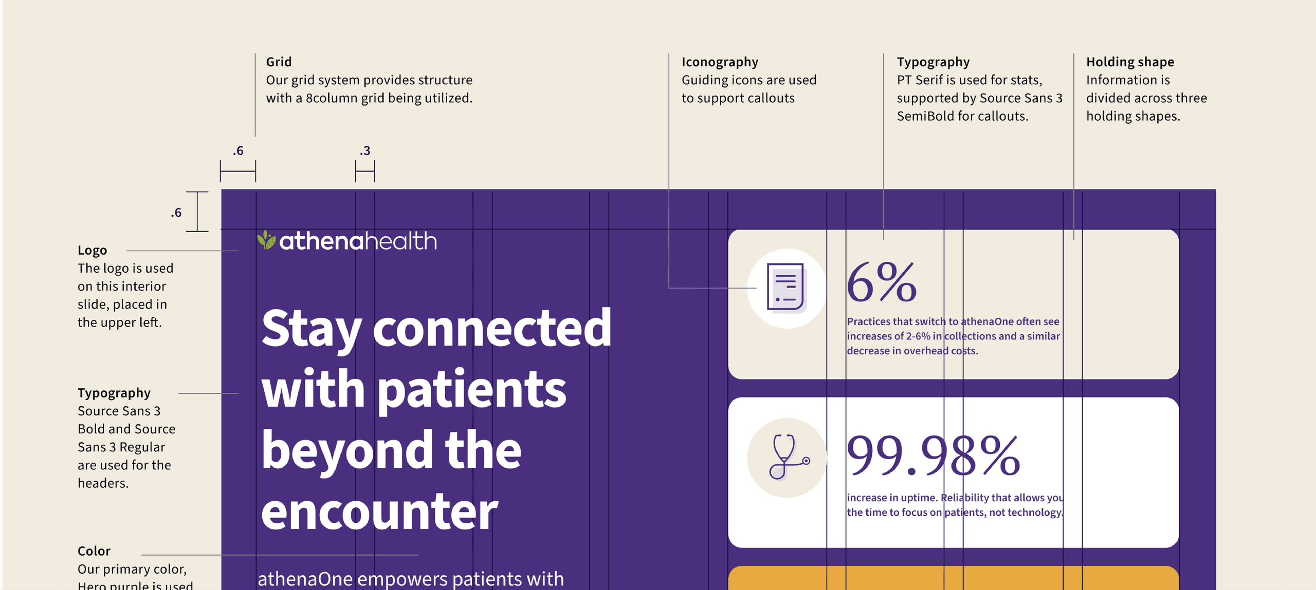
Slide grid system. A presentation slide demonstrates the brand grid, logo placement, and content blocks.
Brand guidelines overview slides. A multi-page layout displays athenahealth’s system elements, logo usage, type, icons, and photography.

System Elements


Over time, the athenahealth brand system had absorbed a lot of dissonant elements. They were muddying the waters and leading to executions that felt divorced from the larger brand. We worked with the athenahealth team to identify the elements that were working, the ones that should be scrapped, then honed in on how best to use what we had to amplify a simple and cohesive brand voice.

Event Promo Social Tile. A social post promoting an Athenahealth Lunch & Learn event, pairing conversational messaging with warm, natural photography.

Like what you see? Look at some more

Doghobble Wine Farm Packaging Boxes. Doghobble Wine Farm wine boxes featuring bold, varietal-inspired floral emblems in clean vertical compositions.
Three ATI Posters at Bus Shelter. A set of three vibrant ATI posters highlights train, bus, and ferry services using bold geometric patterns.
BABY EINSTEIN toy with Einstein illustration in the background
View all work